
Adding and Editing Views
This tutorial walks you through adding views to your moments and building their visual layouts on the canvas. By the end, you'll know how to open the view editor, add components like text and images, and use the component toolbar to adjust what you've placed—giving you a fully editable layout ready to publish to your display.
The Moments graph and your first moment card
The Moments graph is your project's bird's-eye view. Each card on the canvas represents a moment—a single screen in your experience. The Welcome card shown here is tagged First moment, which means it is the entry point visitors reach when the experience launches.
Notice the Views (1) section inside the card, which lists Library Display. A view is the visual layout of a moment for a specific display. Click Library Display to open that view in the editor—that is where the next steps take place.
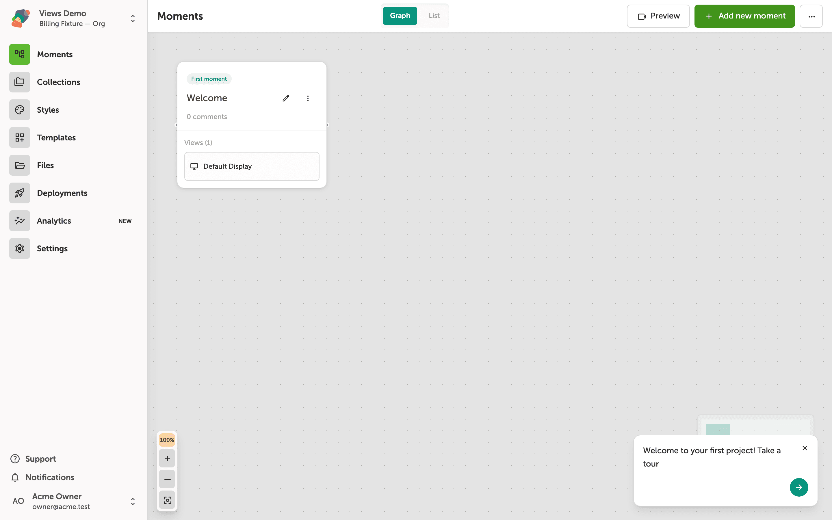
The view editor canvas and its dotted-grid surface
This is the view editor—the main workspace where you build the visual layout for each moment. The dotted grid fills the full canvas area, and the blue-outlined rectangle in the center represents your view boundary: the region that maps to your target display.
Use the left sidebar icons to switch between tools such as components, collections, style sets, and project settings. The Preview button in the top-right corner lets you see the moment as a visitor would experience it on the display device.
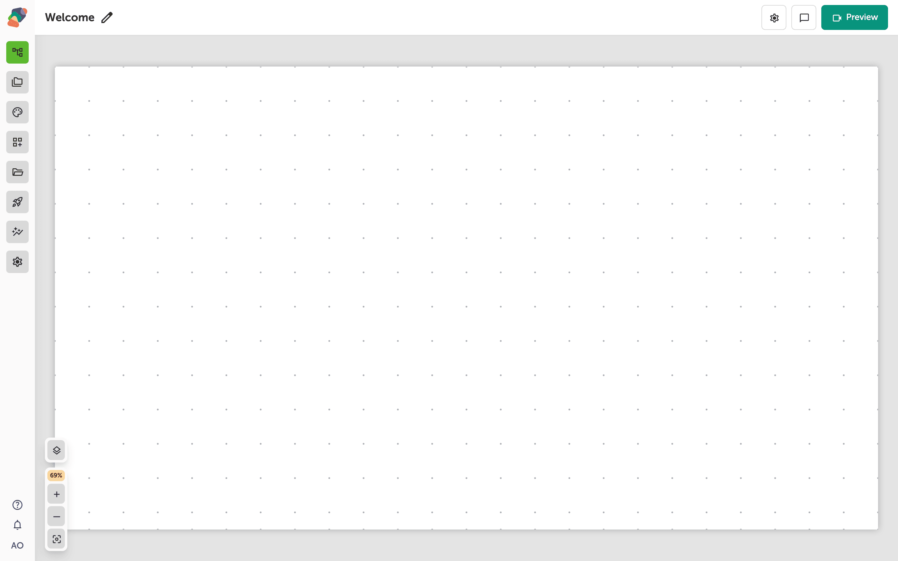
The Add a component panel and its available component types
The Add a component panel opens when you click the + button on the canvas. Components are organized into three groups: Basic Components (Text, Image, Video, Audio, Separator, Icon), Interactive Components (Button, 3D Model, Timeline, Hotspot, Highlight, Carousel), and Layout Components visible at the bottom of the panel.
Click any component tile to place it on the canvas. Interactive Components—such as Hotspot or Timeline—let visitors tap or explore content directly, making them well-suited for hands-on kiosk stations.
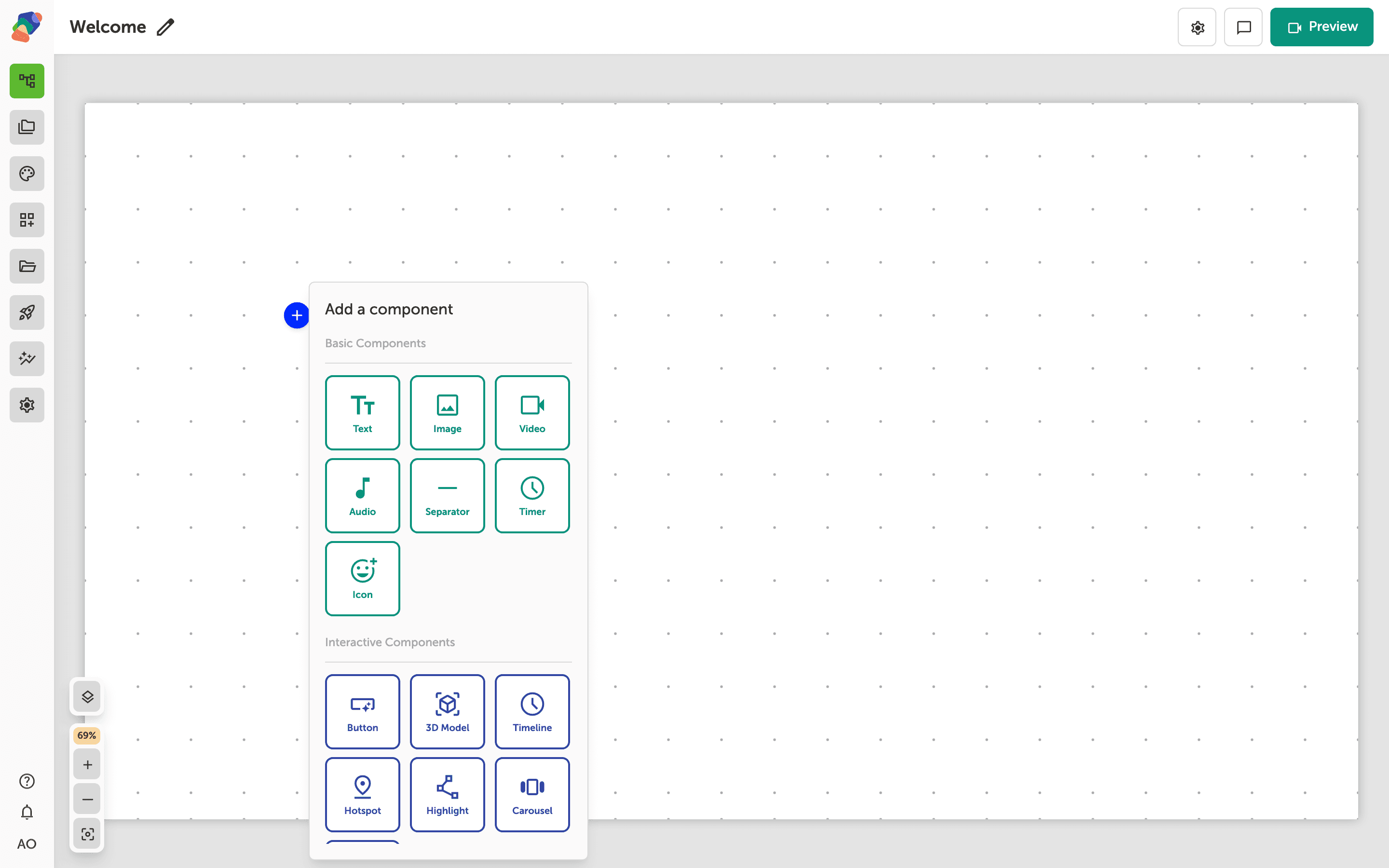
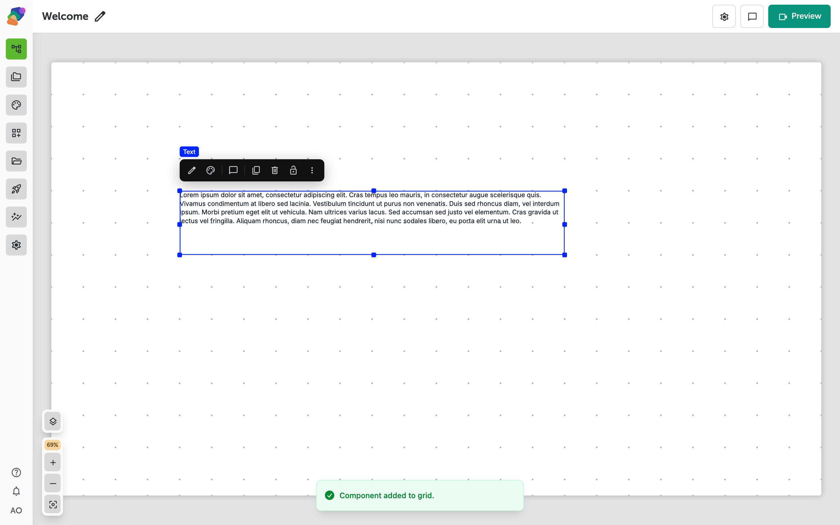
A placed text component selected on the canvas
After adding a text component, it appears directly on the canvas surrounded by a blue selection border with resize handles at each corner and edge. A floating toolbar appears above it with actions including Edit content, Edit styles, Comment, Duplicate, Delete, Lock, and More actions.
You can drag the component to reposition it, or pull any handle to resize it. The confirmation banner at the bottom—"Component added to grid"—confirms the component was placed successfully.
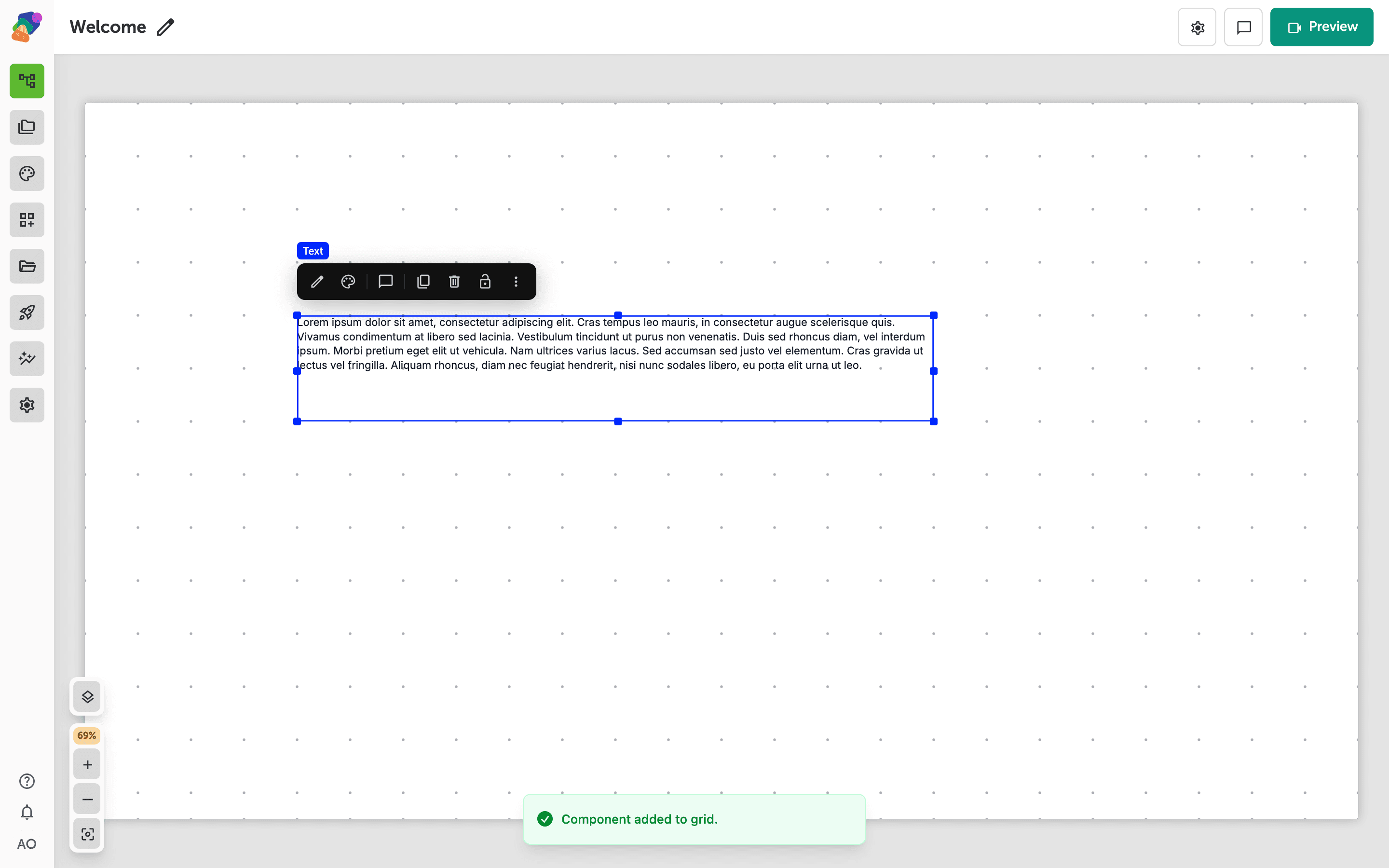
The component toolbar and its quick-action controls
When you select a component on the canvas, a toolbar appears directly above it. From left to right, the toolbar gives you Edit content, Edit styles, Comment, Duplicate, Delete, Lock, and More actions. Use these controls to update what the component displays, change its appearance, or manage it without leaving the canvas.
The "Component added to grid" confirmation at the bottom of the screen confirms your component is placed and ready to edit. Click anywhere outside the component to deselect it, or go straight to Edit content to start adding your text.
With views set up and components in place, you have the foundation of a working moment layout. From here, you can start connecting moments together and refining how your project looks across different devices.
- Link moments with flows: Set up navigation paths so users can move between moments in your project.
- Apply a style set: Define consistent typography and colors across every moment in one step.
- Configure displays: Adjust your layout for different screen resolutions and orientations.
- Work with collections: Connect a reusable data set to populate components dynamically.
- Preview and publish: Test your project on a target display before sending it live.