
Adding Shadows and Effects
This tutorial walks you through adding shadows and visual effects to your project using Zibit's Style Editor. By the end, you'll have a saved shadow preset that you can apply to any component across your project—keeping your design consistent whether you're building a single kiosk display or a multi-moment interactive experience.
The Style Editor overview
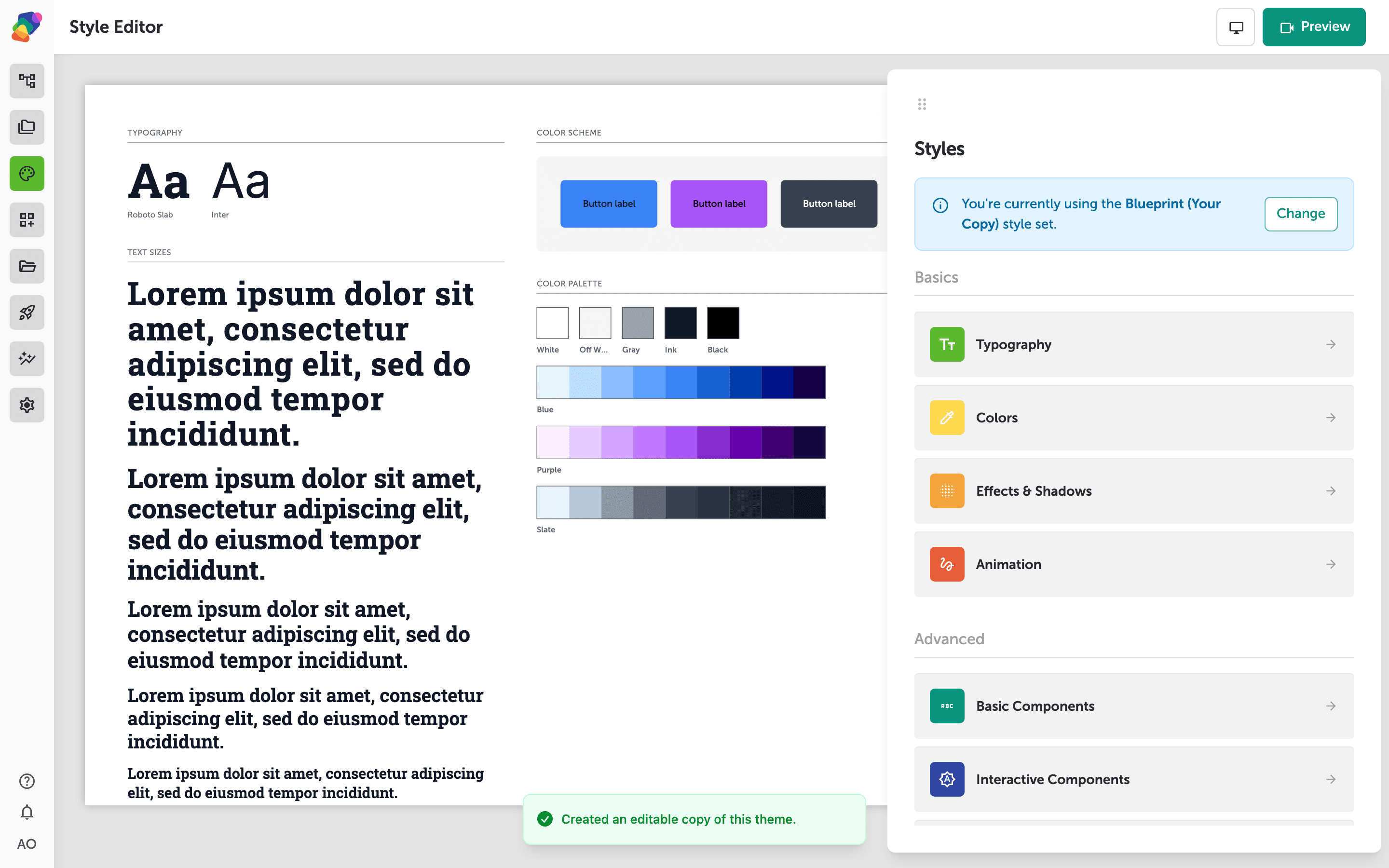
The Style Editor is where you control the visual identity of your entire project—fonts, colors, shadows, animations, and component defaults—all from one place. The live preview on the left shows your current typography and color scheme, so changes you make are reflected immediately.
On the right, the Styles panel lists every category you can edit. Under Basics you'll find Typography, Colors, Effects & Shadows, and Animation. The Advanced section covers Basic Components, Interactive Components, and Layout Components. To reach the shadow and effects controls, you'll click Effects & Shadows in this panel.
The Shadows & Effects panel
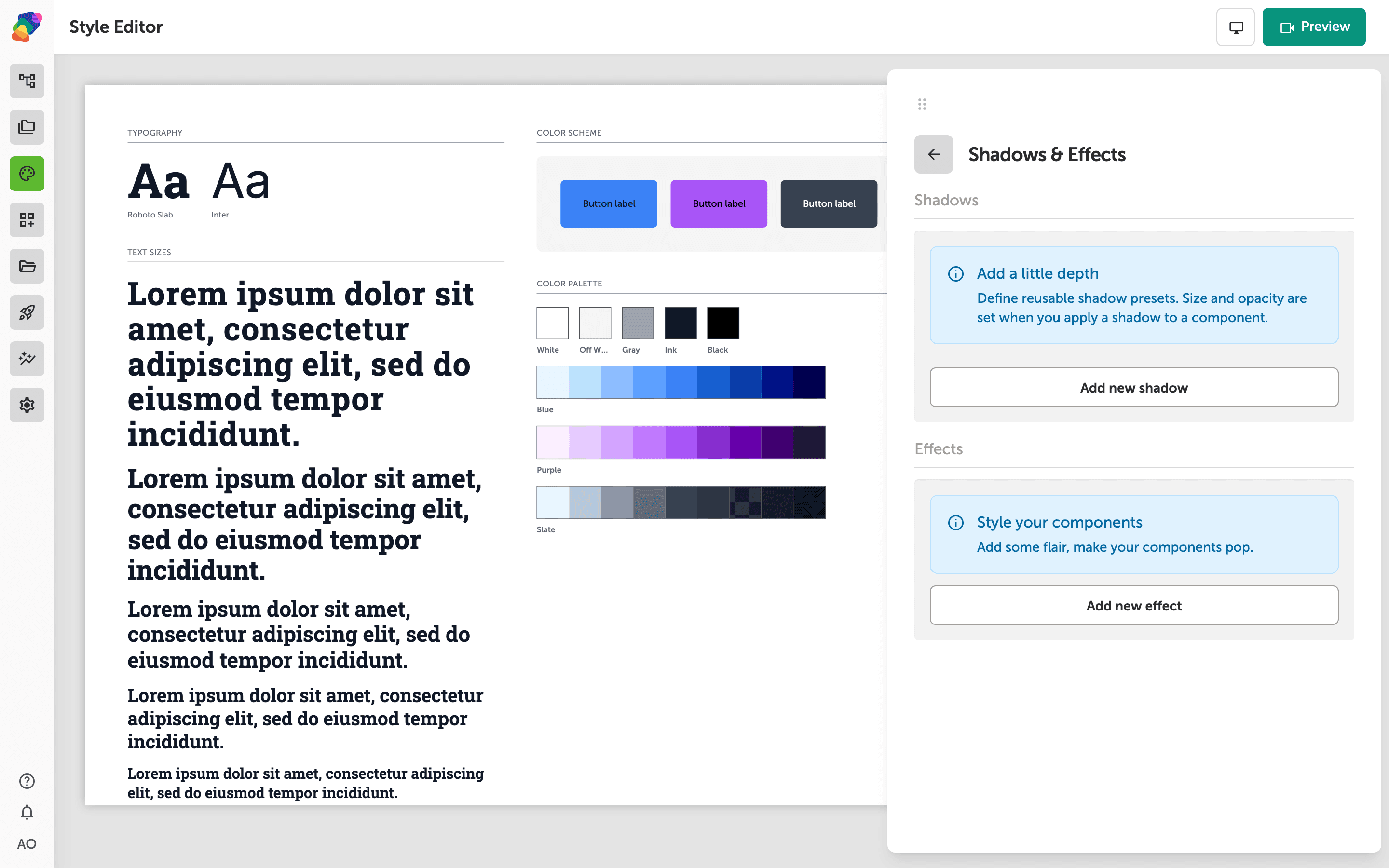
The Shadows & Effects panel has two distinct sections. Shadows is where you define reusable shadow presets—size and opacity are configured later, when you apply a shadow to a specific component. Click Add new shadow to create your first preset.
The Effects section below works the same way: click Add new effect to build a reusable visual effect you can apply across components in your project. Both sections start empty until you add entries.
A new shadow preset row added to the list
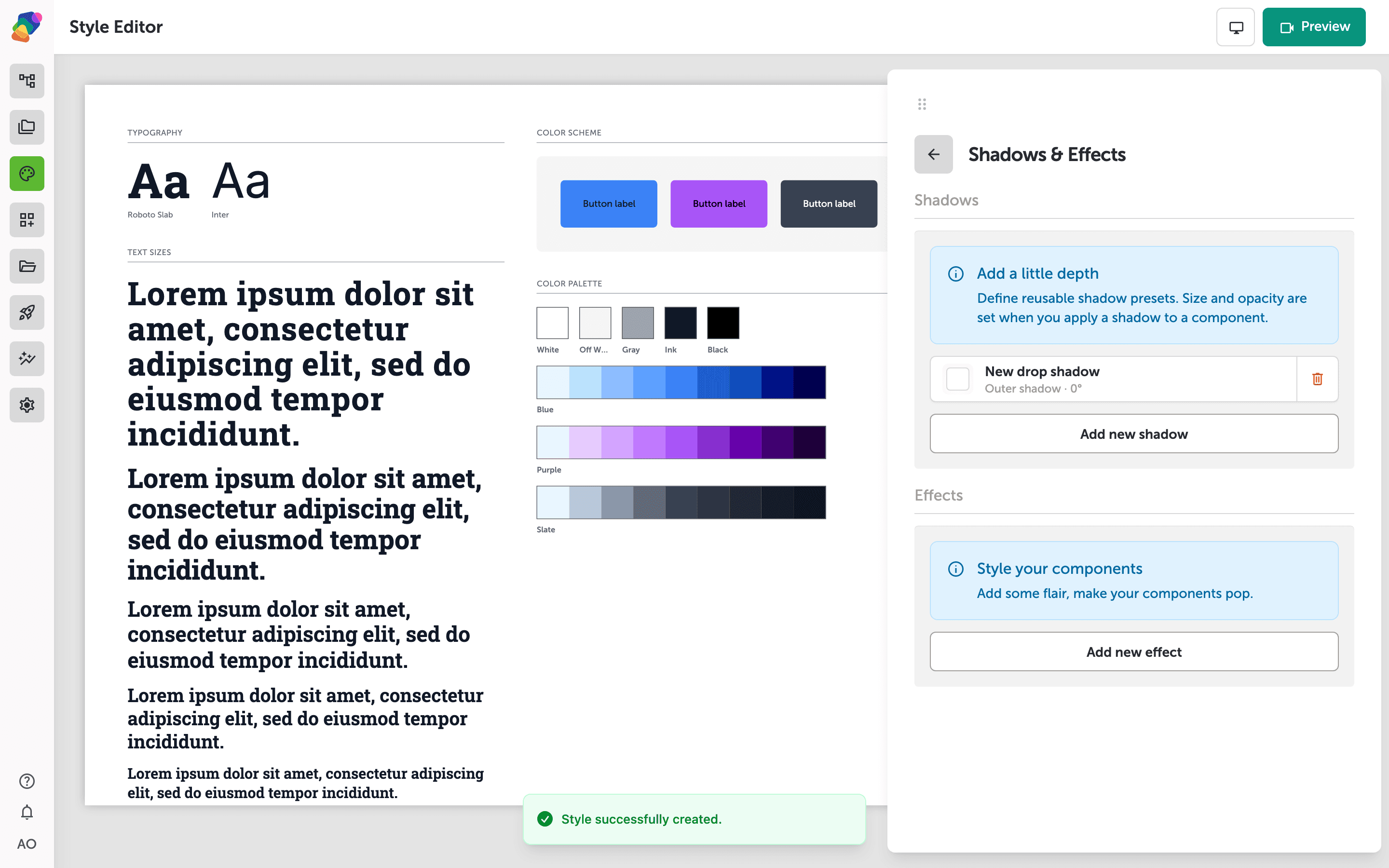
After clicking "Add new shadow", a row labeled "New shadow" appears under the Shadows section. It shows a white swatch and the descriptor "Outer shadow · 0°", indicating the preset is ready to be configured.
Click the row to open its settings, where you can rename the preset and adjust its offset, blur, spread, and color. The delete button on the right removes the preset if you no longer need it.
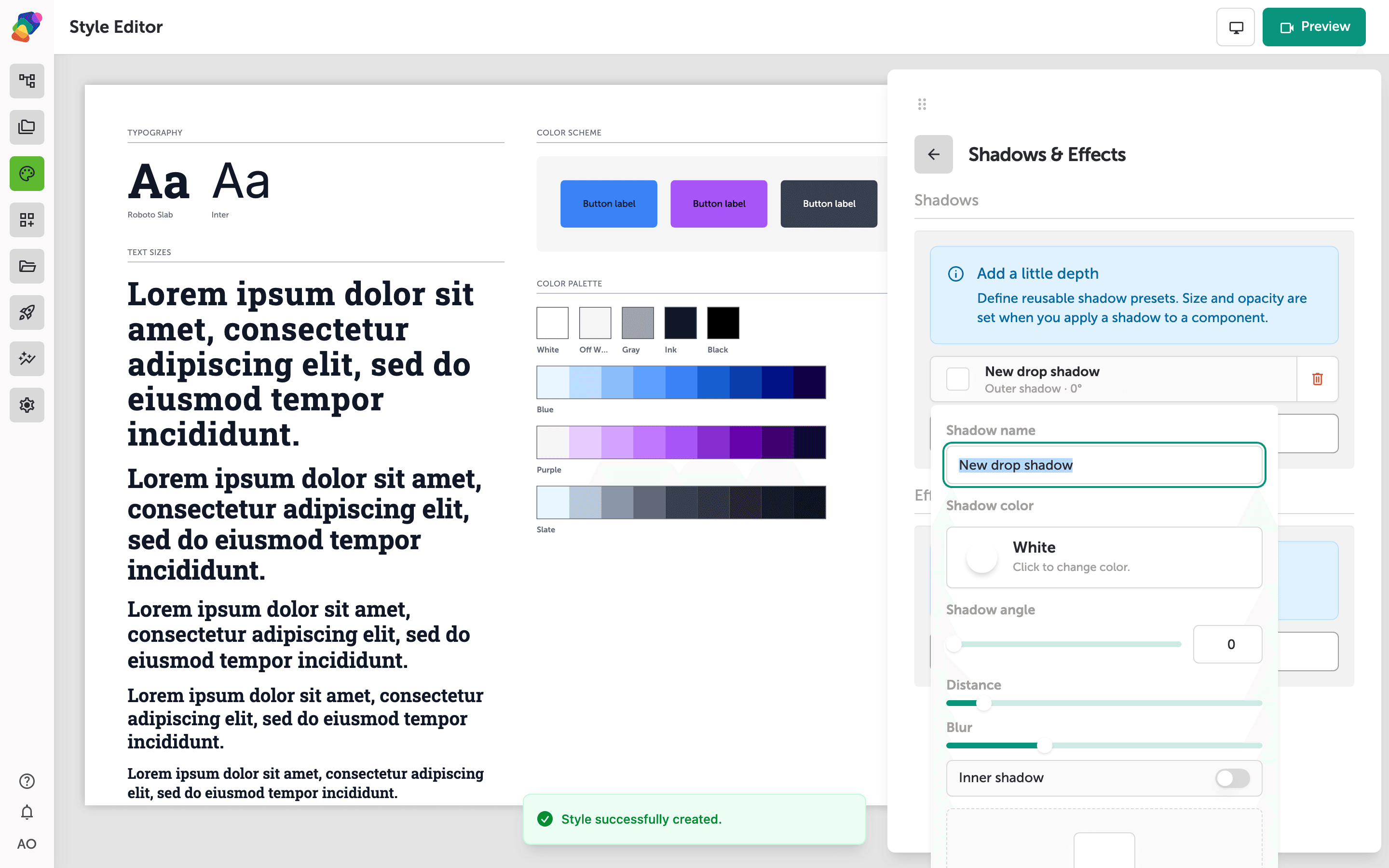
Configuring shadow name, color, angle, distance, and blur
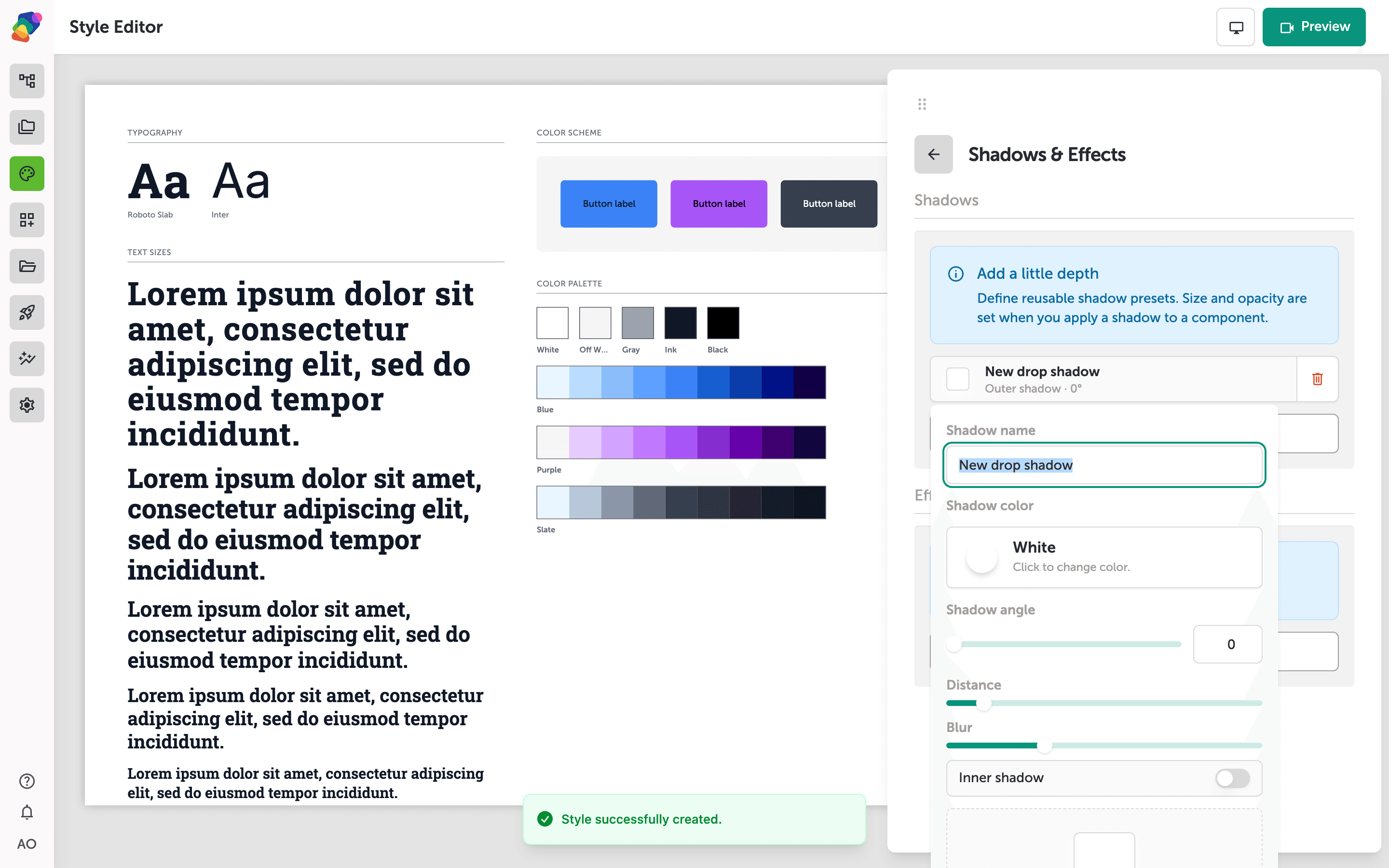
With your new shadow preset selected, the panel expands to show its full configuration. Type a descriptive name into the Shadow name field—this is how the preset will appear when you apply it to a component later. Below that, the Shadow color swatch defaults to black; click it to open the color picker and choose a different hue or opacity.
Use the Shadow angle slider or type a value directly to control the direction of the shadow. The Distance and Blur sliders adjust how far the shadow falls from the element and how soft its edges appear. Toggle Inner shadow on if you want the shadow to appear inside the component boundary rather than behind it. The live preview at the bottom of the panel updates as you adjust each setting. Click Save to commit your changes.
Saving your shadow preset and finishing the style set
With your shadow name, color, angle, distance, and blur configured, the live preview at the bottom of the panel shows how the shadow will look when applied to a component. When you're satisfied with the result, click "Save" to store the preset. Click "Cancel" to discard the current shadow without affecting the rest of your style set.
The "Style successfully created" confirmation at the bottom of the canvas confirms your style set was saved earlier. Your new shadow preset is now part of that style set and will be available whenever you apply shadows to components across your project.
With your shadow preset saved, it's available to any component in your project and will update everywhere at once if you edit it later. From here, you can keep refining your visual design or connect your style set to new moments as your project grows.
- Apply a texture—add noise, grit, or halftone from the same Effects and Shadows panel.
- Add a patterned border—use a zig-zag, scalloped, or hand-drawn edge on a component.
- Applying style sets to moments: Learn how to assign a style set so your shadows, fonts, and colors take effect across an entire moment.
- Building a color palette: Define and name brand colors in the Style Editor so they're available throughout your components.
- Working with typography: Set up font families, sizes, and weights as reusable styles alongside your shadow presets.
- Layering components: Use shadow depth alongside component stacking order to create rich, dimensional layouts.
- Reusing style sets across projects: Explore how to share a style set between projects in a space for a consistent look across multiple experiences.