
Choosing and Changing Your Style Set
A consistent visual identity makes a big difference in how visitors experience your content — whether you're building a touch-screen exhibit for a natural history museum, a wayfinding display for a gallery, or an interactive learning station for a science center. In Zibit, style sets give you a fast, reliable way to define the fonts, colors, and visual details that run through your entire project. You can choose a style set the moment you start a new project, and you can always revisit and refine it as your design evolves — nothing is locked in.
Finding Your Projects on the Dashboard
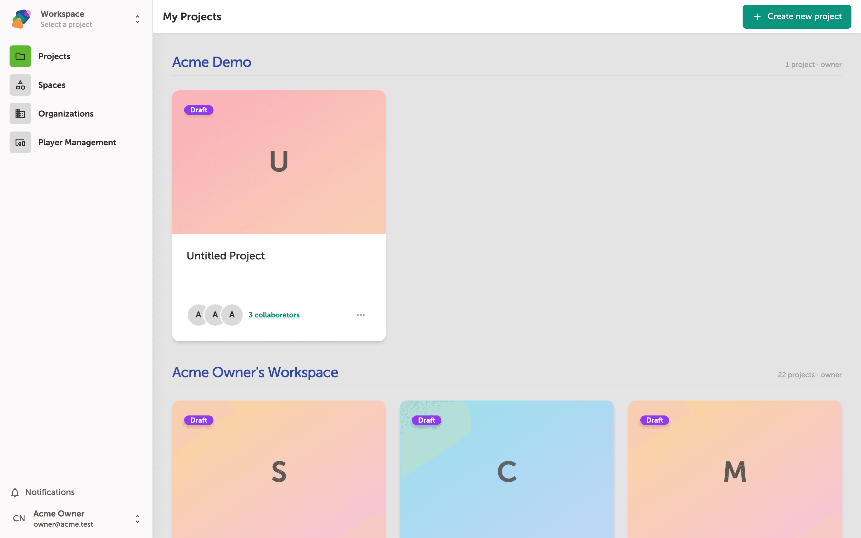
The My Projects dashboard is your home base in Zibit. From here you can open any existing project or start a fresh one. Each project card represents a separate interactive experience — for example, a museum kiosk, a gallery exhibit, or a digital sign.
To assign or change a style set, you have two options: click "Create new project" to start a new project and choose a style set during setup, or find an existing project and click its "Project actions" button (the menu icon on the project card) to open its settings. Don't worry — changing a style set later won't delete your content.
Choose a Starting Style Set
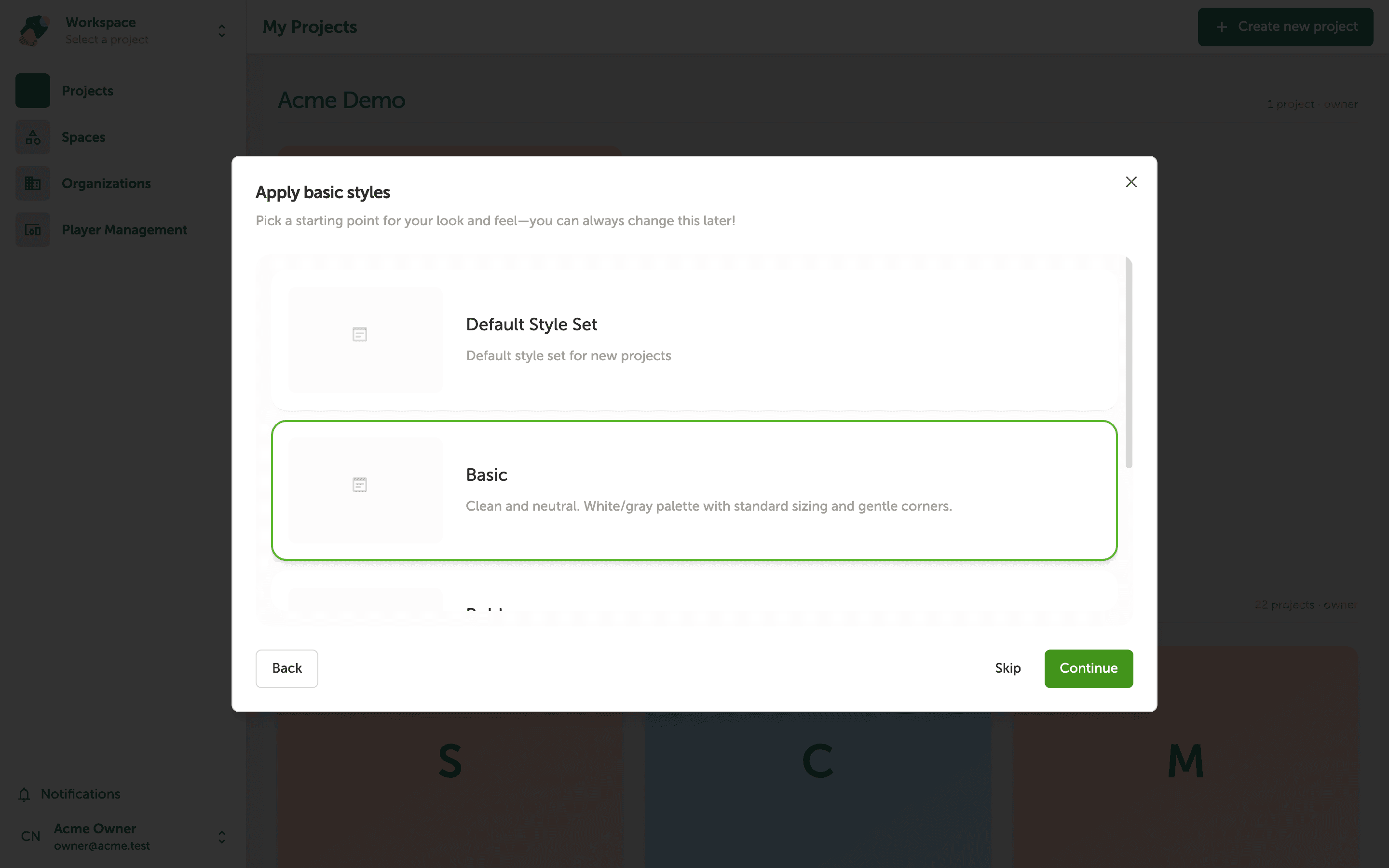
Zibit gives your project a head start by letting you pick a style template — a bundle of fonts, colors, and visual settings that sets the tone for your whole experience. Whether you're building a sleek museum kiosk or a vibrant educational activity, picking the right starting point saves you time.
Click any style option in the "Apply basic styles" dialog to select it — a green border appears around your current choice, so you always know which one is active. Don't worry about getting this perfect now; you can adjust your project's style set at any time after setup.
Customize Your Project's Style Set
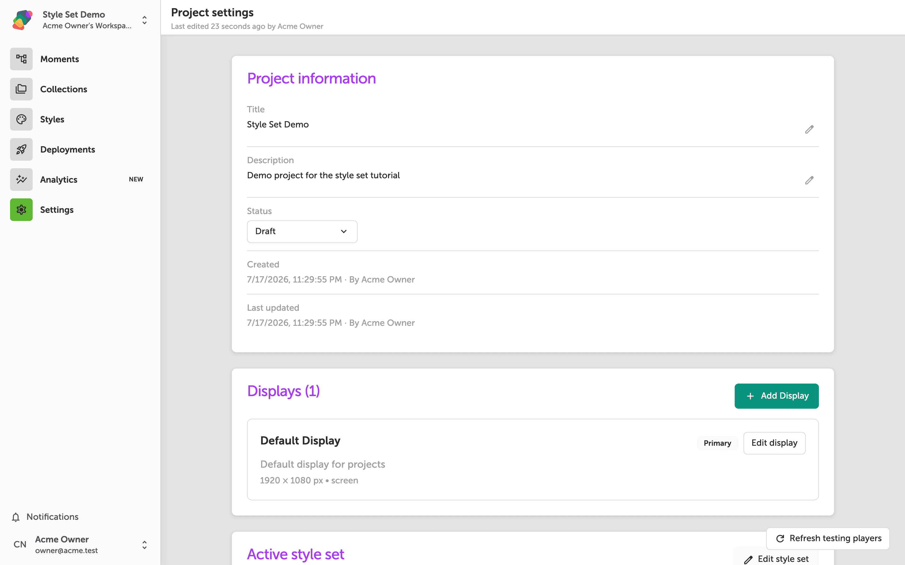
The Active Style Set section shows the name and description of the style set currently applied to your project. A style set bundles together your typography, colors, and component styles — so any changes you make here ripple through every moment in your project automatically.
To adjust fonts, brand colors, or default component appearances, click "Edit Style Set". Don't worry about getting everything perfect now — you can return to this section and update your style set at any time without affecting your project's structure or content.
Exploring the Style Editor
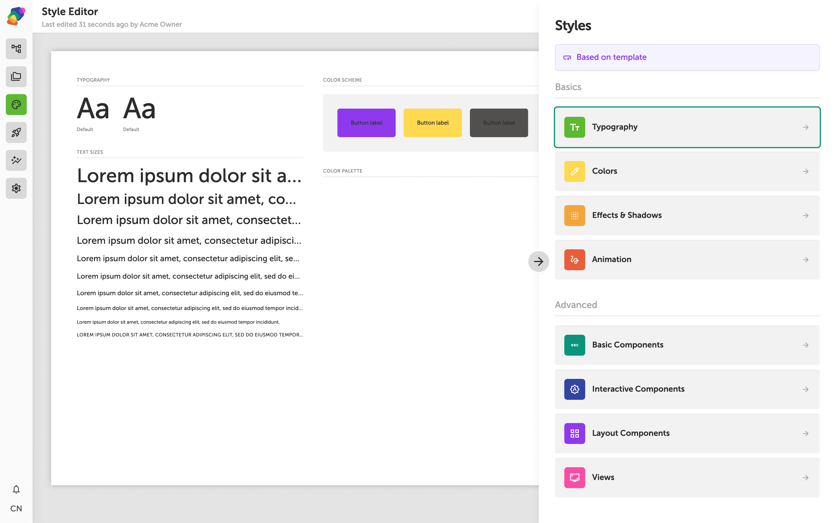
The Style Editor is where you define the look and feel of your entire project in one place. On the left, a live preview shows how your changes appear in real time — you'll see sample text, buttons, images, and other components update as you work. On the right, the Styles panel gives you a full overview of your style set, including palette swatches and token counts.
Use the section tabs — Typography, Colors, Shadows & Effects, Animations & Transitions, and the component groups (Basic, Interactive, Layout, Views) — to drill into specific parts of your design. Any changes you make here apply across every moment in your project, so a single update to your headline font or primary color ripples through everything automatically. Don't worry — you can adjust these settings at any time.
You now have everything you need to choose, apply, and refine the visual identity of your Zibit project. Style sets are designed to be flexible, so don't hesitate to experiment as your exhibit takes shape. Here are some good next steps to keep the momentum going:
- Add your first moment — Start building out your project's content by creating a moment and adding components like text, images, or video.
- Set up a display — Define the target screen resolution for your experience so every view is sized correctly for your hardware.
- Explore other style sets — Browse the full library of style sets to find one that better matches your institution's brand or exhibit theme.
- Customize your typography — Open the Style Editor and fine-tune font choices, sizes, and weights to align with your organization's visual guidelines.
- Save a custom style set — Once you're happy with your adjustments, save your changes as a named style set so you can reuse it across future projects.