
Configuring Animations and Transitions
Motion design plays a powerful role in guiding a visitor's attention—whether you're building a touchscreen kiosk for a natural history exhibit, an interactive timeline for a gallery, or a digital wayfinding display. Zibit's animation and transition tools let you control exactly how components appear on screen and how your project flows between moments, so every interaction feels intentional and polished. In this tutorial, you'll use the Style Editor to configure entry animations and transition effects as part of a style set, giving your entire project a consistent sense of movement without having to adjust each component individually.
Exploring the Style Editor
The Style Editor is where you define the visual identity of your project—all in one place. You'll find panels for Typography, Colors & Scheme, Shadows & Effects, Animations & Transitions, and styles for every component type, from basic text and images to interactive timelines and buttons.
The live preview on the right updates as you make changes, so you can see exactly how your style set will look across your project's moments. Use the panel tabs—Basic, Interactive, Layout, and Views—to jump to component-specific styles. Nothing here is permanent until you save, so feel free to explore.
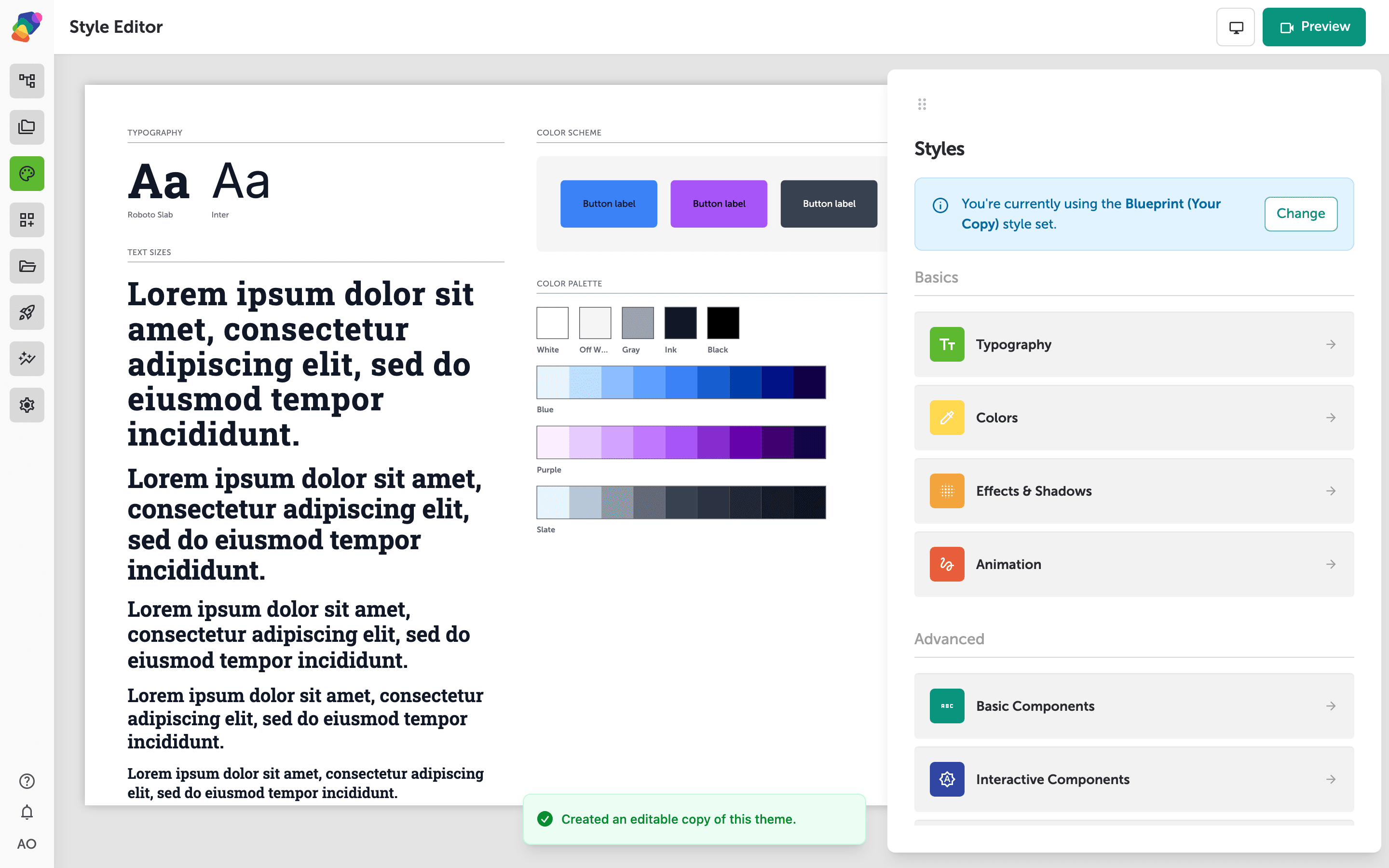
Setting Animations & Transitions
The Animations & Transitions section is where you control how your project moves and flows. At the top, you'll find transition presets—these govern how one moment shifts to the next as visitors navigate through your experience. Below that, entry animation controls let you define how individual components appear when a moment loads, such as fading in, sliding up, or scaling into view.
Choose presets that match the mood of your exhibit—subtle fades work well for contemplative gallery experiences, while energetic slides can suit interactive kiosks for younger audiences. Don't worry about getting it perfect now; you can revisit and adjust these settings at any time from the Style Editor.
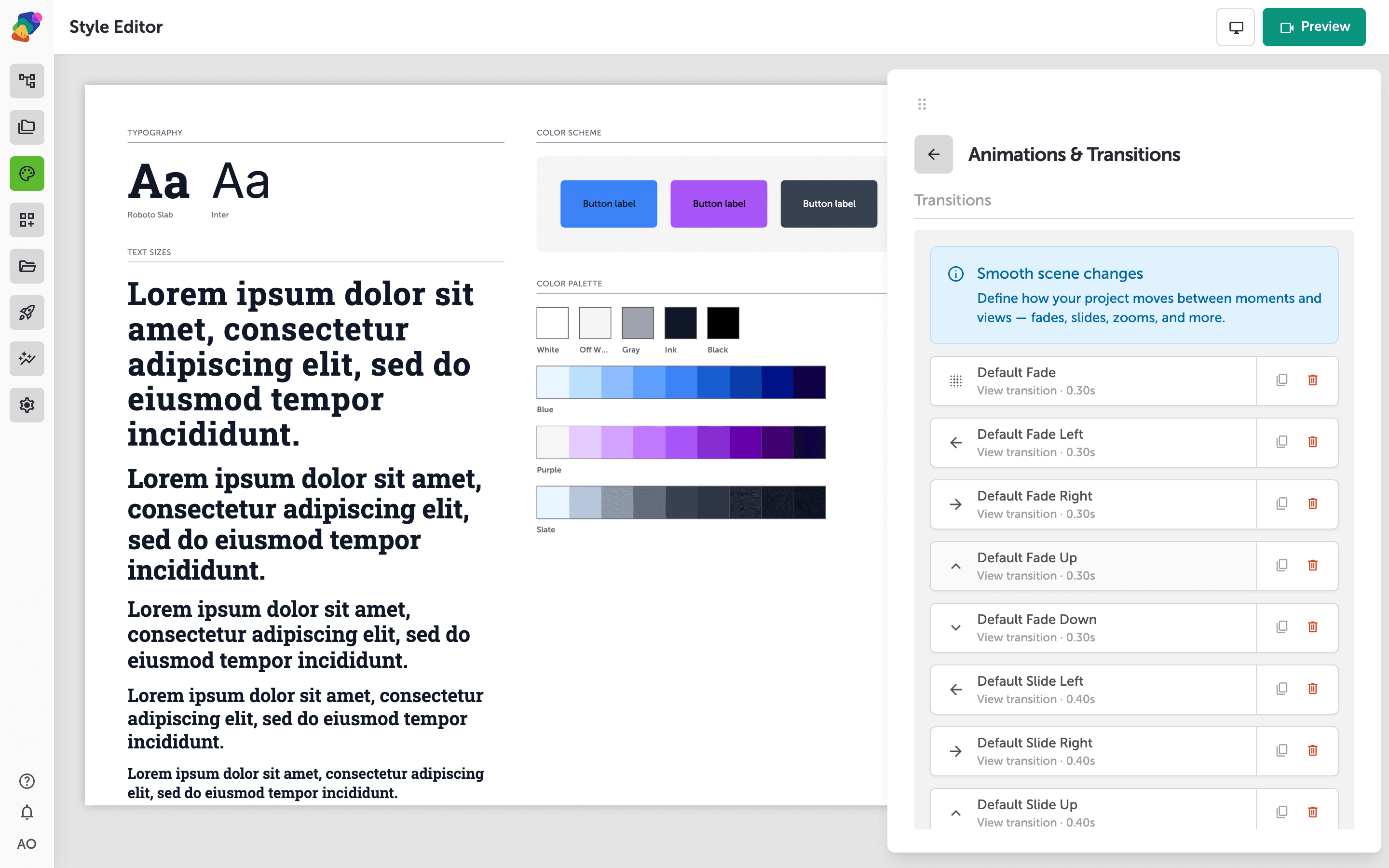
Setting Up Animations & Transitions
The Animations & Transitions section of your style set controls how components and moments move on screen. Each row represents a transition type—click any row to expand it and adjust the animation type, easing curve, and duration to match the energy of your exhibit.
For example, a children's discovery exhibit might use bouncy, fast transitions, while a fine art gallery might call for slow, smooth fades. These settings apply globally across your project, but you can always come back and fine-tune them as your experience takes shape.
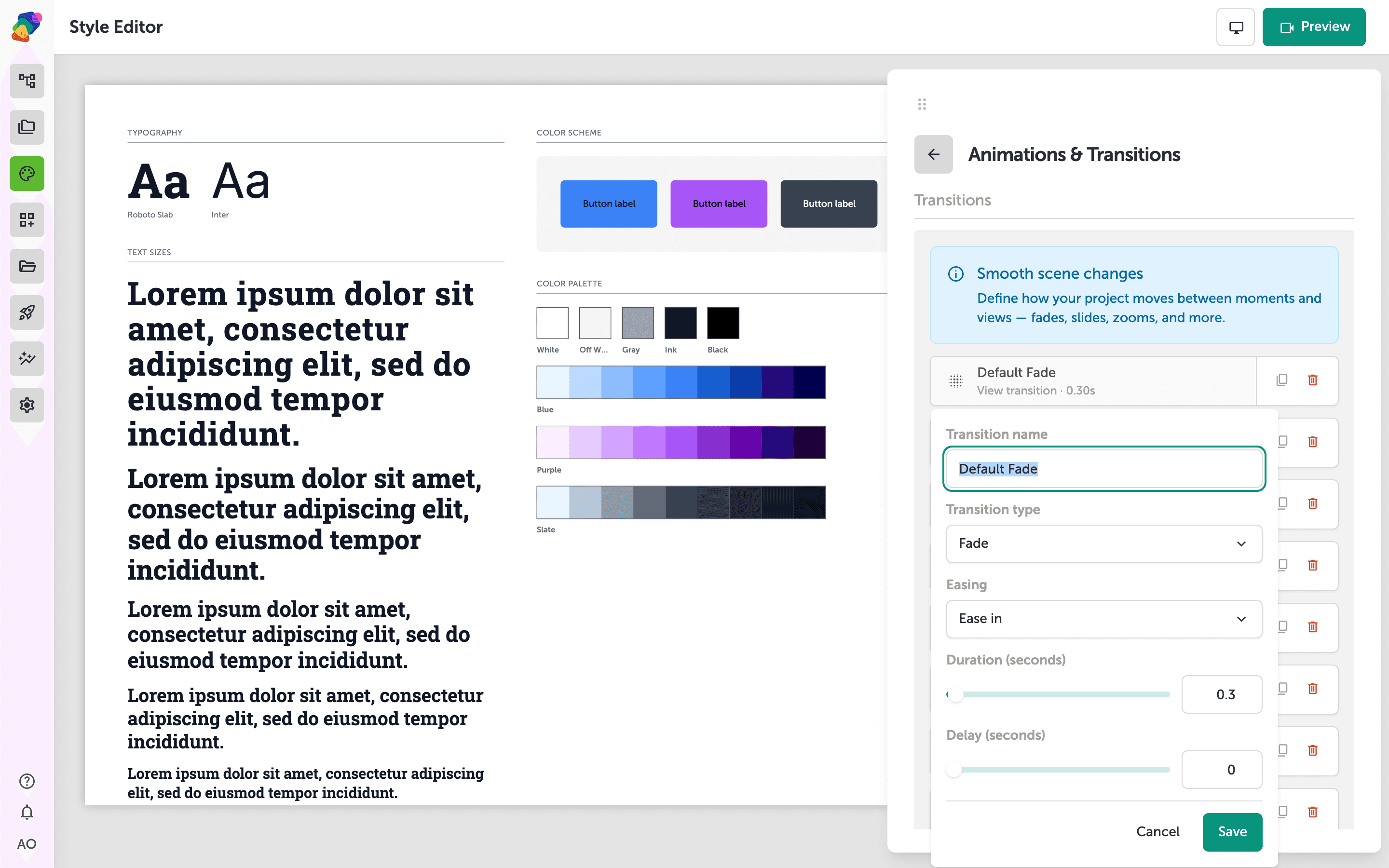
Fine-Tuning Your Transition Settings
With the transition editor open, you can control exactly how one moment moves to the next. Choose an animation type (such as fade, slide, or scale), pick an easing curve to shape the feel of the motion—smooth and gradual, or quick and snappy—and drag the duration slider to set how many seconds the transition takes. Together, these three settings define the personality of your flow.
For a museum kiosk, a gentle fade with a slow ease-in can feel calm and welcoming, while a fast slide might suit a high-energy interactive exhibit. Don't worry about getting it perfect right away—you can reopen the transition editor and adjust any of these values whenever you like.
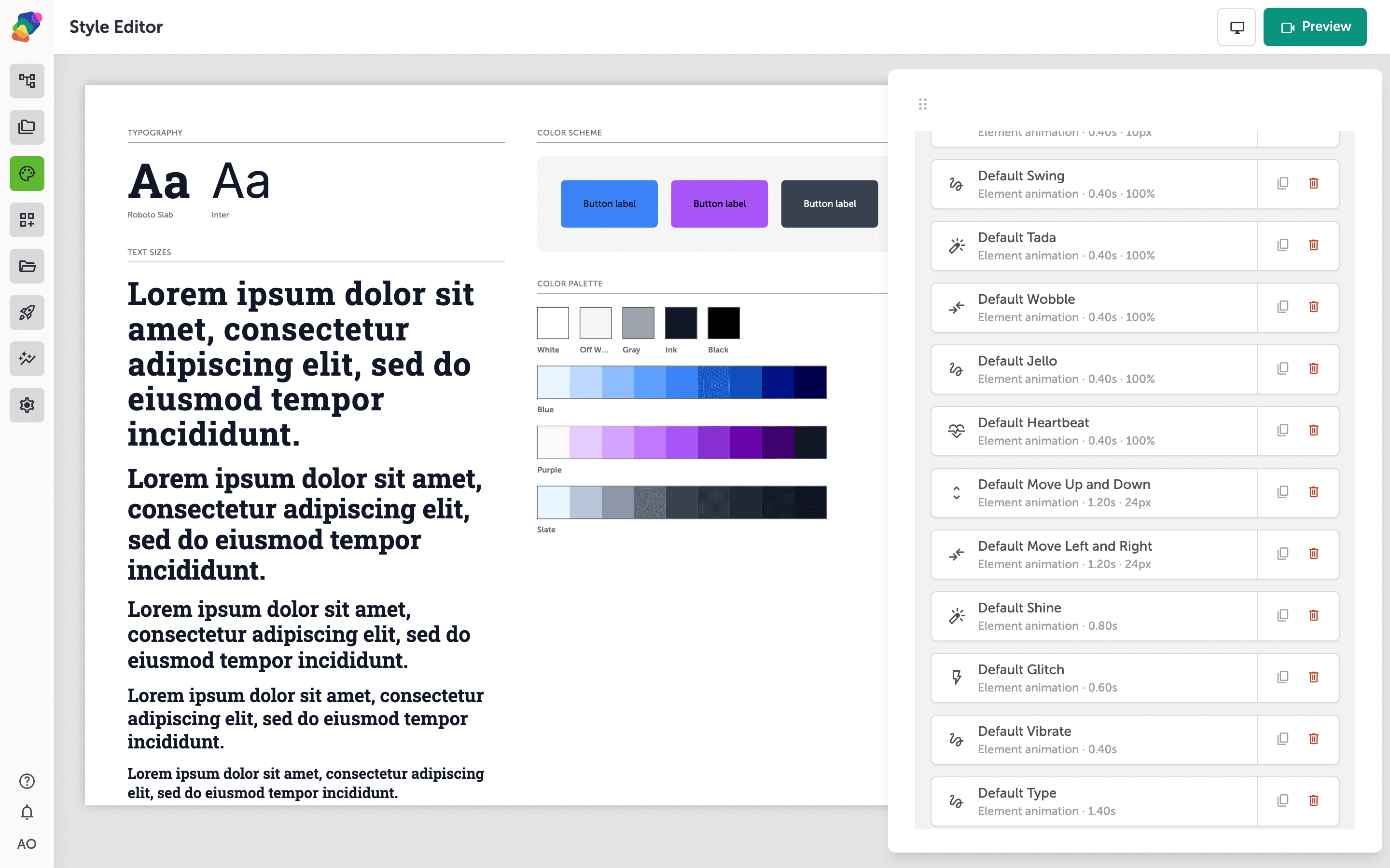
Adding Entry Animations to Your Style Set
In the Animations & Transitions section of the Style Editor, you can define how components appear when a moment loads. Choose an animation type—like Fade In or Slide Up—from the dropdown, then set a duration in milliseconds to control how fast or slow the effect plays. When you're happy with the settings, click Add animation to apply it to your style set.
Entry animations are a great way to give museum exhibits a polished, cinematic feel—a slow fade can draw visitors in gently, while a slide-up creates energy and momentum. You can always come back and adjust the type or duration later without affecting the rest of your project.
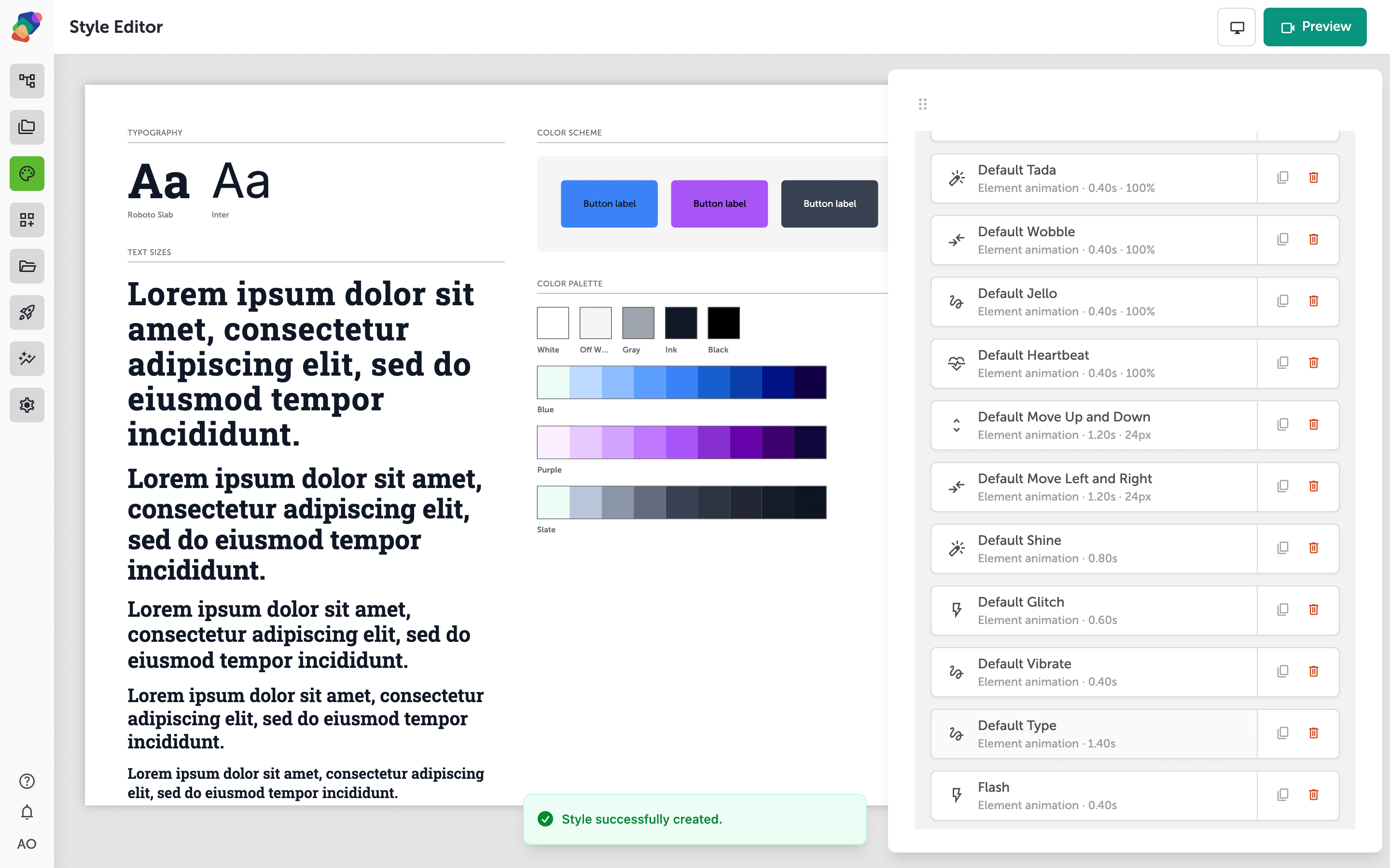
You now have a fully configured set of animations and transitions ready to bring your project to life. From here, there's plenty more you can explore to make your experience feel even more refined:
- Animate text letter by letter—use the Type presets for a heading that reveals one character at a time.
- Add hover motion—play a sweep, ripple, or underline when a visitor hovers or focuses a button.
- Apply your style set to a new project—Reuse the animations and transitions you've configured by linking this style set to other projects, keeping your motion design consistent across multiple displays or exhibits.
- Test transitions in Preview mode—Open your project in Preview to see how your moments flow together in real time, and fine-tune timing or easing if something feels too fast or abrupt.
- Combine entry animations with component triggers—Pair entry animations with button interactions and flows to create layered, responsive moments that react to visitor input.
- Adjust animations per display—If your project targets multiple screen sizes or orientations, revisit your style set to make sure animations feel right on each display's view.
- Explore other style set settings—The Style Editor also controls typography, colors, and shadows—rounding out your style set means every visual detail works together cohesively.