
Customizing Typography Styles
This tutorial walks you through customizing typography in your Zibit project using the Style Editor. By the end, you'll have a style set with defined font families, sizes, and scales that apply consistently across every moment in your project—so a museum kiosk running twenty moments all follows the same visual language without manual adjustments to individual components.
The Style Editor overview
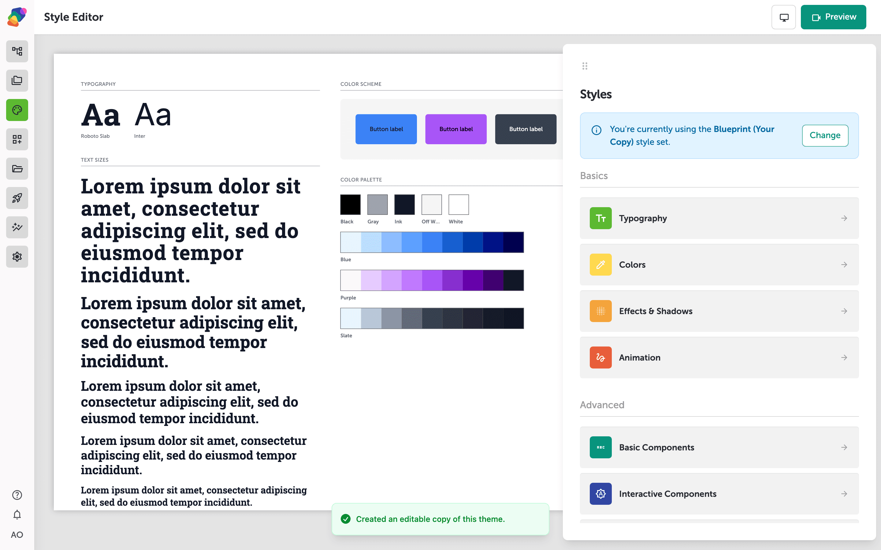
The Style Editor gives you a central place to control how your project looks across every moment. The live preview on the left shows your current typography scale, color scheme, and color palette so you can see changes in context as you work.
The Styles panel on the right is organized into two groups: Basics (Typography, Colors, Effects & Shadows, Animation) and Advanced (Basic Components, Interactive Components, Layout Components). A banner at the top tells you which theme is currently active. If that theme is from the library, click Copy to edit so Typography and the other panels become editable. Click Change if you want to switch to a different theme before diving into individual settings.
Open the Typography panel
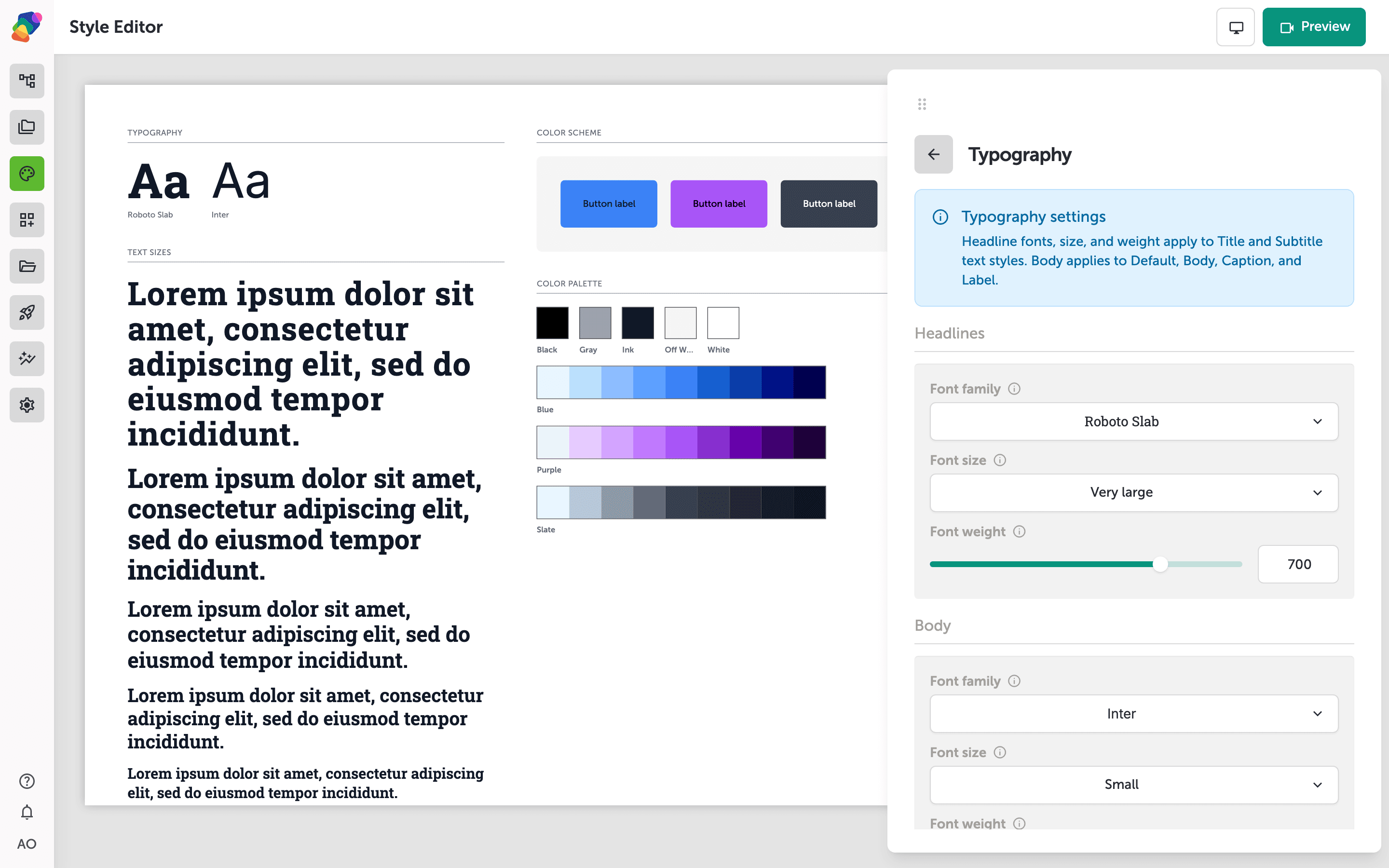
Click Typography in the Styles panel to open typography settings. The panel is split into Headlines and Body: each has a font family, size, and weight. Headline settings apply to Title and Subtitle text styles; body settings apply to Default, Body, Caption, and Label.
Don't worry about getting every value perfect—you can change fonts and sizes later and every component that inherits those styles will update together.
Add extra fonts for individual components
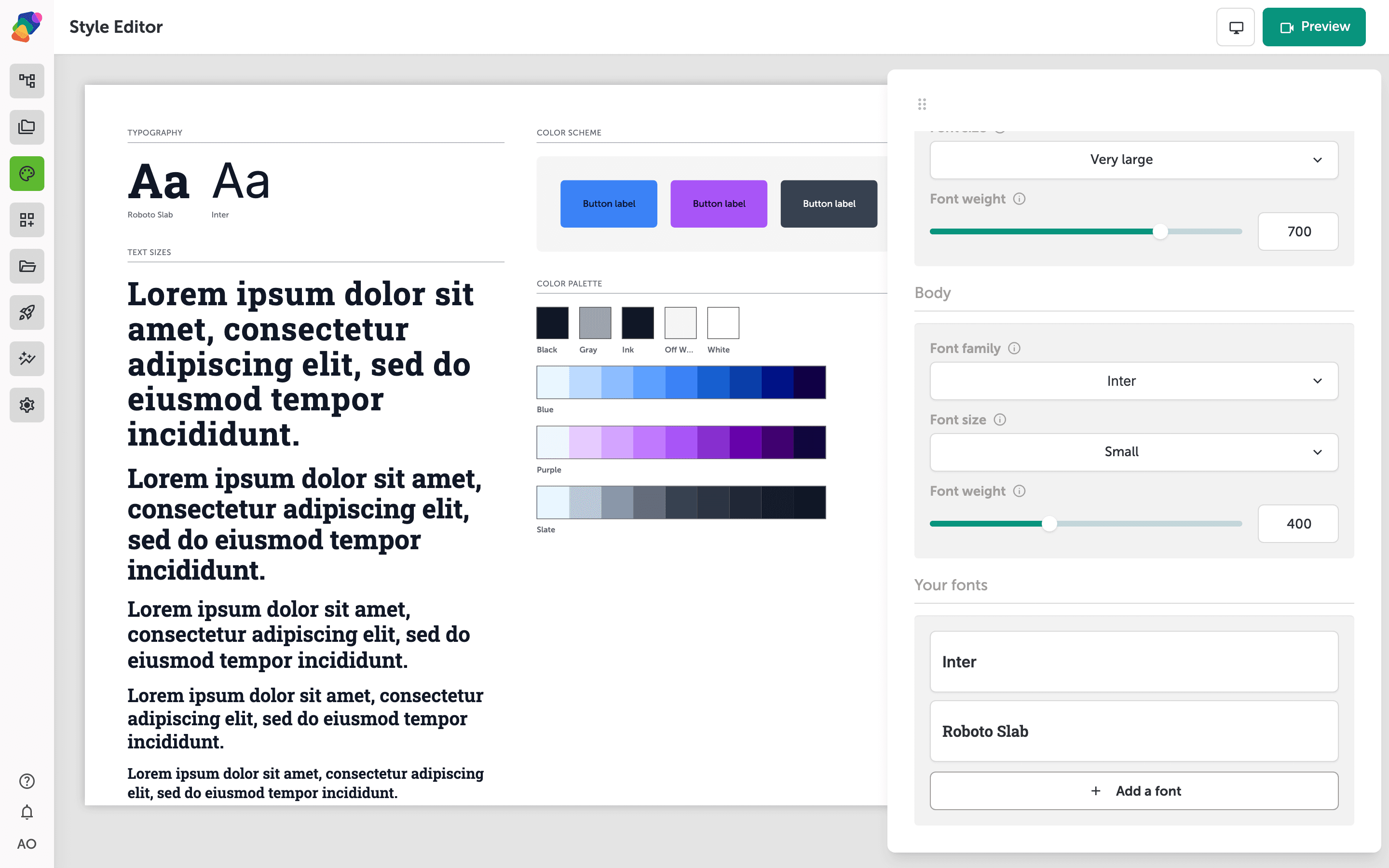
Headline and body cover most text. Scroll to Your fonts when you need another typeface on a specific component. Click Add a font to pick from the library or upload a file. Those extra fonts stay in this theme and are available wherever you choose a font family on a component.
With your typography configured in the style set, any component that inherits those styles will update automatically as you refine your design. From here, you can go further with the rest of your visual system.
- Customize colors and shadows: Use the Style Editor to define your project's full color palette and shadow tokens alongside your type settings.
- Select a new theme: Browse the Theme Library and apply a different theme when you want a new visual starting point. See Selecting a New Theme.
- Set display-specific type scales: Adjust font sizes per display so your typography reads well on both a large wall screen and a handheld tablet.
- Link a collection to dynamic text components: Connect a collection to text components so labels and descriptions pull from structured data rather than hardcoded strings.
- Audit typography across moments: Step through each moment in your flow to verify that inherited styles are rendering as expected before publishing.