
Editing Component-Specific Styles
This tutorial walks you through editing component-specific styles inside Zibit's Style Editor. By the end, you'll know how to navigate the component style categories, configure visual properties for individual component types, and set up interactive states like hover—so every element in your project looks and behaves exactly as intended. For example, a museum kiosk can use distinct button and text styles to match an institution's brand without touching each moment individually.
The Style Editor home and its navigation panel
The Style Editor is your central hub for controlling how your project looks across every component. The preview canvas on the left shows the current typography, color scheme, and color palette at a glance, while the Styles panel on the right lists every category you can edit.
Under Basics you'll find Typography, Colors, Effects & Shadows, and Animation. Scroll down in the Styles panel to reach the Advanced section, which contains Basic Components, Interactive Components, and Layout Components—the categories covered in this tutorial. Click any row to open that category's settings.
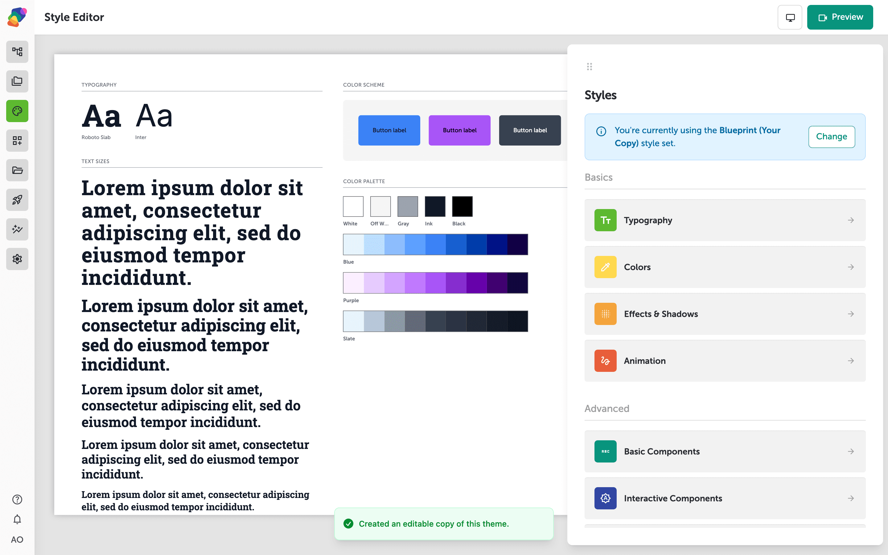
Navigating the component style categories in the Styles panel
The right-hand Styles panel groups everything you can customize into two tiers. Under Basics, you'll find Typography, Colors, Effects & Shadows, and Animation—settings that apply broadly across your project. Scroll past those and the Advanced section lists three component-specific categories: Basic Components, Interactive Components, and Layout Components.
Each category is a bucket that holds styles for a particular family of components. Click any row to step into it and see the individual component types it contains—for example, Basic Components covers elements like text, image, and video, while Interactive Components covers buttons and similar controls.
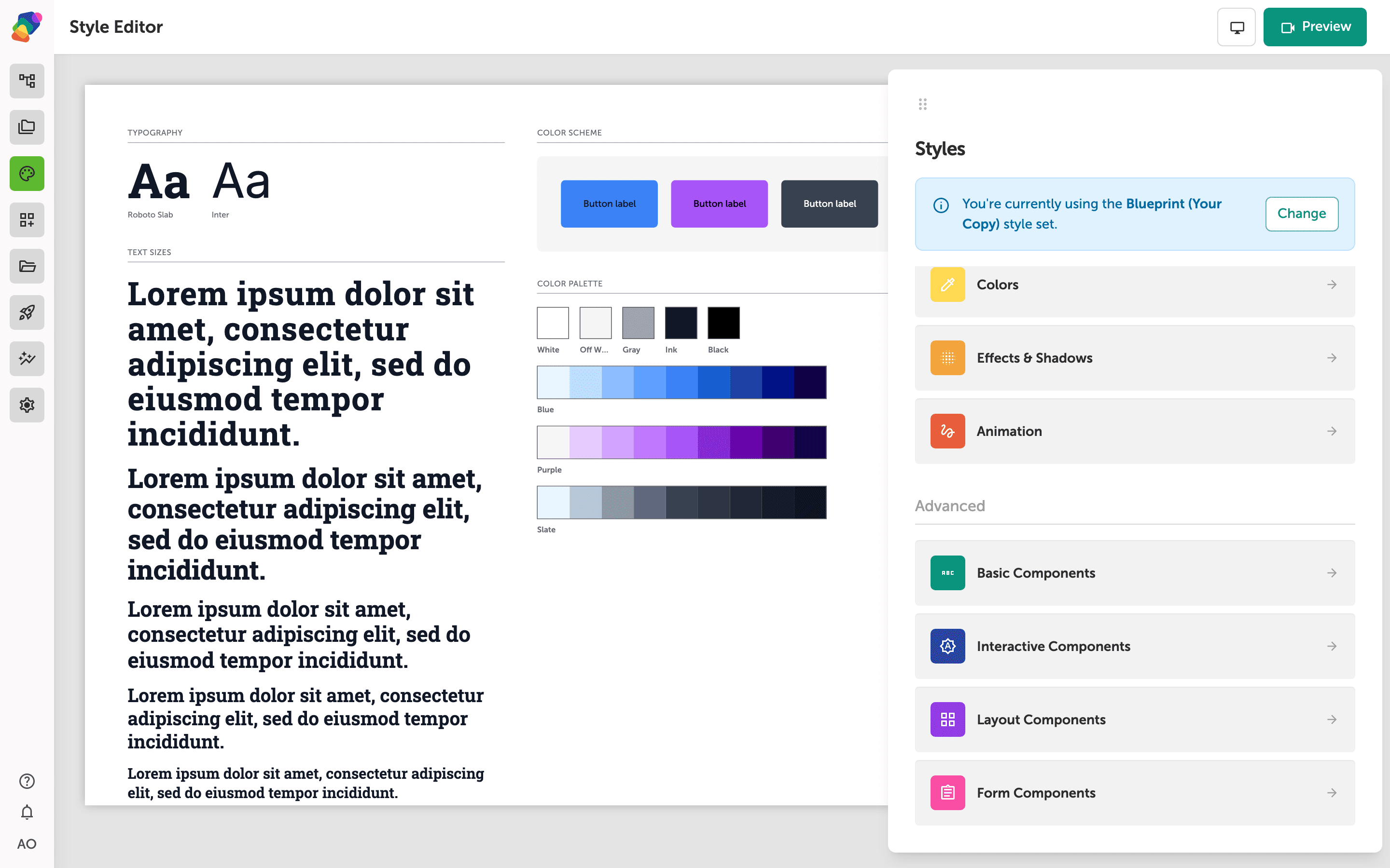
The Basic Components list and its component types
The right panel now shows the Basic Components category, listing six component types: Text, Image, Video, Audio, Separator, and Icon. Each row represents a component type that can have its own style rules within the current style set.
Click any row to open the style settings for that component type. The arrow on each row indicates there are individual styles to review or edit inside.
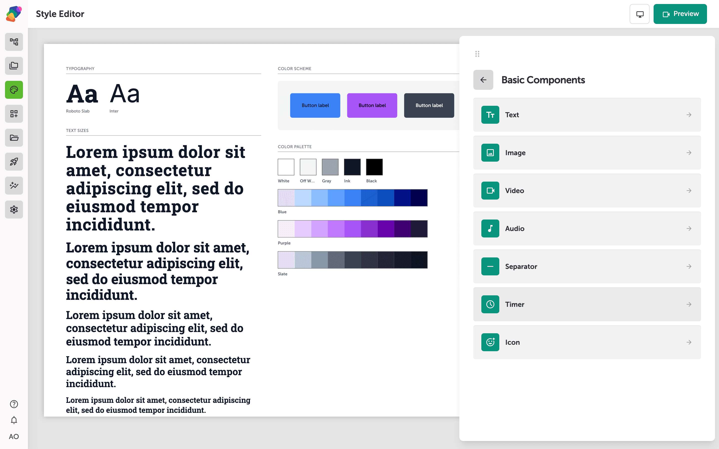
Reviewing the Style Editor's live preview and component panel
The main canvas shows a live preview of your current style set—TYPOGRAPHY displays your chosen typefaces (here, Roboto Slab and Roboto), TEXT SIZES shows every text scale in sequence, and COLOR SCHEME and COLOR PALETTE reflect your active colors. This gives you an at-a-glance check of how the style set looks before you dive into editing individual components.
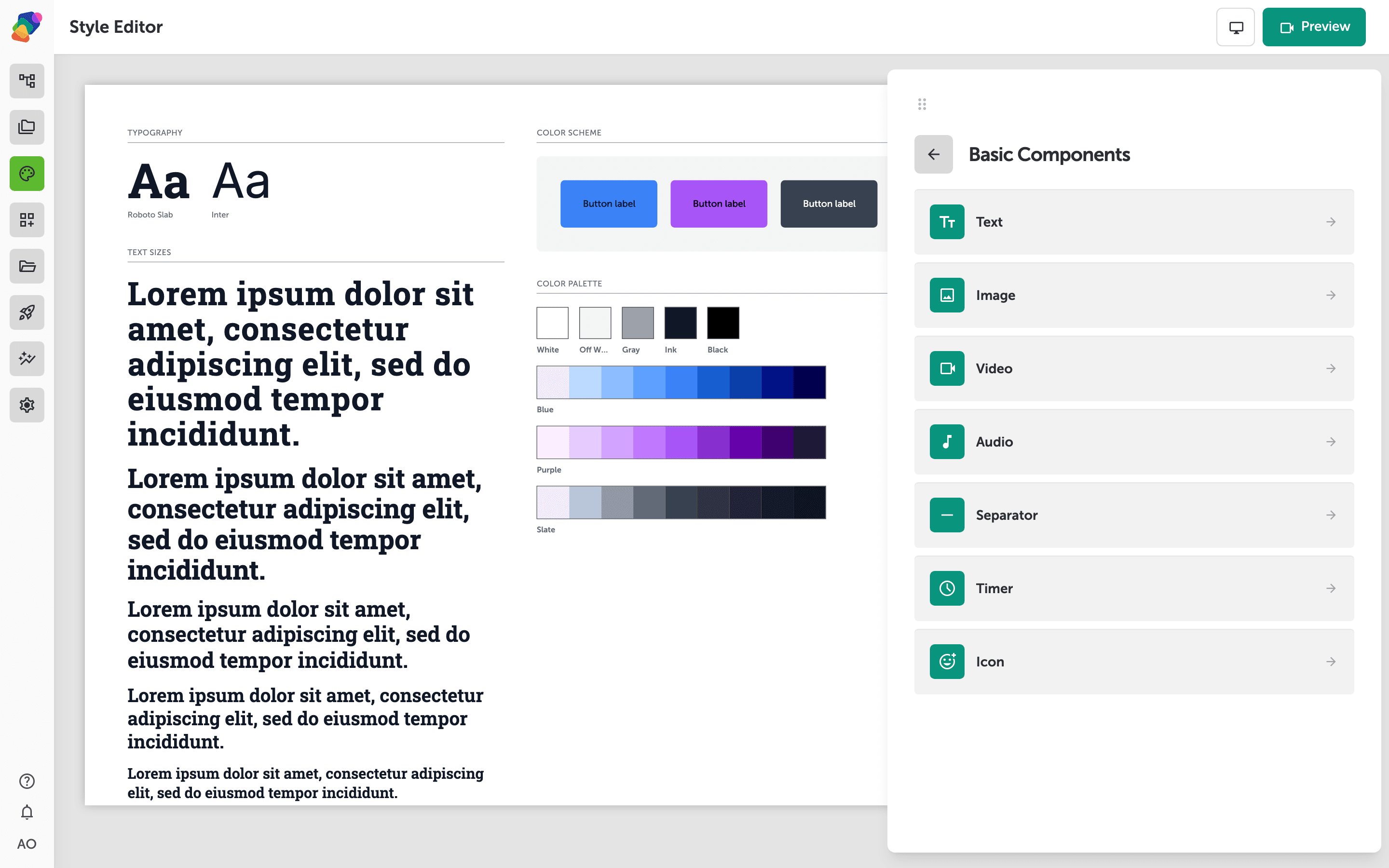
The panel on the right lists Basic Components—Text, Image, Video, Audio, Separator, and Icon—each with an arrow indicating you can open that component's style settings. Click any row to edit the styles specific to that component type.
Setting visual properties for a text style
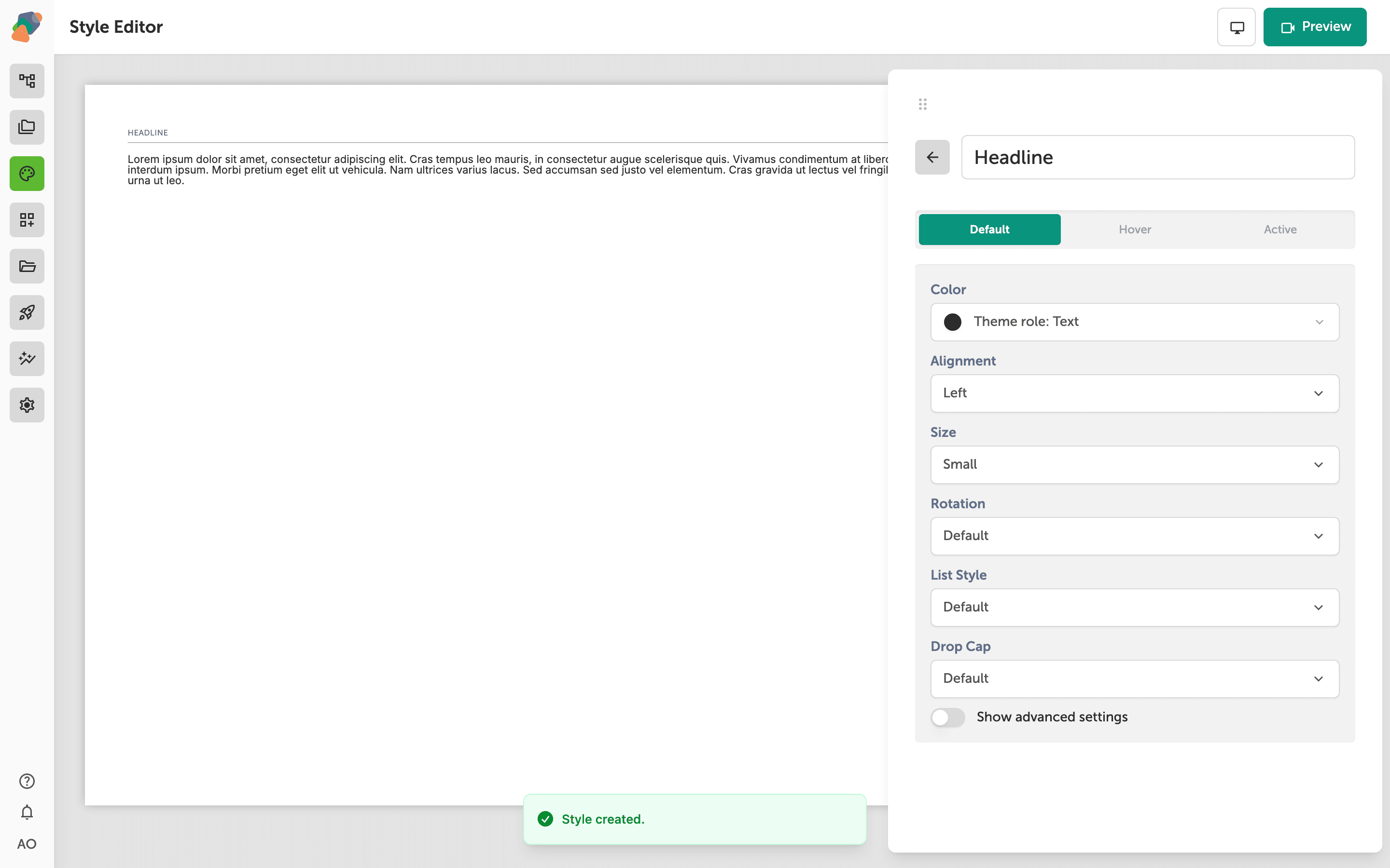
With your new text style open, the right panel shows all the visual properties you can configure for its Default state: Color, Size, Spacing, Corners, Shadow, and Effects. Each property has a dropdown—open any one to choose a value from your style set's defined options, or leave it as Default to inherit the project-wide setting.
The Default, Hover, and Active tabs at the top let you define how the style looks in each interaction state. The canvas preview on the left updates as you make changes, so you can judge the result in context before moving on. Toggle Show advanced settings at the bottom of the panel to reveal additional controls if you need finer control.
Configuring the Hover state for a text style
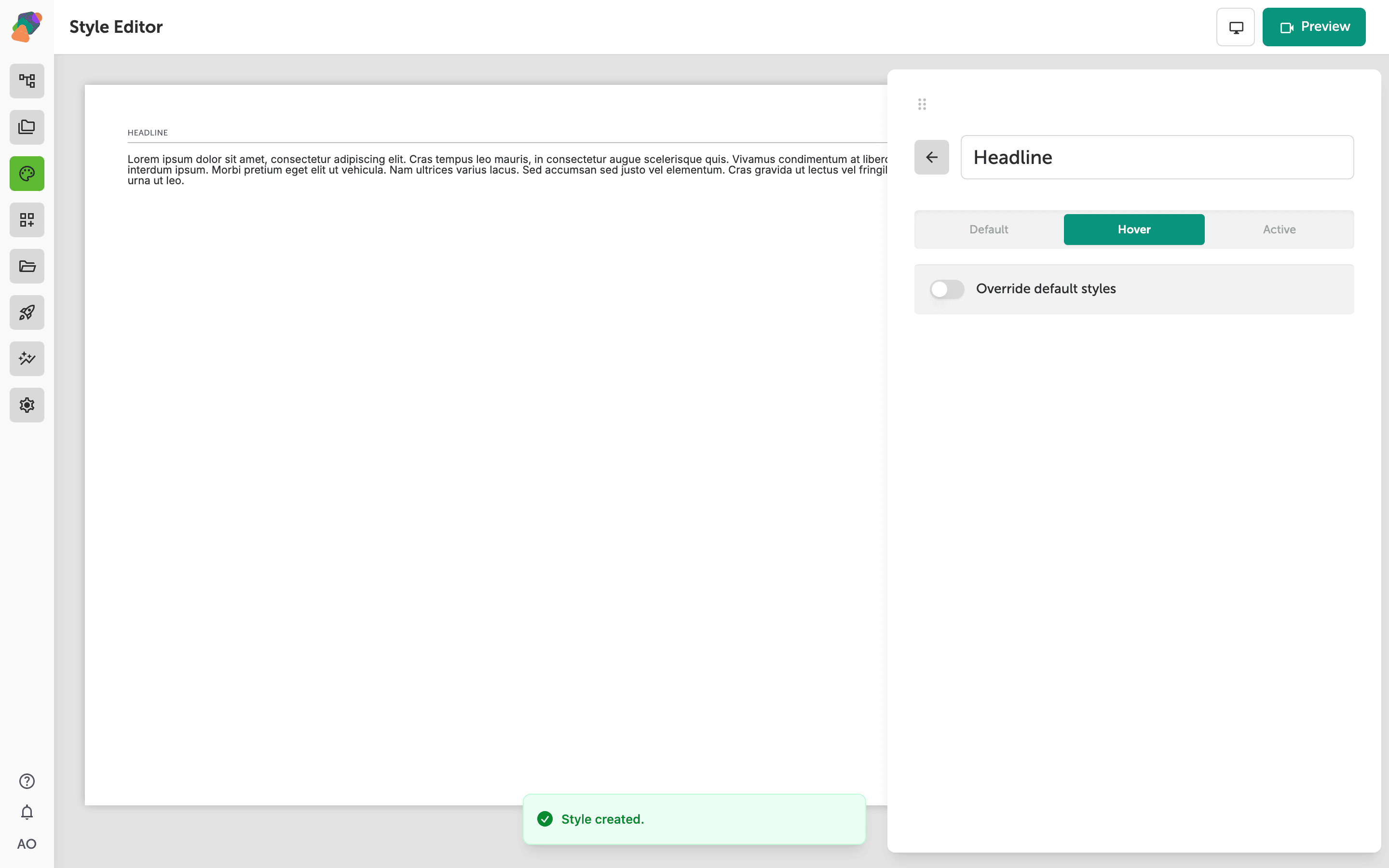
The right panel is now showing the Hover tab, which controls how your text style appears when a visitor moves their pointer over the component. The Hover tab is selected between Default and Active—each tab holds independent style settings so you can give visitors clear visual feedback as they interact with your experience.
To apply hover-specific styling, turn on the Override default styles toggle. When the toggle is off, the component simply inherits its Default tab settings during hover. The confirmation banner at the bottom confirms your style was saved successfully.
You now have the tools to fine-tune how each component type looks and responds across your entire project through a single style set. To keep building on this foundation, explore these related skills:
- Creating and switching style sets—learn how to maintain multiple style sets for different displays or themes within the same project.
- Configuring additional interactive states—go beyond Hover to set up Focus, Active, and Disabled states for interactive components.
- Applying styles to a specific view—understand how component styles interact with display-level overrides when you target a particular screen resolution.
- Linking a collection to styled components—connect a reusable data collection to component types so dynamic content inherits your custom styles automatically.
- Sharing a style set across projects—find out how to reuse a polished style set in other projects inside your space.