
Editing Text Components
Text is one of the most powerful tools in any exhibit or digital experience. Whether you're writing a wayfinding label for a museum gallery, adding a headline to a touch-screen kiosk, or crafting instructional copy for an educational display, the Text component gives you full control over how words appear on screen. In this tutorial, you'll add a text component to a view and use the inline editor to format your content—no design experience required.
Adding Components to Your View
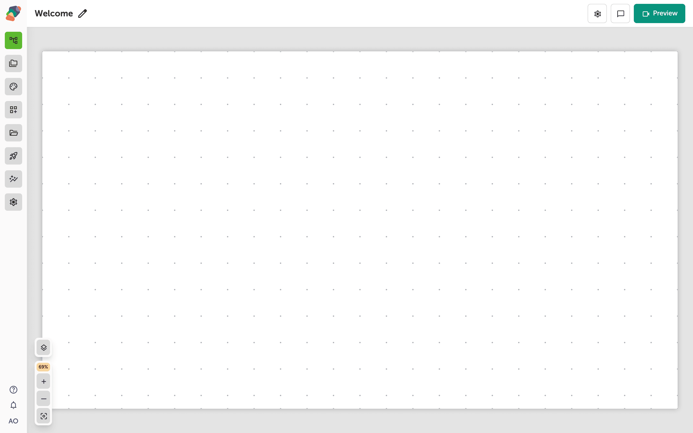
You're now in the View Editor—this is where your moment comes to life. The empty grid you see is your canvas, ready for you to start placing components like text, images, videos, and buttons.
To add your first component, click "Add component" in the toolbar. You can arrange and resize components freely on the grid, and nothing is permanent—you can always move, replace, or remove anything you add.
Add a Text Component to Your View
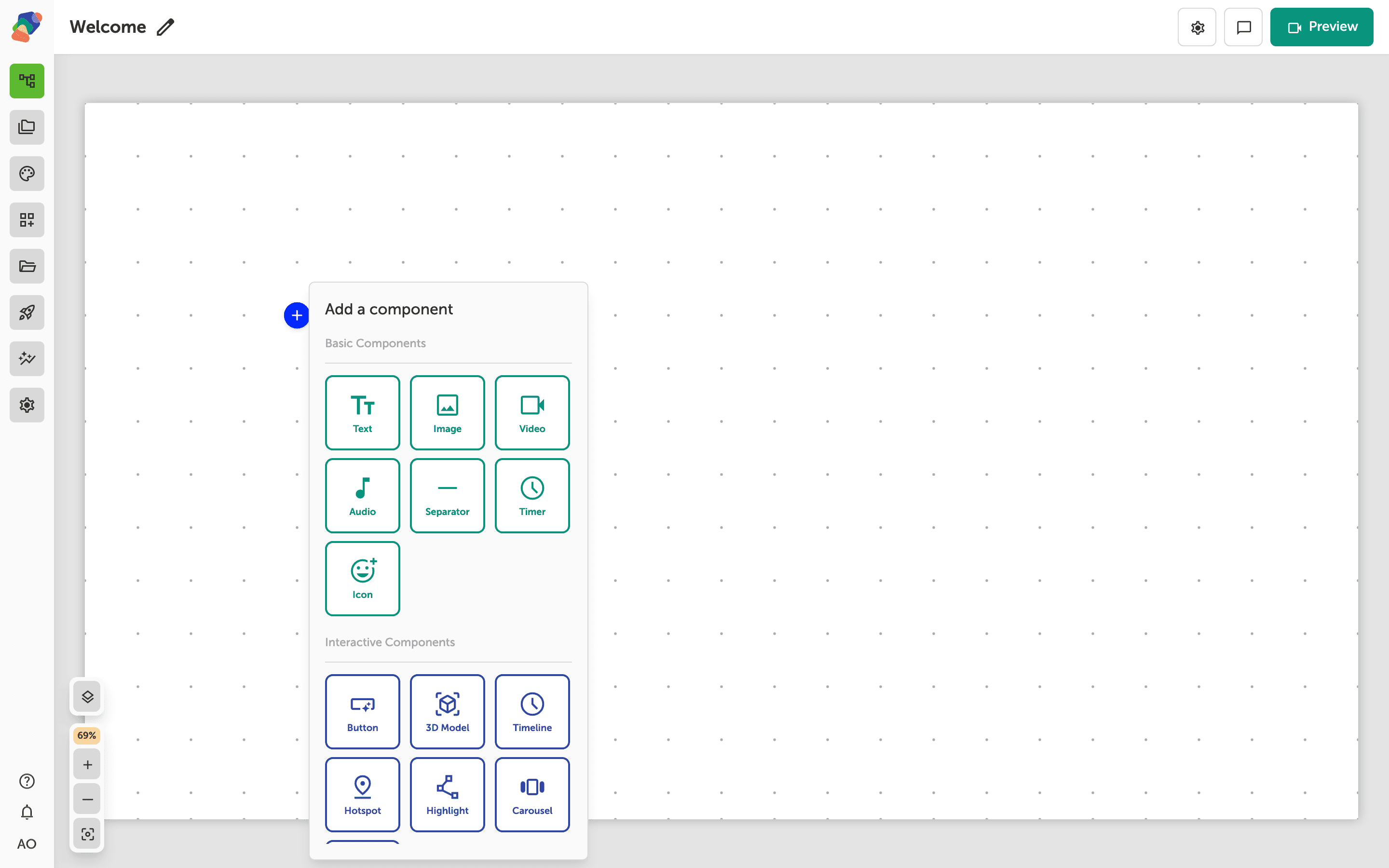
With the Add component popover open, you'll see a list of all the components you can place on the canvas. Click Text to add a text block to your view—great for labels, exhibit descriptions, or instructional copy.
Don't worry about getting the wording perfect right away. You can edit the text content, font, size, and styling at any time after placing it on the canvas.
Add a Text Component to Your View
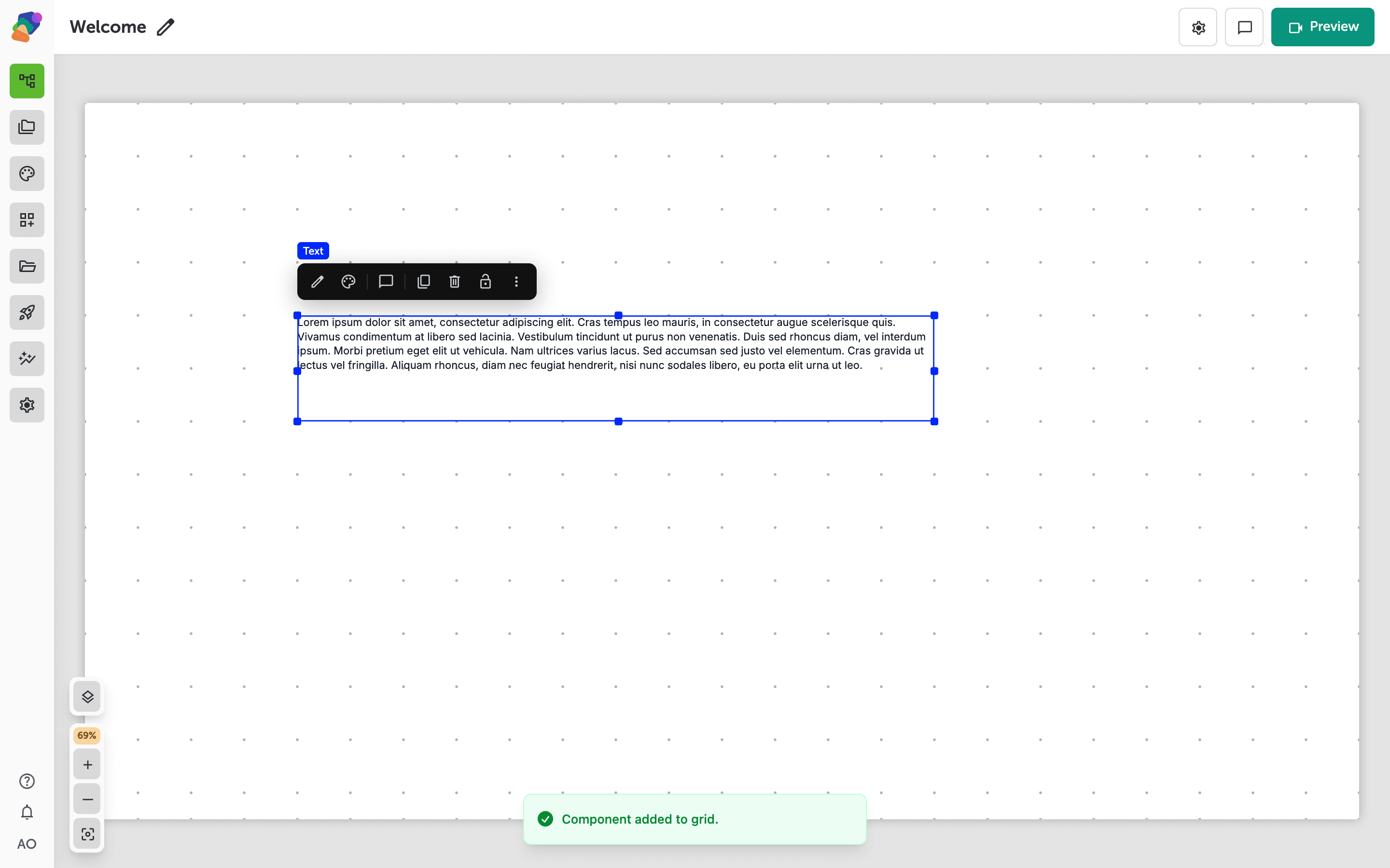
You've added a Text component to your view—you'll see it placed on the grid with default placeholder copy. This is where your words come to life on screen, whether that's a welcome message at a museum entrance, a label beside an artifact, or a heading for an interactive kiosk.
To update the placeholder text, select the component on the canvas (look for "Text on canvas" in the grid) and use the "Text content" panel to type in your own copy. Don't worry—you can edit, move, or remove this component at any time.
Edit Your Text Component's Content
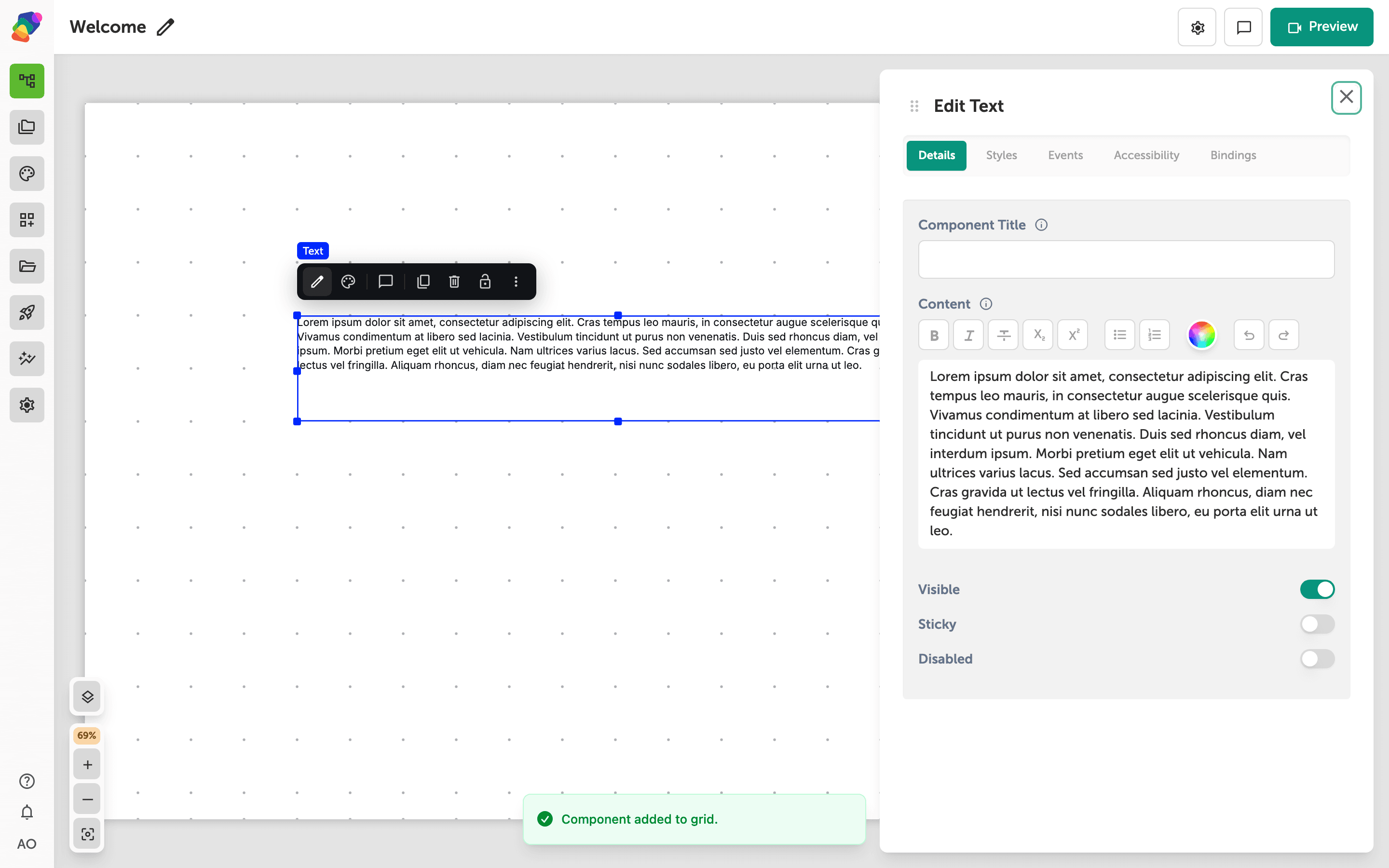
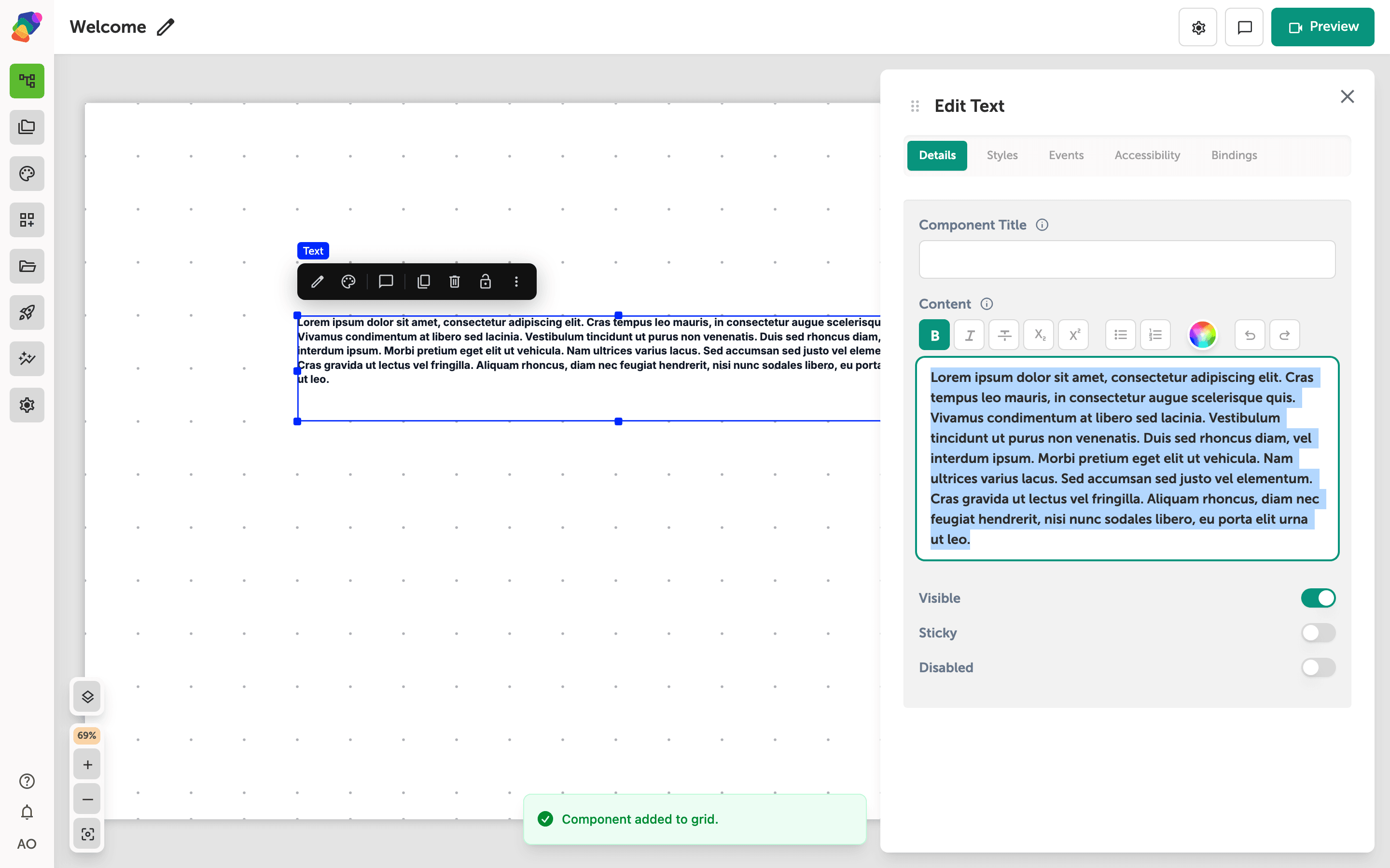
With your text component selected, the Edit panel opens on the right and lands on the Details tab. Here you can type or paste your content directly into the Content field—a rich text editor that supports bold, italic, bullet lists, and text color controls. This is a great place to add exhibit labels, wayfinding instructions, or descriptive copy for your museum display.
You can also update the Component Title to give this piece of text a recognizable name in your layers panel, and use the Tag field to set the HTML element type (like a heading or paragraph). The Visible and Disabled toggles let you control whether the component appears in your published experience—and don't worry, nothing here is permanent. You can edit the content again at any time.
Make Text Stand Out with Bold Formatting
With your text component selected, you can style its content directly using the rich text toolbar. To apply bold formatting, highlight the words you want to emphasize and click the Bold button in the toolbar—your changes appear on the canvas instantly.
This is a great way to draw visitors' attention to key information in your exhibit, like a title, a call to action, or an important fact. Don't worry if you change your mind—you can remove bold formatting just as easily by selecting the text again and clicking Bold to toggle it off.
You've placed and formatted your first text component—a foundational skill you'll use in almost every project you build in Zibit. From here, there's a lot more you can do to bring your content to life.
- Rotate text—turn a heading in 45-degree steps from the Typography styles.
- Explore other component types—Try adding image, video, or button components to the same view to build a richer layout.
- Apply a style set—Use a style set to keep your typography and colors consistent across every moment in your project.
- Link your text to a collection—Connect a text component to a collection so your content updates dynamically from a shared data source.
- Create a flow between moments—Add a button component and wire up a flow so visitors can navigate from one moment to the next.
- Preview on your display—Switch to preview mode to see exactly how your text looks on the target device resolution before publishing.