
Managing Your Color Palette
This tutorial walks you through everything you need to manage color in a Zibit project. By the end, you'll have a organized palette of named colors and gradients, and you'll know how to assign those colors to the semantic roles that drive consistent styling across every moment—useful any time you're setting up a branded experience, like a gallery kiosk with a specific institutional color system.
The Style Editor overview
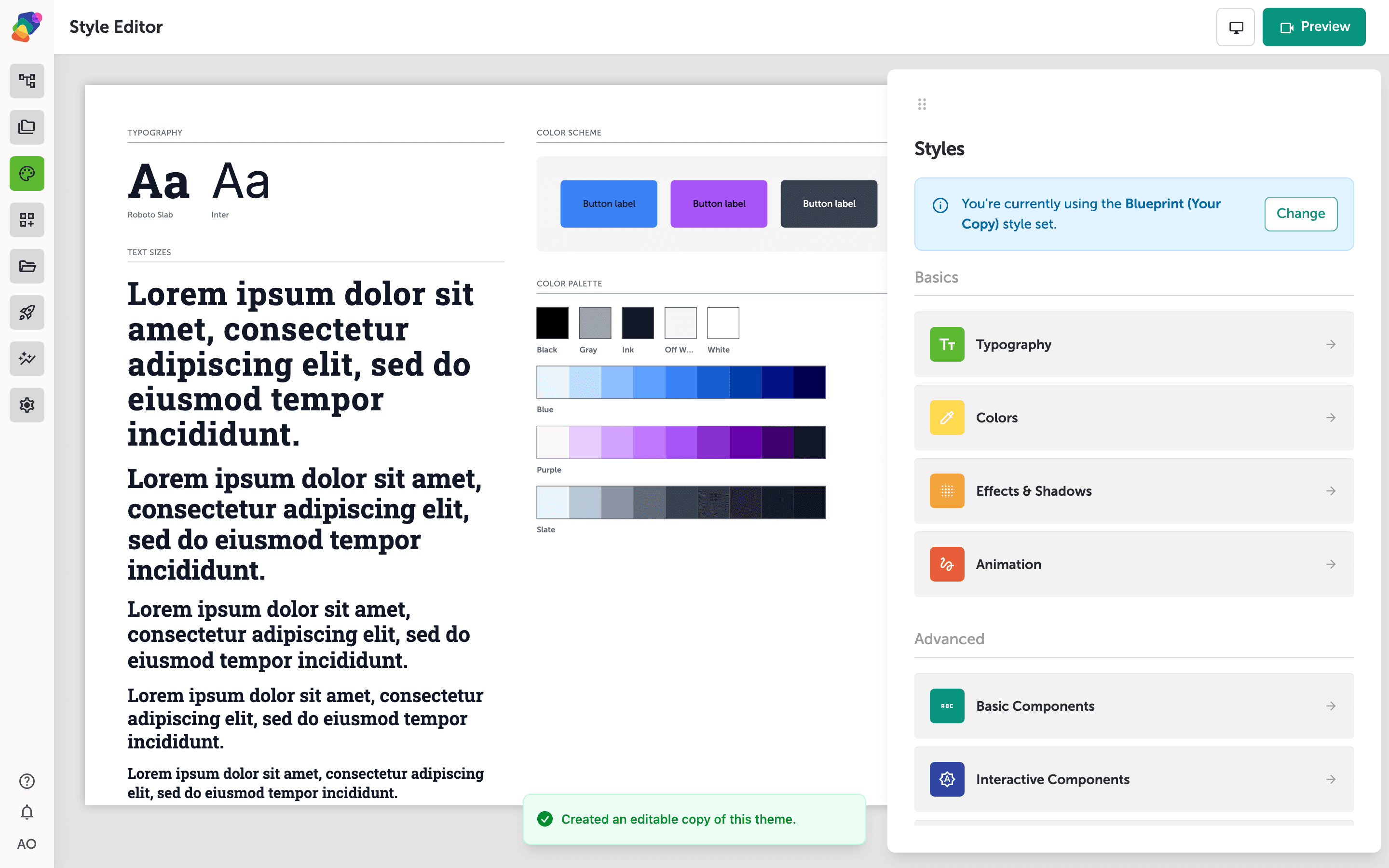
The Style Editor is where you control the visual identity of your project. The left side shows a live preview of your current typography, text sizes, color scheme, and color palette. Any changes you make are reflected here immediately.
The Styles panel on the right lists every category you can edit, grouped into Basics—Typography, Colors, Effects & Shadows, and Animation—and Advanced sections for component-level styles. A teal banner at the top shows which style set is active; select Change to switch to a different one. To manage your color palette, select Colors.
Colors & Scheme panel layout
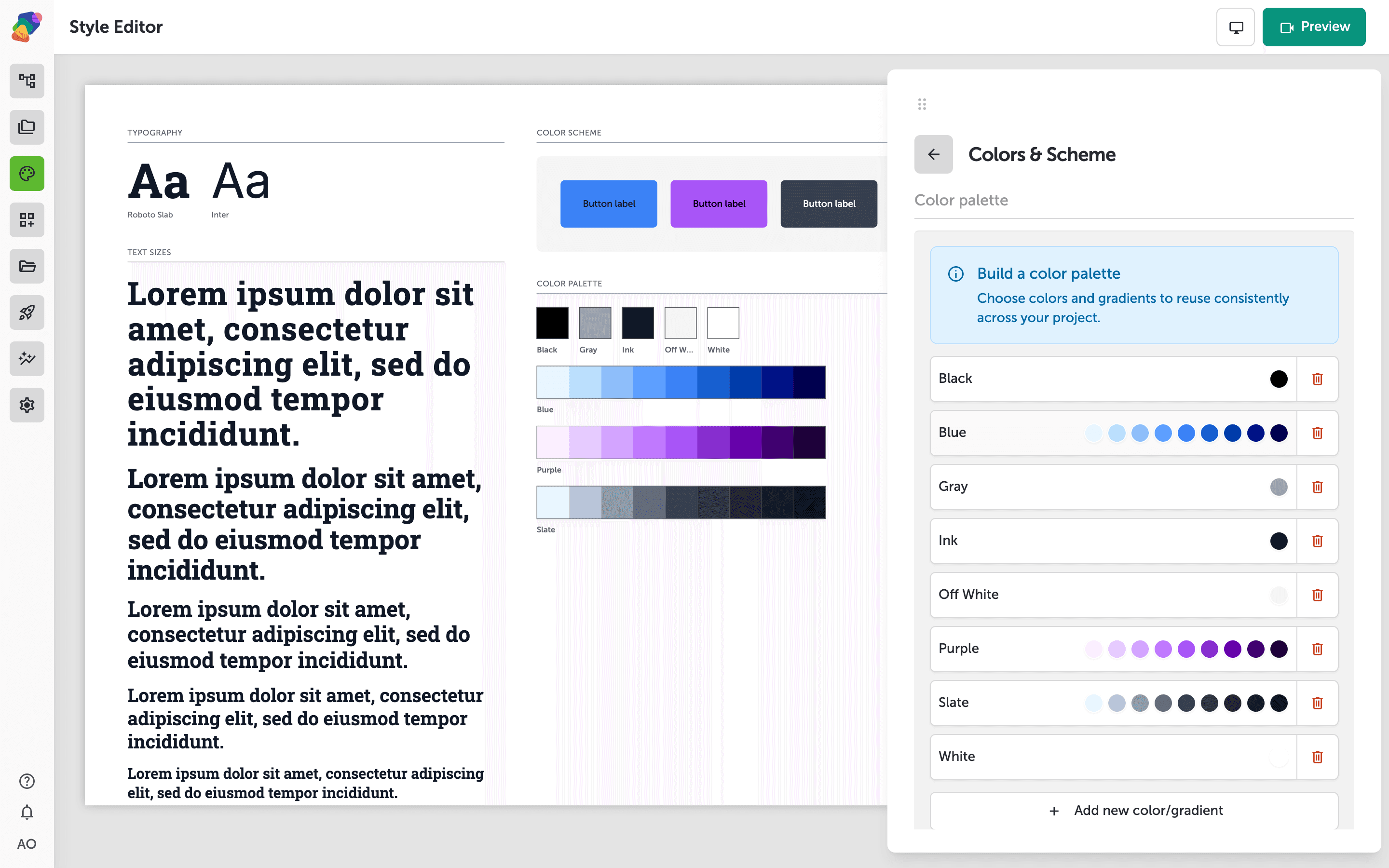
The Colors & Scheme panel is split into two sections. The upper Color palette section is where you build a library of reusable colors and gradients—click + Add new color/gradient to add your first entry. Every color you add here becomes available to reuse anywhere in your project.
The lower Color scheme section lets you map palette colors to semantic roles: Foreground, Background, Surfaces, Border, Primary, and more. Each role has a color picker and an opacity percentage field. Assigning roles here means components that reference "Primary" or "Background" will update automatically when you change the mapped color.
A new color row added to your palette
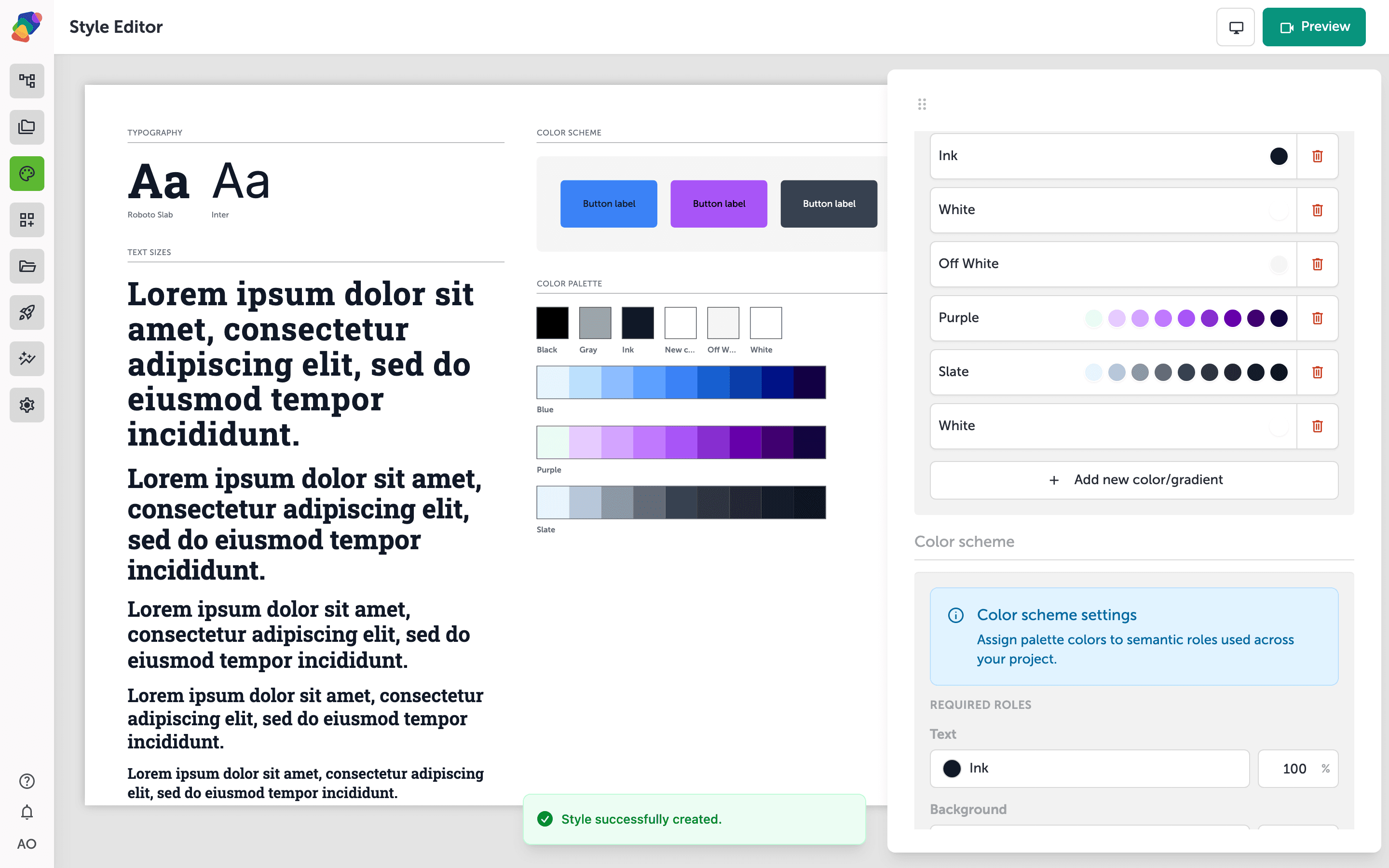
After clicking "+ Add new color/gradient", a new swatch row appears in the Color palette section, labeled "White" and ready to configure. The row includes a color swatch on the left and a delete button on the right—click the swatch or the label to rename the color and set its value.
The Color scheme section below lets you assign palette colors to semantic roles such as Foreground, Background, Surfaces, and Border. Build out your palette first, then map colors to these roles so they apply consistently across every moment in your project.
Defining a color with the visual picker
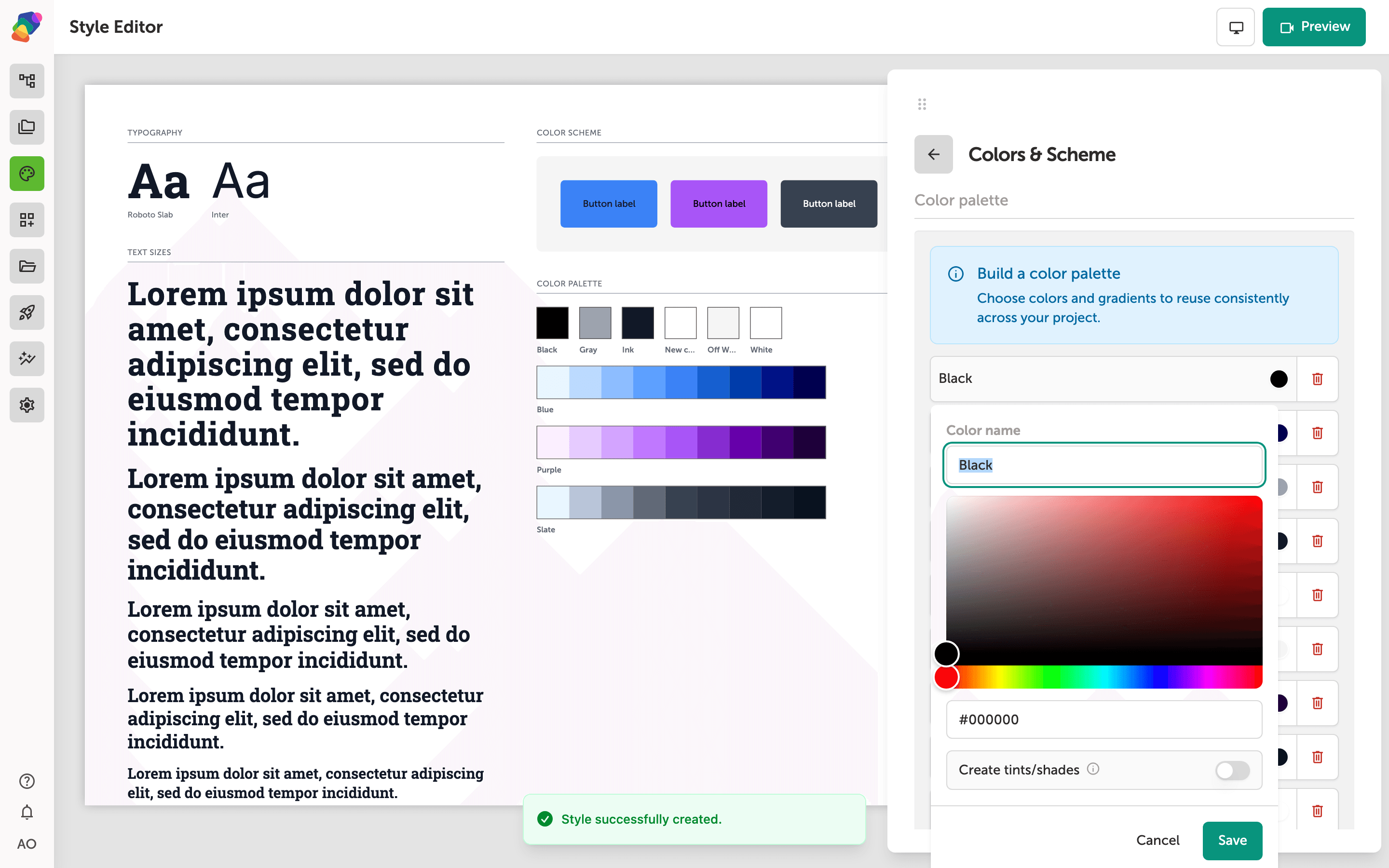
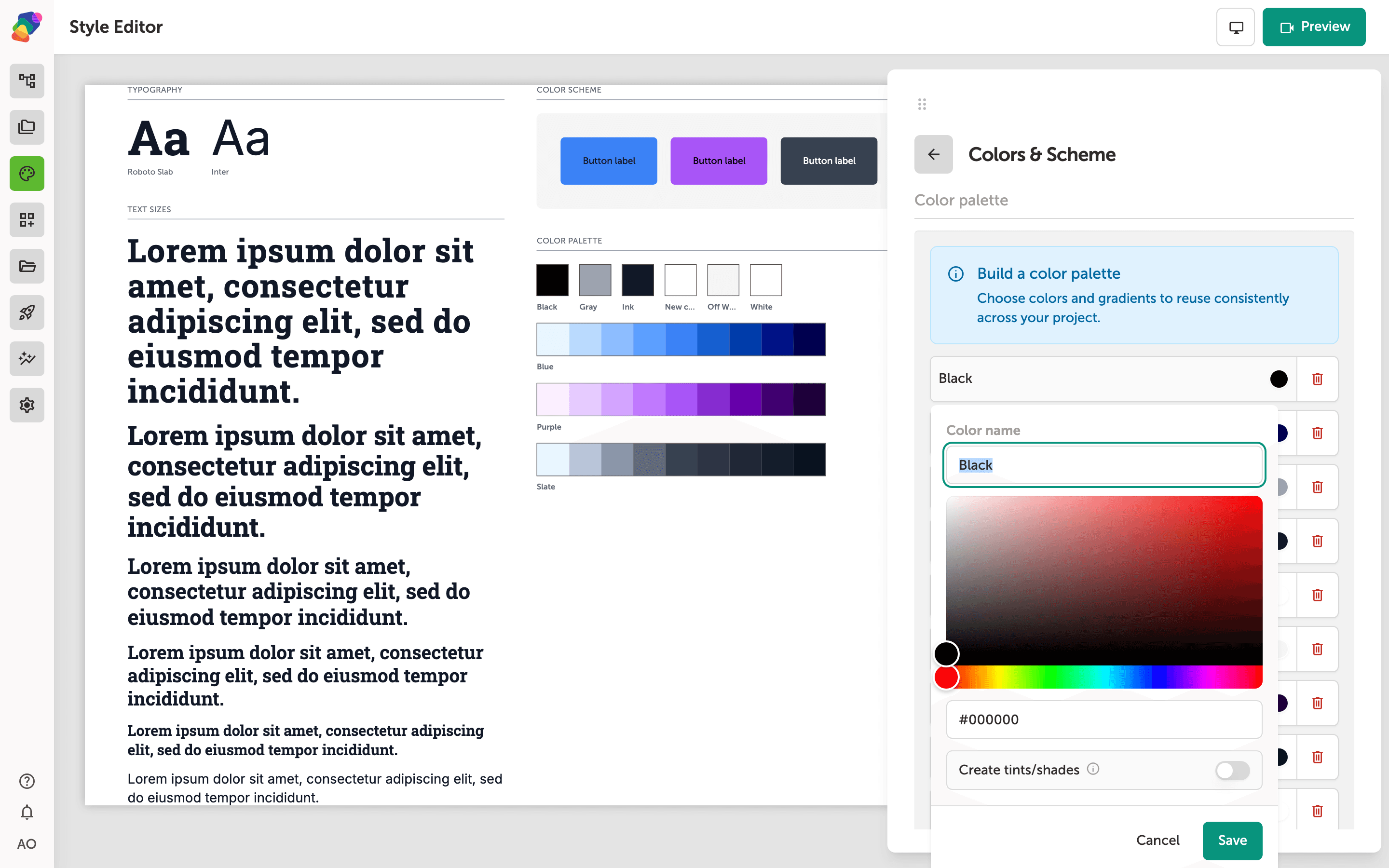
The color picker opens directly below the Color name field. Use the gradient canvas to pick a hue and lightness, then drag the rainbow strip below it to shift the base hue. The hex field (showing #ffffff) lets you type an exact value if you already know it.
Give the color a meaningful name in the Color name field—"White" is filled in here. The Create tints/shades toggle, when enabled, automatically generates lighter and darker variants of the color for use across your project. When you're satisfied, click Save to add the color to your palette, or Cancel to discard it.
Saving a named color to your palette
With your color selected in the picker, type a descriptive label into the Color name field—the current entry reads White. Once the name reflects the color's purpose, click Save to add it to your palette, or Cancel to discard the entry.
After saving, this named color becomes available throughout the Colors & Scheme panel, where you can assign it to semantic roles like Foreground, Background, Primary, Secondary, and Tertiary. Assigning palette colors to these roles ensures consistent styling across every moment in your project.
With a solid palette in place, your project has a reliable color foundation you can apply consistently as you build out moments and components. From here, you can go further with the rest of your style set and the broader design system.
- Applying colors to components: Learn how to bind palette colors to text, backgrounds, and borders on individual components.
- Working with style sets: Explore how typography, shadows, and spacing work alongside your color palette in the Style Editor.
- Creating and reusing style sets: Save a style set and apply it across multiple projects in your space.
- Using semantic roles in flows: See how scheme roles like "primary" and "surface" adapt your design when you switch themes or displays.
- Managing collections with color data: Link a collection to drive dynamic color changes across moments based on exhibit content.