
Using the Library Modal
Whether you're building a touch-screen exhibit for a natural history museum, a wayfinding display for a gallery, or an educational kiosk for a science center, your project's visuals matter. Zibit's Library modal makes it easy to connect the media files you've uploaded to your project directly to components on your canvas—no file paths, no manual linking. In just a few steps, you'll have images, videos, and other assets flowing into your moments exactly where you need them.
Add an Image Component to Your View
Your view is now open in the editor—you'll see an empty grid canvas ready for content. To place an image on screen, click "Add component" in the toolbar. This opens a panel where you can choose from available component types, including images, text, video, and buttons.
Select Image from the component list to drop it onto the canvas. Don't worry about positioning it perfectly right away—you can drag, resize, and adjust it at any time. This is a great moment to add a hero image for a museum exhibit welcome screen or a logo for digital signage.
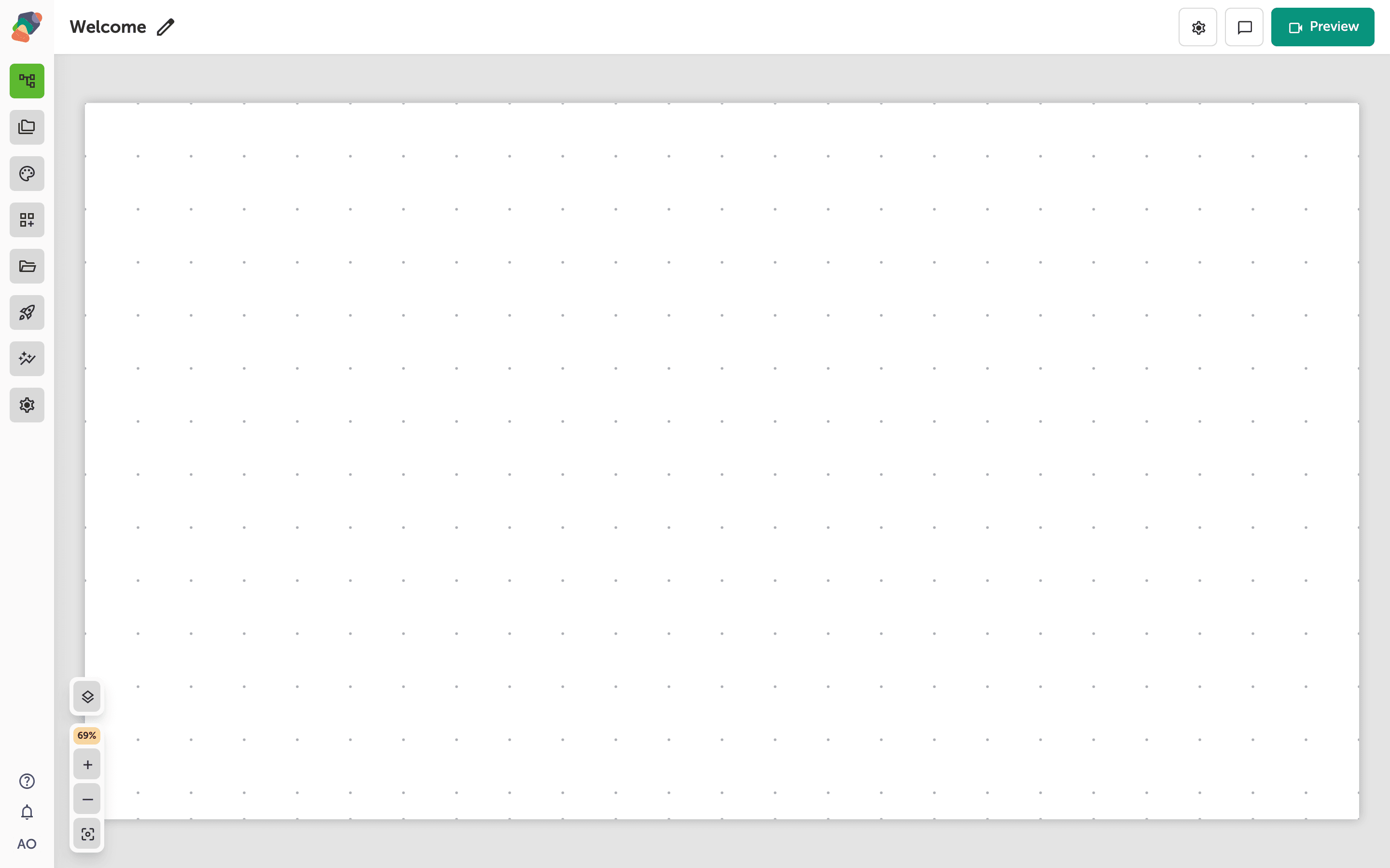
Add an Image Component to Your View
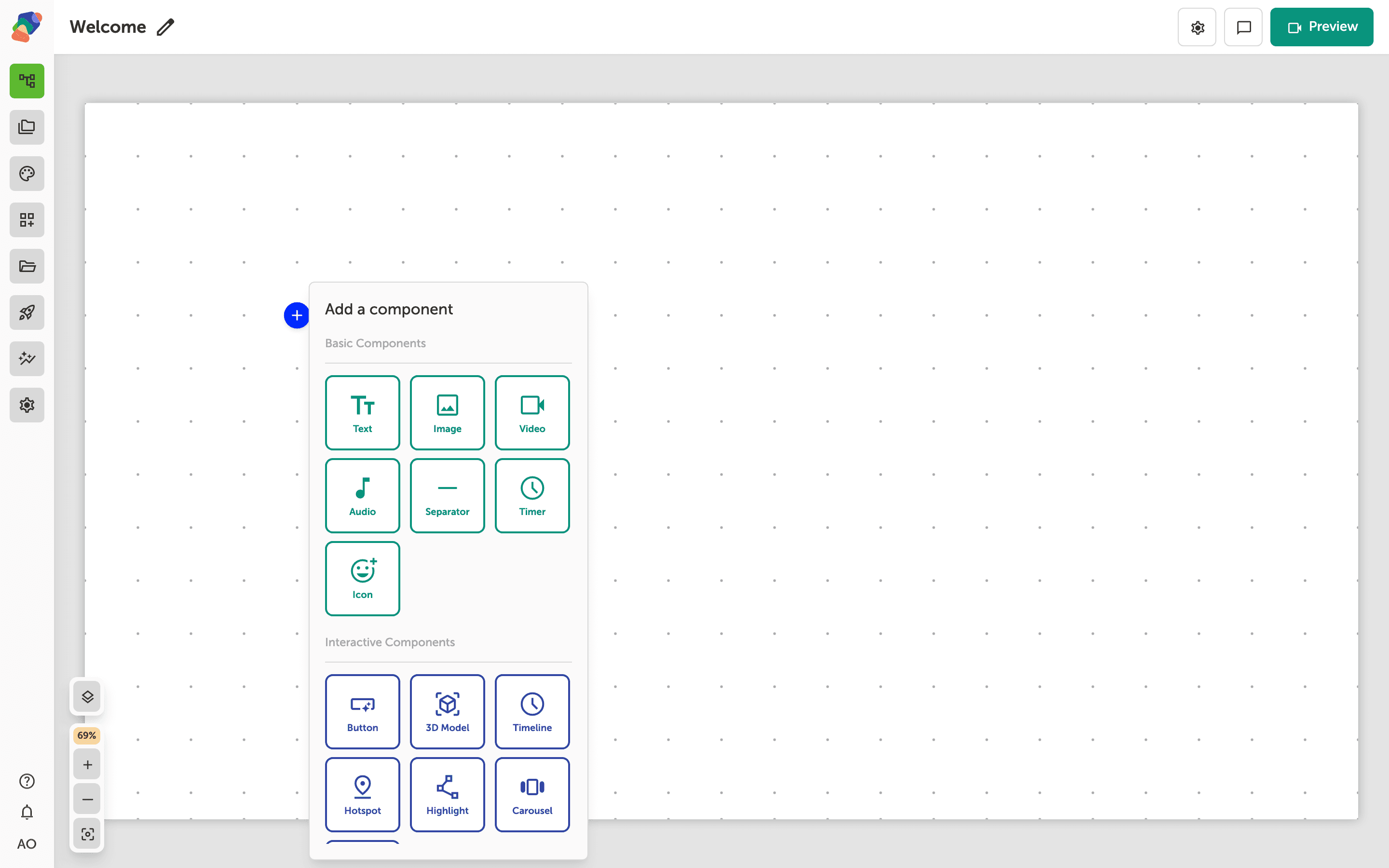
With the Add component popover open, you'll see a list of all the components you can place on your canvas. Click Image to add a media block—perfect for displaying artwork, exhibit photos, or sponsor logos in your moment.
The image component will appear on the canvas right away, and you can reposition or resize it at any time. Don't worry about getting it perfect now—everything is adjustable as you build out your view.
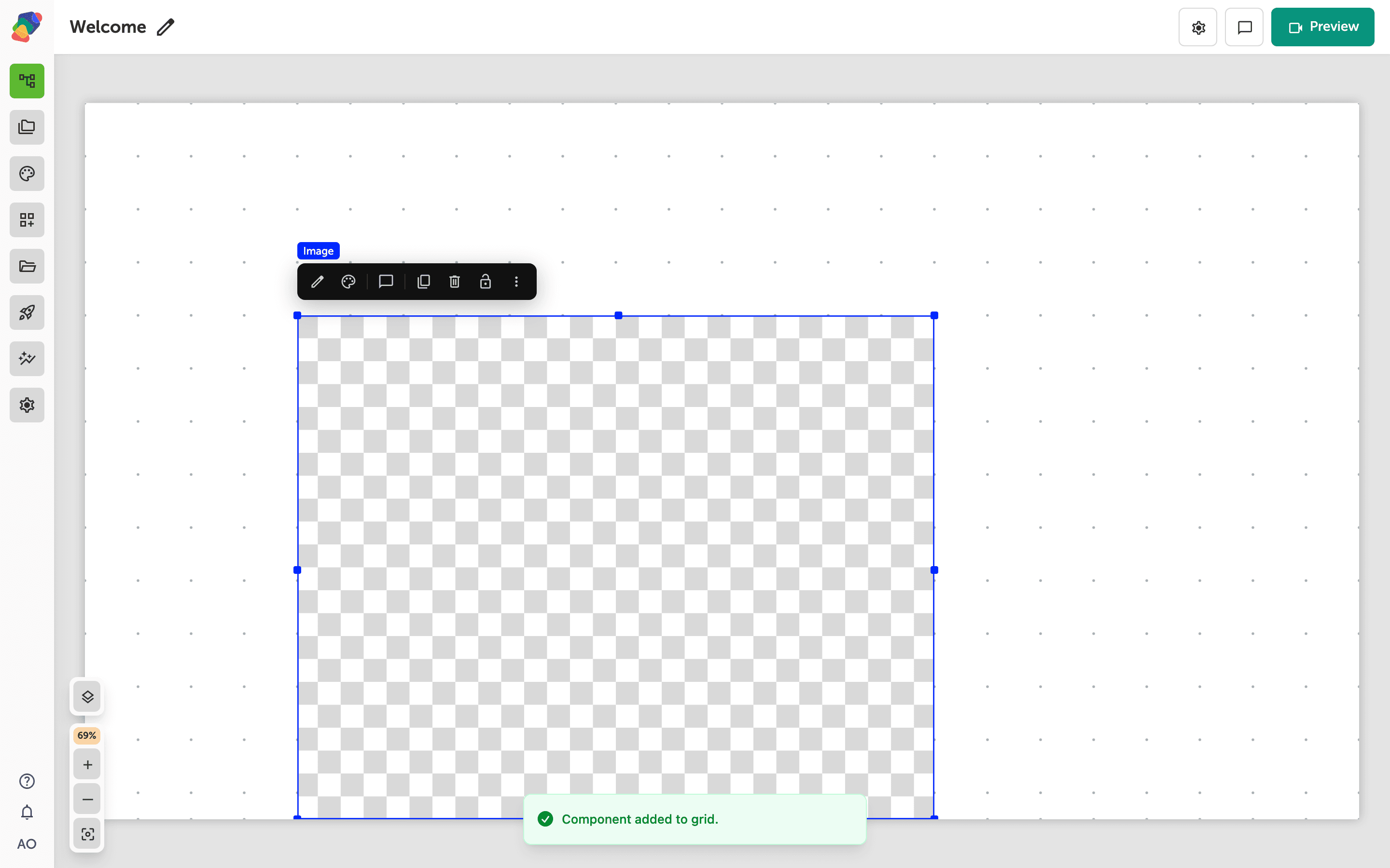
Bind an Image to Your Project Library
You've added an Image component to your view—now it's time to connect it to a real file. Click "Open" to browse your project library and pick the image you want to display. This is where any photos, illustrations, or graphics you've uploaded to the project will appear.
Once you select a file, it's bound directly to this component. If you ever need to swap the image out later—say, to update an exhibit banner or refresh seasonal content—you can come back and repeat this step without affecting anything else in your moment.
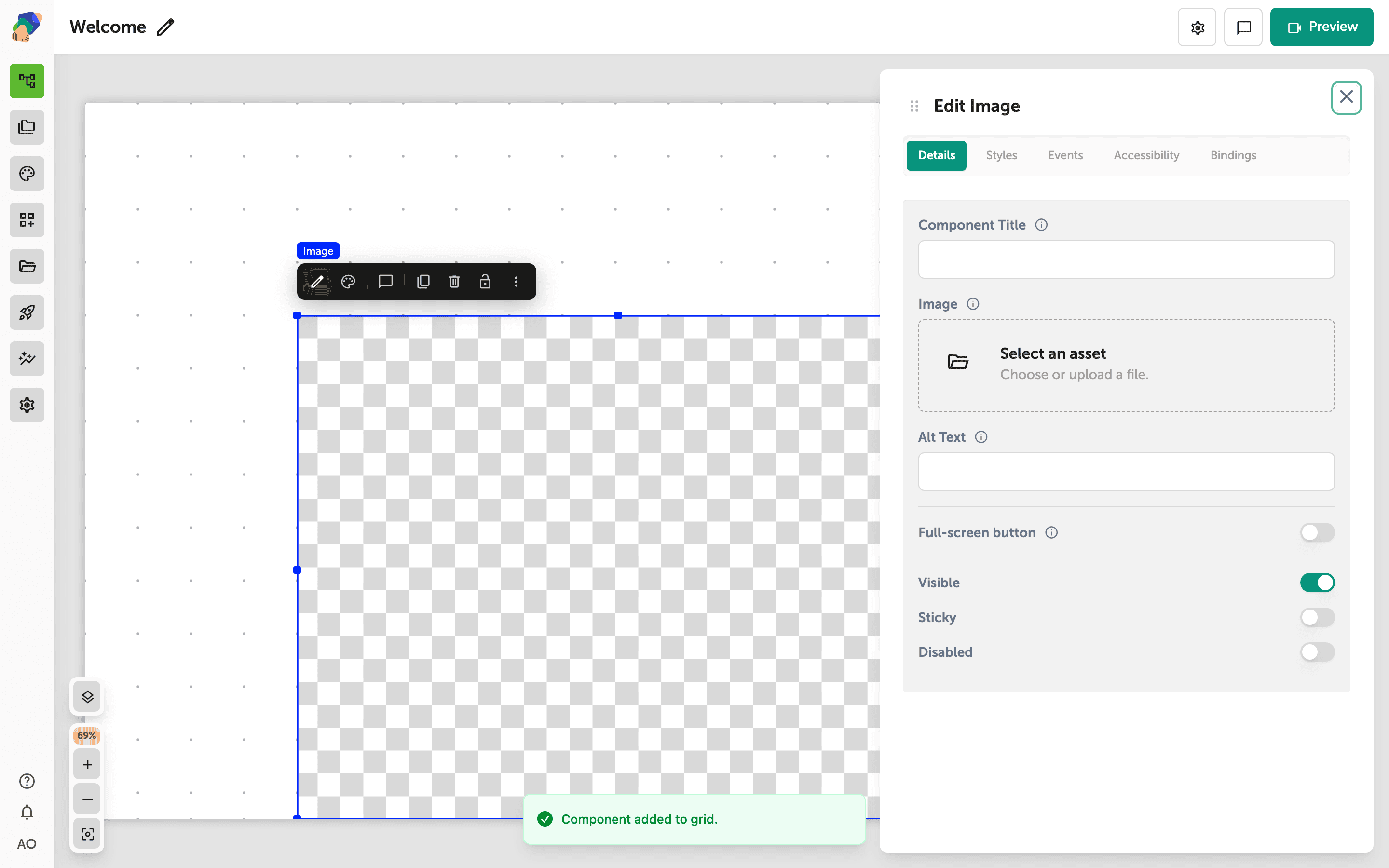
Add an Image to Your Component
With your image component selected, the Edit panel on the right shows the Details tab. Find the Image field and click Open to open the asset library—this is where you'll choose the image you want to display on screen.
Once the library opens, browse or search for your asset and select it. This could be a photo of an artifact, a venue map, or any visual content you've already uploaded to your workspace. Don't worry—you can swap the image out at any time by coming back to this same field.
Choose an Image from Your Assets Library
The Assets library gives you access to all the files uploaded to your project. You can search by name using the Search files field, or narrow things down by file type using the File type filter. Browse the grid to find the image you want to use—this might be a hero photo for a museum exhibit panel, an icon for a kiosk button, or a background for a digital sign.
When you spot the right file, click its card to select it, then click Select to add it to your component. If you don't see what you need yet, click Upload to bring in a new file—you can always come back and swap it out later.
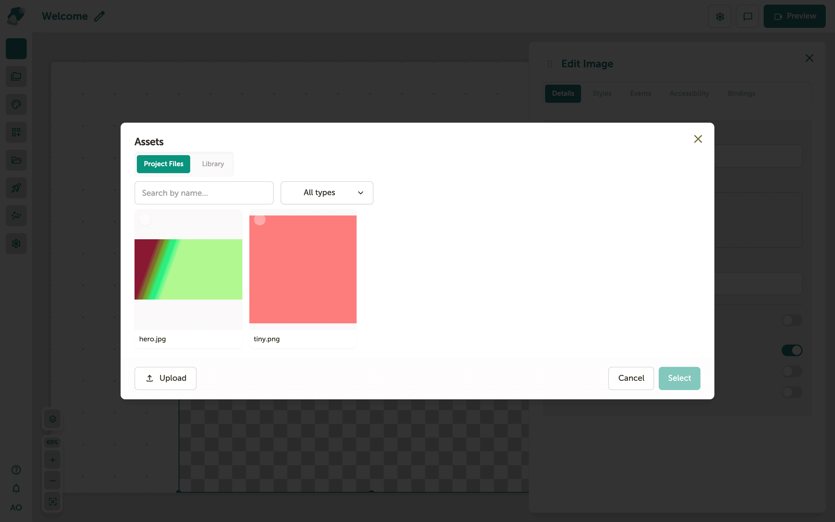
Choose Your Image from the Asset Library
Browse through your uploaded files in the Assets panel and click the one you want to use. When you select a file, it becomes highlighted and the "Select" button activates at the bottom of the panel—click it to confirm your choice and link the image to your Image component.
This is great for museum exhibit content like artwork photos, wayfinding icons, or sponsor logos. Don't worry if you pick the wrong file—you can always come back to this panel and swap it out later.
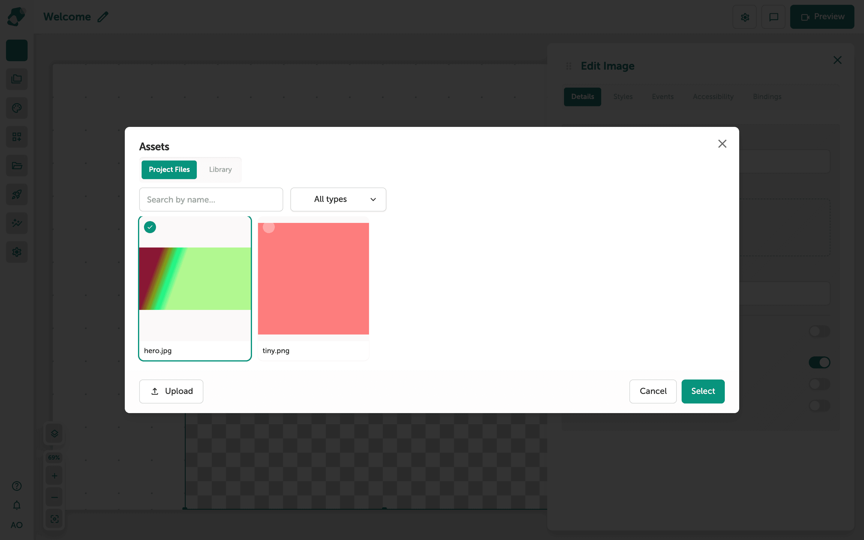
You've successfully used the Library modal to browse your project's uploaded files and bind a media asset to a component—your moment is already looking more dynamic. From here, there's plenty more you can do to bring your experience to life.
- Upload more assets to your project library: Head to your project's Files section to add images, videos, and documents that will be available across all moments and components.
- Bind media to other component types: The Library modal works with video, audio, and document components too—try connecting a video file to a Video component for a richer exhibit experience.
- Reuse assets across multiple moments: Any file you've uploaded is available in the Assets library no matter which moment you're editing, so you can keep visuals consistent throughout your project.
- Organize your files with collections: Group related assets into a collection to make browsing faster, especially useful when managing large exhibits with dozens of media files.
- Adjust component styling after binding: Once your asset is linked, explore the Style tab in the Edit panel to resize, crop, or apply effects—and don't worry, you can swap the asset out at any time.