
Adding a Collection Component to a View
This tutorial walks you through placing a collection component on a view canvas and binding it to a data collection so your content updates automatically from a single source. When you finish, your view will pull items—such as artifact records for a museum gallery kiosk—directly from your collection, making it easy to keep displays current without editing each moment by hand.
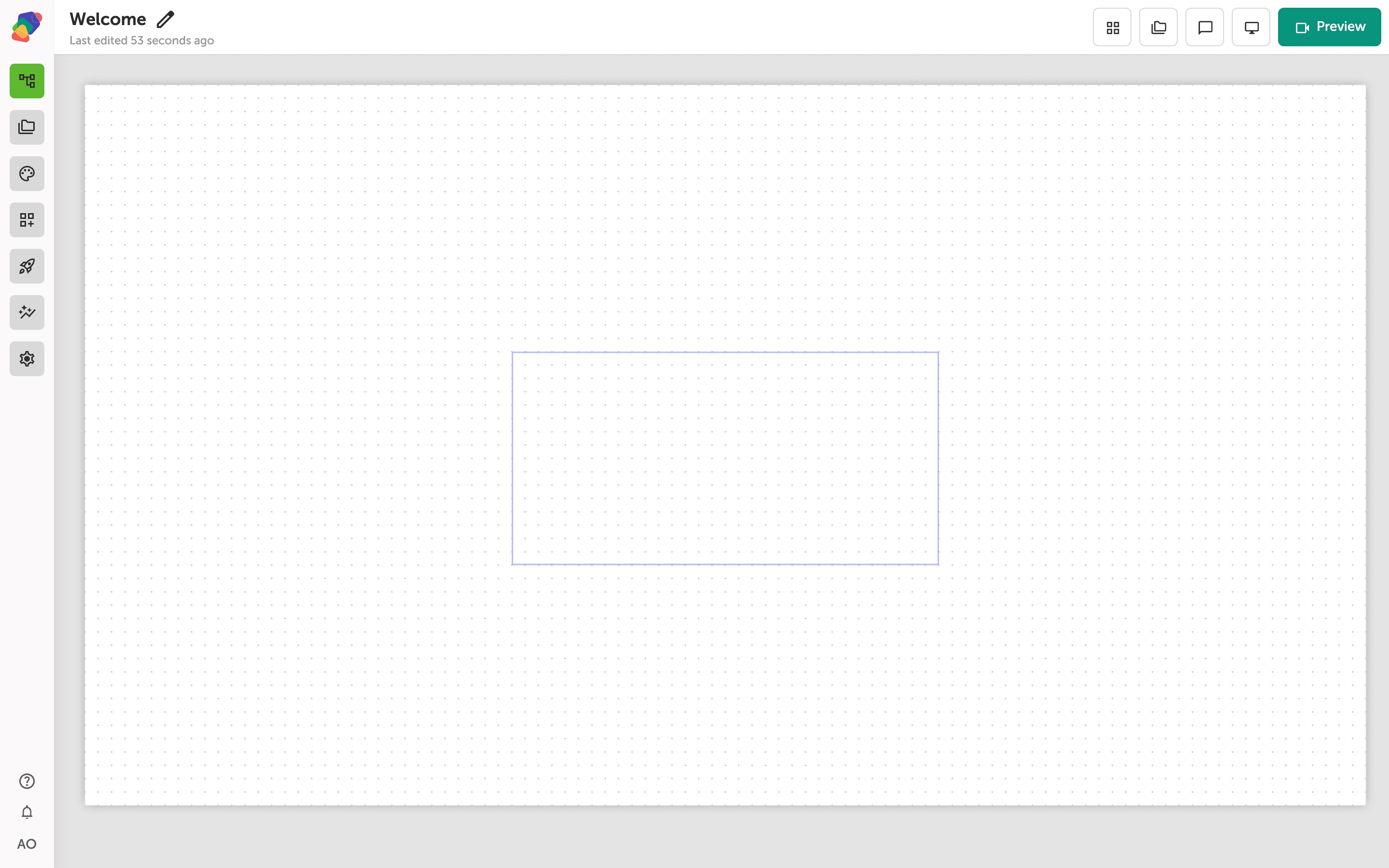
The view editor canvas for your moment
This is the view editor—the dotted-grid canvas where you build the visual layout for a moment. The blue-outlined rectangle in the center represents the view boundary for your selected display. Everything you add to this moment will be placed within that boundary.
The left sidebar gives you access to components, collections, style sets, and project settings. The toolbar at the top right lets you switch between display sizes and open a Preview of your work at any time.
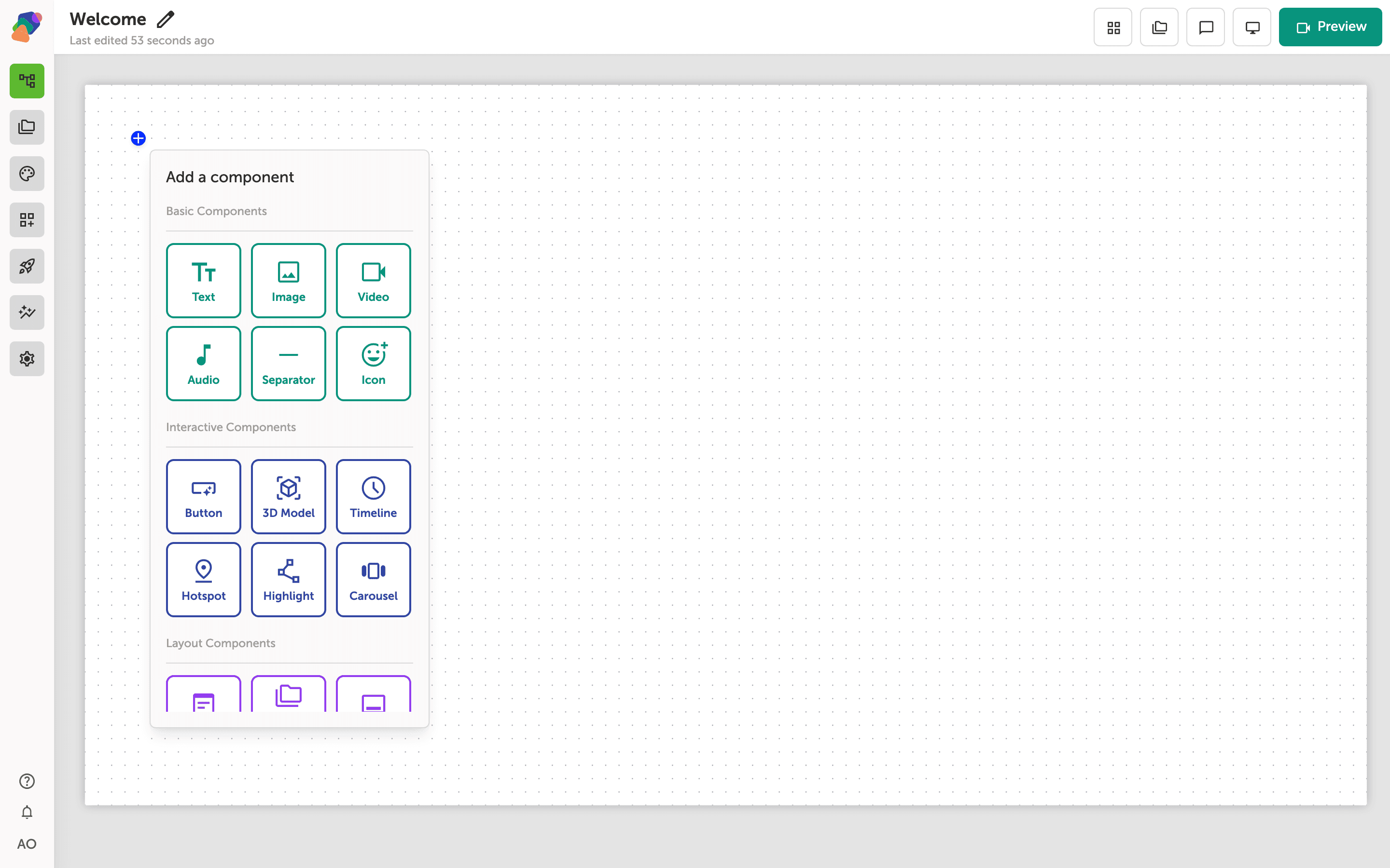
The Add a component panel and its available component types
Clicking the + button opens the Add a component panel. You'll see components grouped into three categories: Basic Components (Text, Image, Video, Audio, Separator, Icon), Interactive Components (Button, 3D Model, Timeline, Hotspot, Highlight, Carousel), and Layout Components at the bottom of the panel.
Scroll down to the Layout Components section to find the component you need for this tutorial. The Collection component lives there—it repeats a set of child content once for each item in a linked collection.
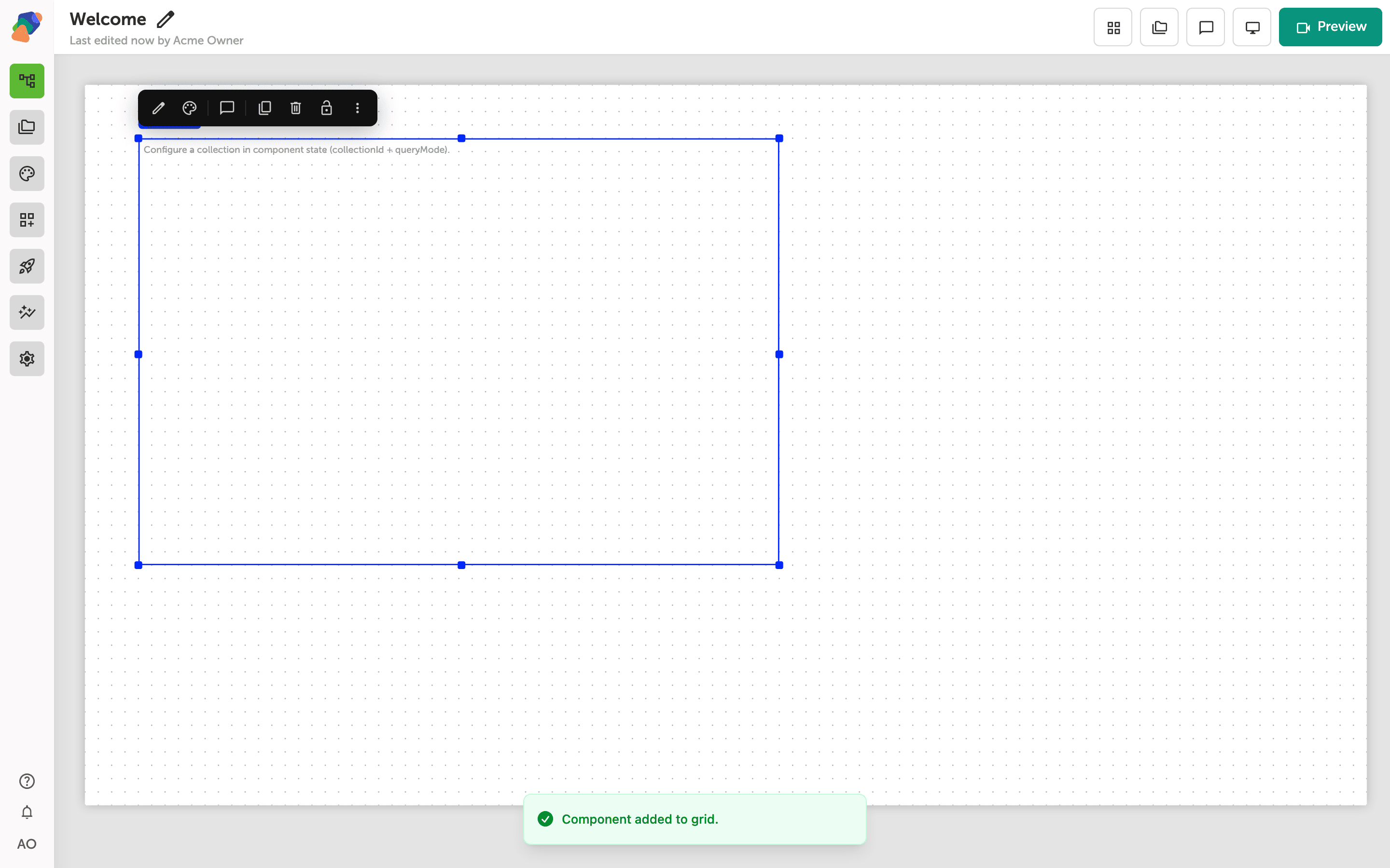
A collection component placed and selected on the canvas
The component has landed on the canvas and is now selected, shown by the blue resize handles around its edges. A "Component added to grid" confirmation appears at the bottom of the screen. The component displays the placeholder message "Configure a collection in component state (collectionId + queryMode)"—this is expected, and means the component is ready but not yet bound to a collection.
The floating toolbar above the component gives you quick access to edit content, edit styles, duplicate, delete, lock, and more. You'll connect the component to a real collection in the next step.
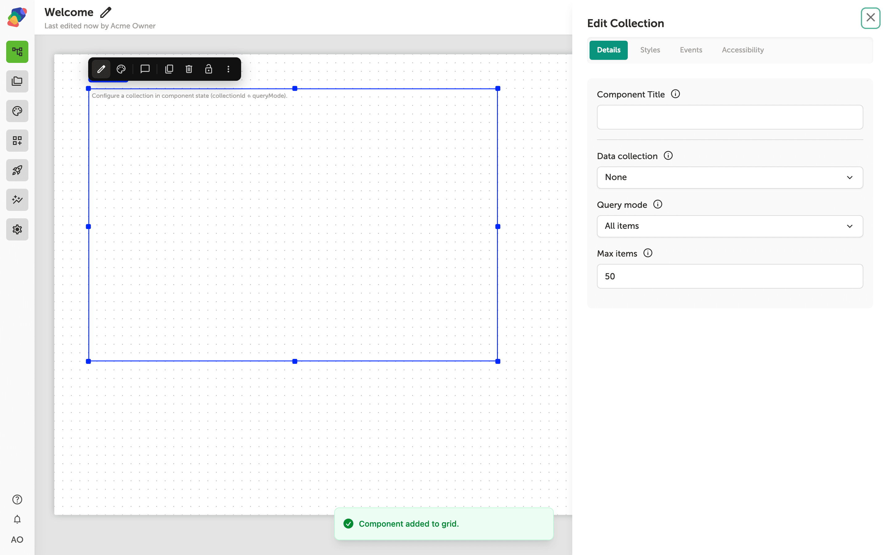
The Edit Collection panel for binding data to your component
With the collection component selected, the Edit Collection panel opens on the right. The Details tab is active and shows four fields: Component Title, Data collection, Query mode, and Max items.
Use the Data collection dropdown—currently set to None—to choose the collection you want this component to display. Set Query mode to control whether the component shows All items or a filtered subset, and adjust Max items (default 50) to limit how many records are loaded at once. For example, a gallery kiosk showing artifact thumbnails might cap this at 20 to keep the display responsive.
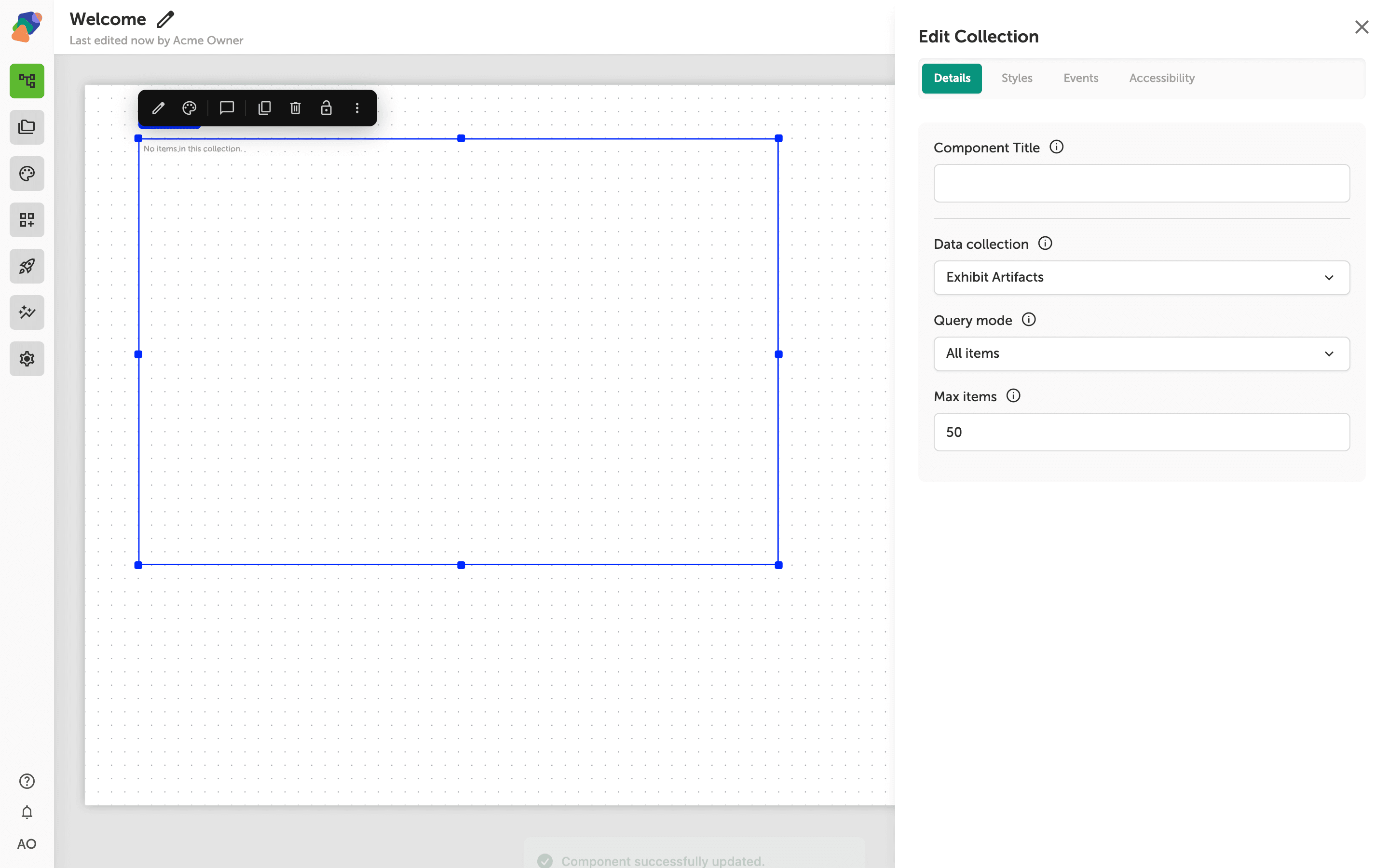
Configuring query mode and item limits for the bound collection
With Exhibit Artifacts selected as the Data collection, the panel shows two more controls that determine what your component actually displays. Query mode is set to All items by default, which pulls every record from the collection. Use the dropdown to switch to a filtered or manual selection if you only want a subset to appear on screen.
The Max items field is set to 50—lower this number if your display is space-constrained or your collection is large and you want to cap how many records load at once. When you're satisfied with these settings, your collection component is fully configured and connected to your data.
Your view is now wired to a live data source, and any updates to the collection will flow through to your display automatically. From here, you can go further with how that data looks and behaves.
- Style the collection component—Apply a style set or adjust typography and spacing so items match your project's visual identity.
- Add item templates—Control how each record in the collection is laid out using a repeating item template inside the component.
- Set up filters and sorting—Refine which collection records appear and in what order using query conditions.
- Connect flows to collection items—Link individual items to other moments so visitors can tap through to detail views.
- Manage your collection—Add, edit, or import records in the collection itself to keep your content fresh across every view that uses it.