
Reading Your Analytics Dashboard
Once your project is published and visitors start using it, the Analytics dashboard gives you a clear picture of how it is performing. This tutorial walks you through the three main tabs—User Engagement, User Behavior, and Content Performance—and shows you how to use period-over-period comparison deltas to spot trends. By the end, you will know how to find your session counts, trace how visitors move between moments, and identify which components are getting the most attention.
The Analytics dashboard and User Engagement tab
The Analytics section shows how visitors are interacting with your deployed project. At the top, three filters let you narrow the data: Last 7 days sets the date range, All devices limits results to a specific display type, and All snapshots targets a particular published version. Changing any filter updates every chart on the page instantly.
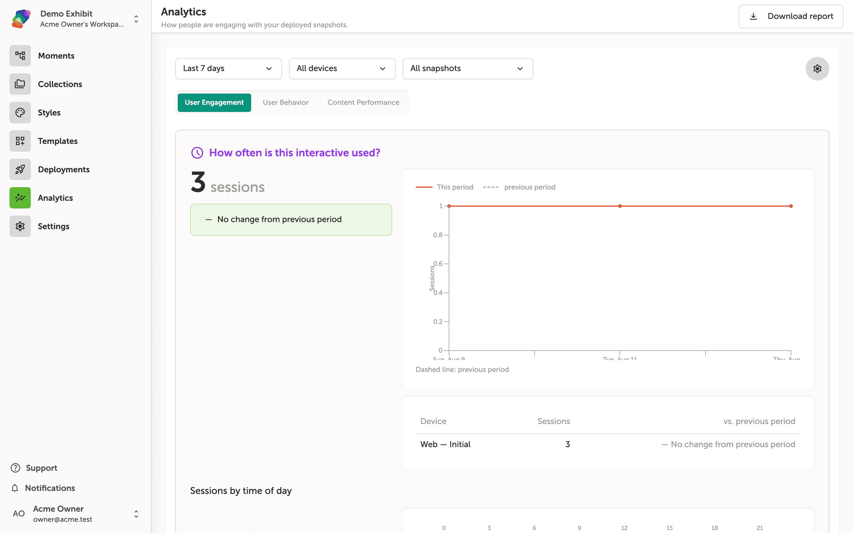
Below the filters, three tabs organize the data: User Engagement, User Behavior, and Content Performance. The User Engagement tab is active by default, and the first thing you see is a session count—the total number of times visitors started an interaction—alongside a comparison to the previous period. The line chart plots sessions across the selected date range, with a dashed line representing the previous period for quick comparison.
Reading the session count and line chart
The User Engagement tab opens with a summary of how often your deployed project has been used. The large number under "How often is this interactive used?" shows total sessions for the selected period, and the callout beneath it compares that count to the previous period—in this case, no change is detected.
The line chart to the right plots sessions day by day, with a solid line for the current period and a dashed line for the previous one. Below the chart, the Device breakdown table lists each display type alongside its session count and period-over-period change, so you can see exactly where engagement is coming from.
Exploring the User Behavior tab and journey map
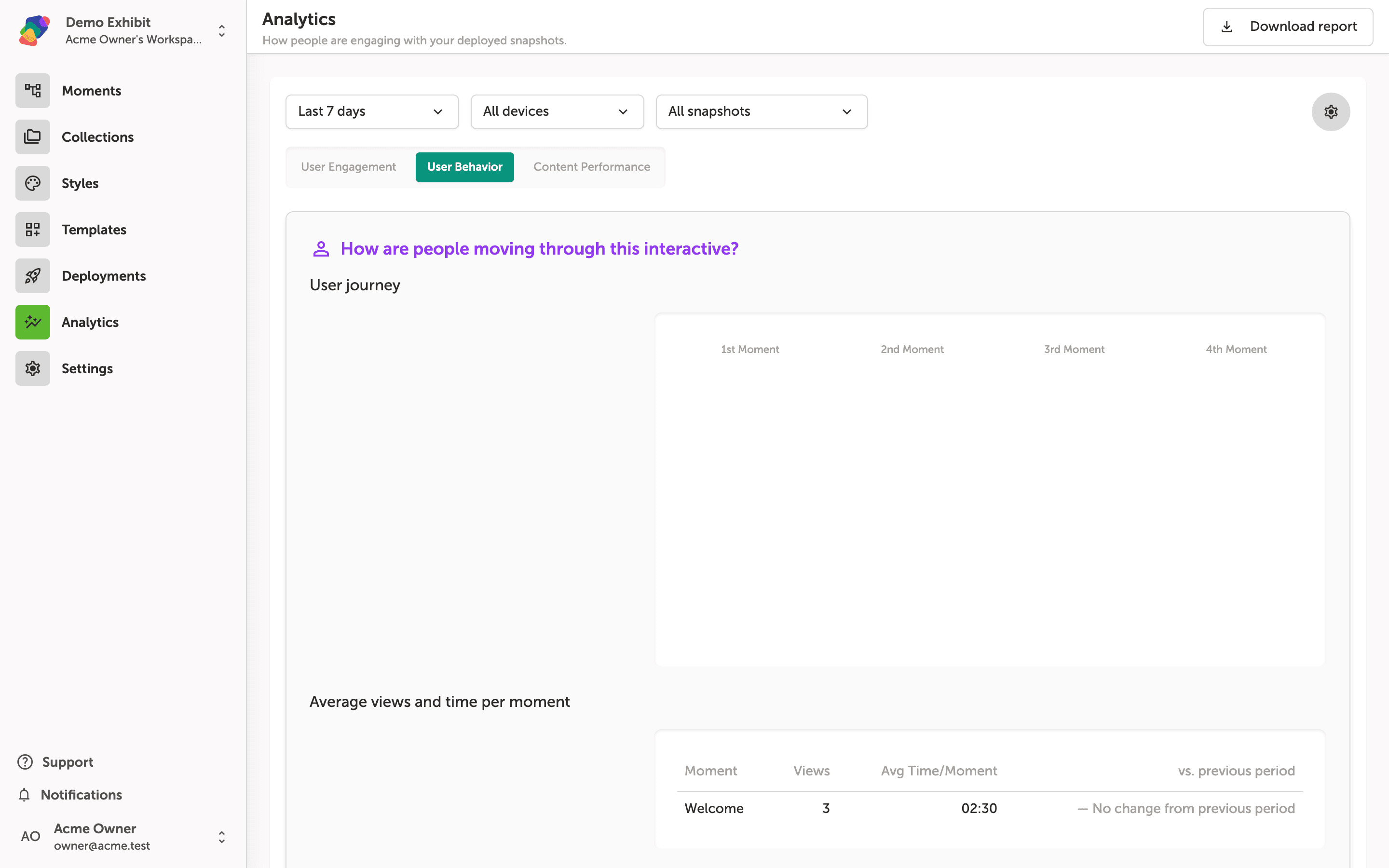
The User Behavior tab shows how visitors move through your project from moment to moment. The User journey section visualizes this as a flow across columns labeled 1st Moment, 2nd Moment, 3rd Moment, and 4th Moment, so you can see where people go after each screen.
Scroll down to find Average views and time per moment, which lists each moment by name alongside its view count and average time spent. For example, the Welcome moment shows 3 views with an average of 2 minutes 30 seconds, along with a comparison to the previous period. Use the Last 7 days, All devices, and All snapshots filters at the top to narrow the data to a specific time range, device type, or deployment.
Average views and time spent per moment
Scroll down within the User Behavior tab to reach the Average views and time per moment table. Each row lists a moment by name, how many times it was viewed, and the average time visitors spent on it—for example, the Welcome moment shows 3 views at an average of 2 minutes 30 seconds. The vs. previous period column tells you whether engagement on that moment has changed since the prior date range, so you can quickly spot which moments are gaining or losing attention.
Use the Last 7 days, All devices, and All snapshots filters at the top of the page to narrow the data before reading this table. Changing any filter updates all sections on the page at once.
Content Performance tab: component interactions and scroll depth
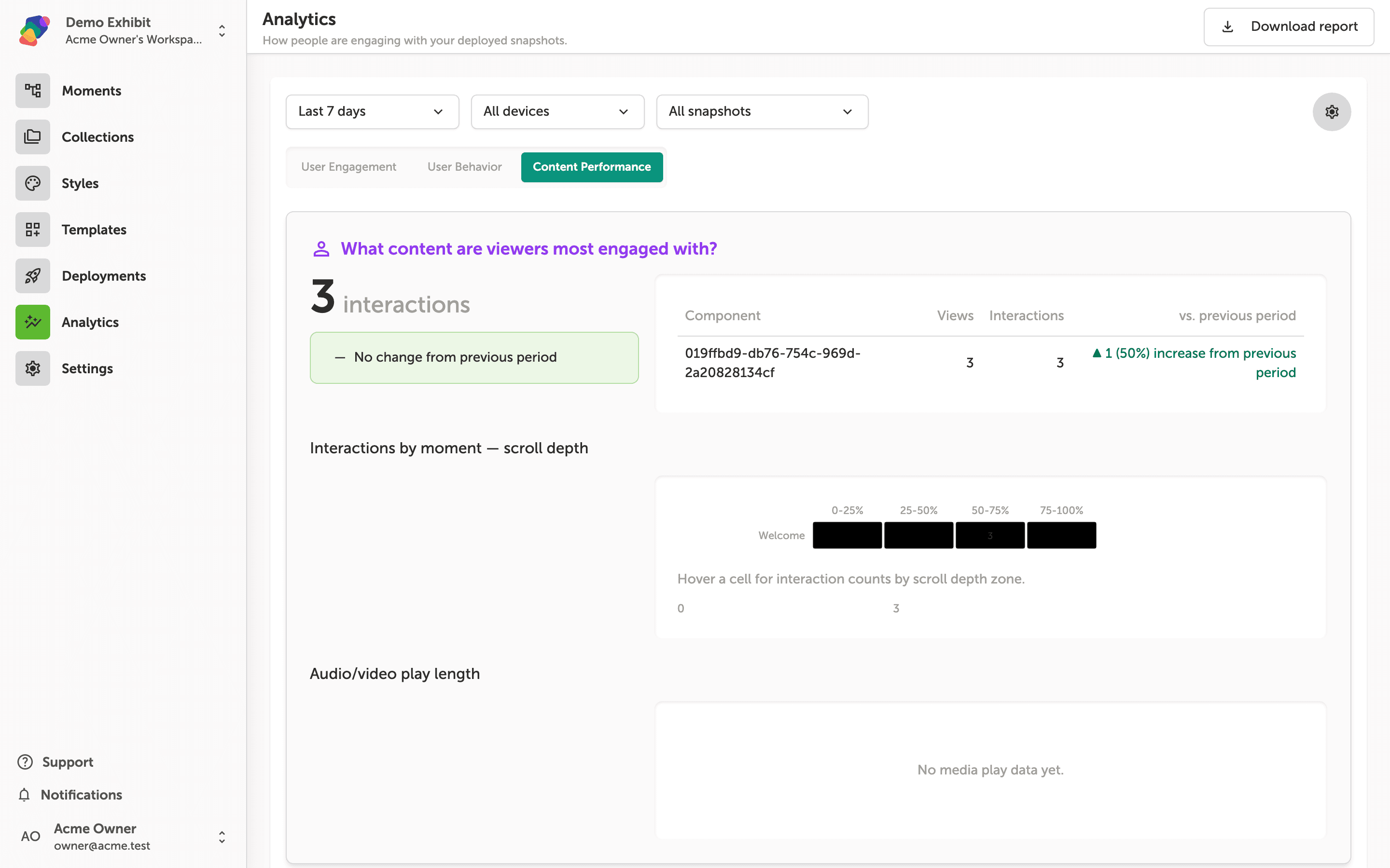
The Content Performance tab shows how visitors are interacting with individual components in your deployed project. At the top of the section, Zibit displays the total interaction count alongside a comparison to the previous period—in this case, 3 interactions with a 50% increase. The component table lists each component by ID, its view count, interaction count, and a delta against the previous period, so you can spot which elements are drawing the most attention.
Below the component table, the Interactions by moment—scroll depth heatmap breaks down where in each moment those interactions happened. Hover over any cell to see the exact interaction count for that scroll depth zone. The Audio/video play length section appears further down and will populate once visitors play media components. To export everything on this tab, click Download report in the top-right corner.
You now have the tools to interpret the data your published project is generating. As you collect more sessions over time, revisit these tabs regularly to spot patterns and refine your content.
- Adjust your flows based on journey data—use drop-off points in the journey map to rethink which moments lead where.
- A/B test component placement—move high-priority components to moments with stronger engagement and republish to compare results.
- Set a comparison period—align your date ranges with real-world events, such as a gallery opening or a school visit week, to give your data context.
- Connect a collection—if your project uses dynamic content, link a collection to track which data-driven moments are resonating most.
- Share dashboard access—invite colleagues to your space so curators and educators can review performance data directly.