
Selecting a New Theme
A theme controls the colors, typography, and component styles applied across your entire Zibit project, so switching to a different one is one of the fastest ways to give your content a fresh look. This tutorial walks you through opening the Theme Library, browsing available themes, and applying a new one — all without leaving the Style Editor.
Open the Style Editor
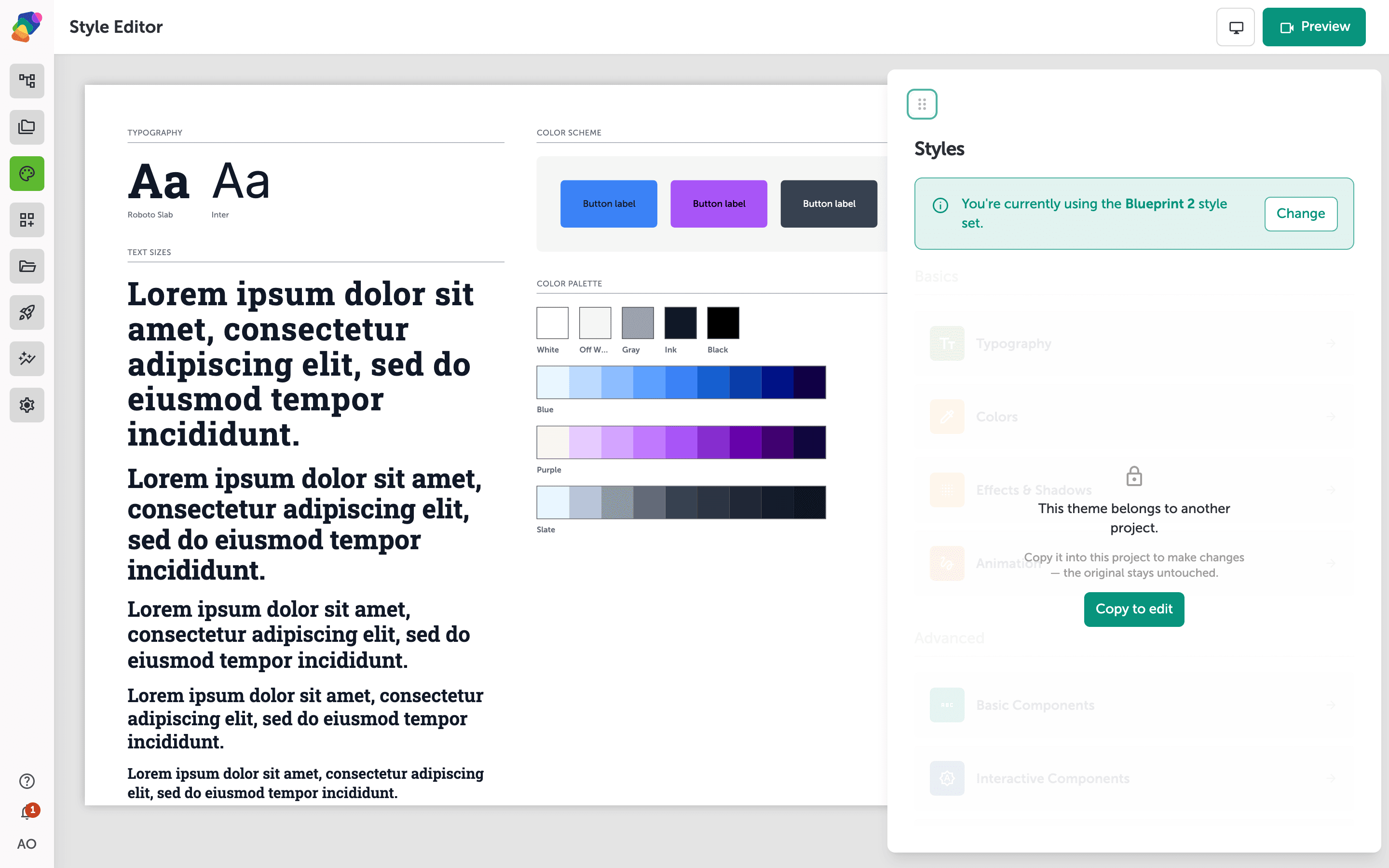
Start by opening your project and clicking "Styles" in the sidebar. The Style Editor loads with a live preview of your current design on the left and a list of editing panels on the right. At the top, a banner displays the name of your active theme along with a "Change" button. That button is your entry point to the Theme Library.
Browse the Theme Library
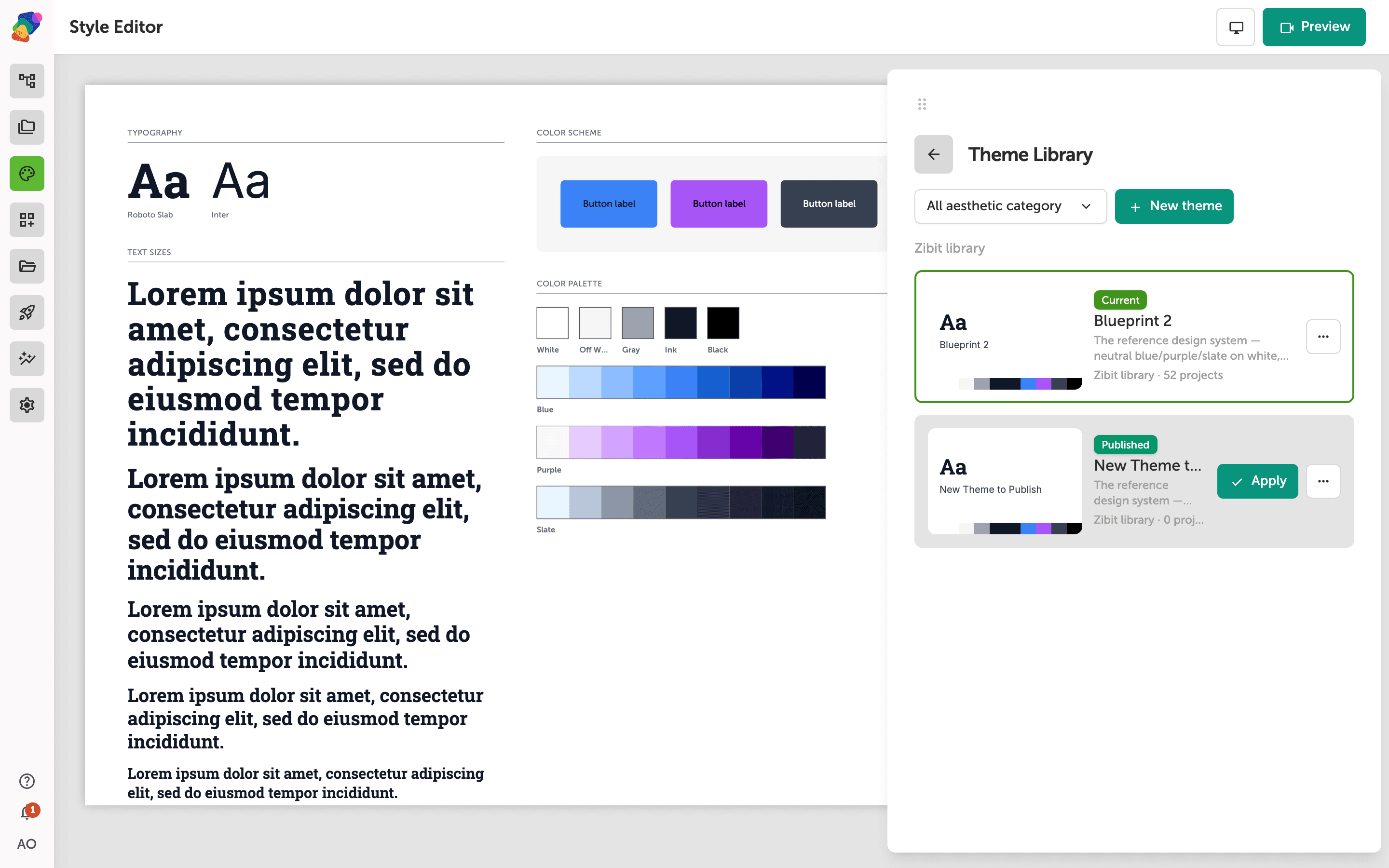
Click "Change" to open the Theme Library — an in-drawer panel that appears inside the Style Editor. Themes are grouped by scope: themes created for this project, themes shared across your organization, and themes from the Zibit library. The theme your project is currently using is marked with a "Current" badge so you can always spot it at a glance.
Scroll through the groups to explore what's available. Each theme card shows a preview of its color palette and typography, giving you a quick sense of the visual direction before you commit.
Apply a new theme
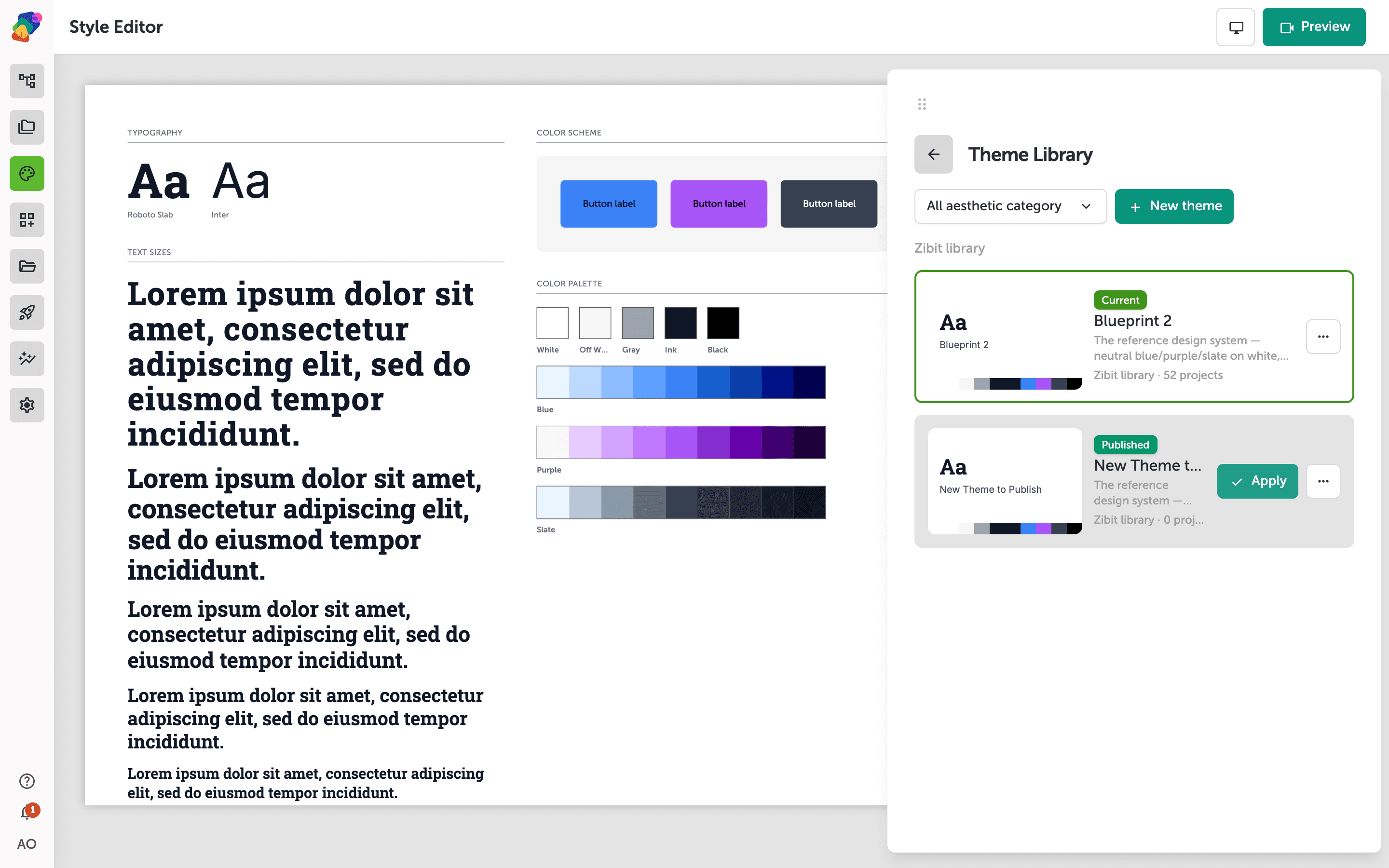
When you find a theme you like, hover over its card to reveal the "Apply" button. This lets you confirm which theme you're about to activate before making the switch.
Click "Apply" to switch your project to the new theme. The Style Editor updates immediately — you'll see the preview canvas reflect the new color palette, typography scales, and component styles. Every component in your project picks up the change automatically, so there's nothing else to configure unless you want to fine-tune individual settings.
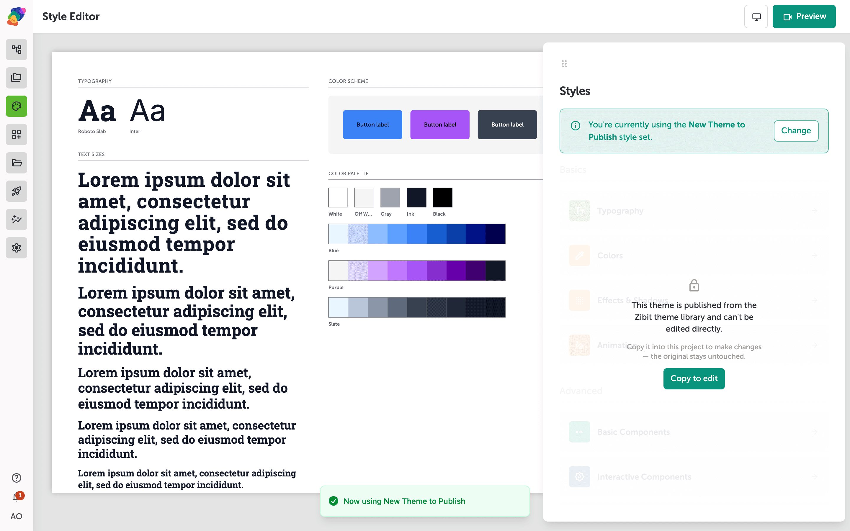
Your project now has a new visual identity, and you can keep iterating from here. A few things you might want to do next:
- Customize your theme's colors: Open the Colors panel in the Style Editor to adjust the palette to match your brand.
- Adjust typography settings: Fine-tune font families, sizes, and weights under the Typography panel.
- Create a new theme from scratch: Duplicate your current theme and customize it into something entirely your own.