
Using the Advanced Analytics Dashboard
The Advanced Analytics Dashboard gives you a detailed picture of how visitors experience your deployed project—from when they arrive and how long they stay, to which components they interact with most. By the end of this tutorial, you'll know how to read each of the three analytics tabs, interpret the sessions heatmap, and act on the AI insight cards that surface automatically alongside your content data. This is especially useful when you're refining a long-running installation, such as a museum kiosk, and need evidence to guide your next round of edits.
The Analytics page and User Engagement tab
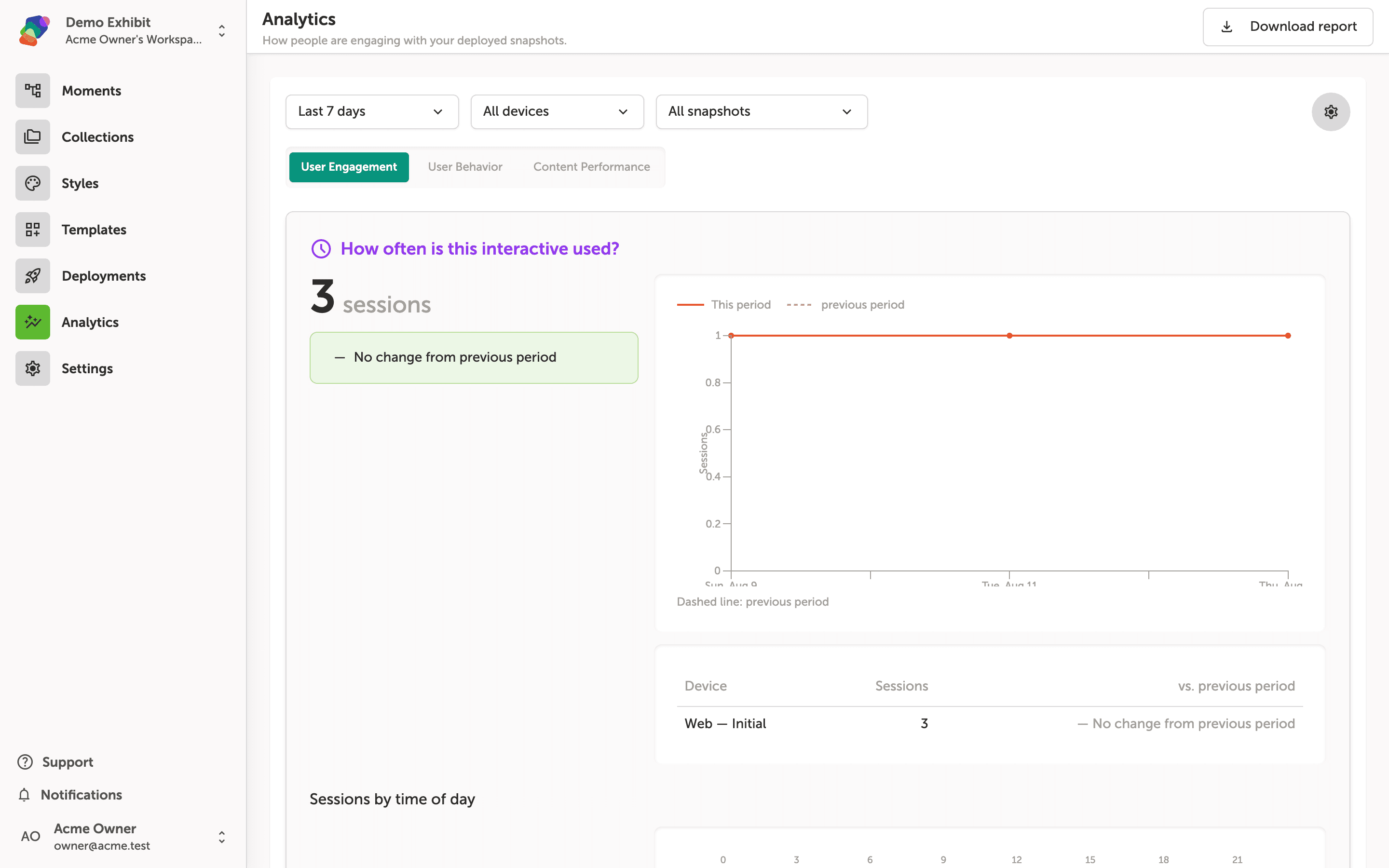
The Analytics page shows how people are interacting with your deployed project. At the top, three filters let you narrow the data: Last 7 days sets the date range, All devices limits results by display type, and All snapshots focuses on a specific published version. Adjust any filter and the charts update automatically.
The User Engagement tab is active by default. Here you can see total sessions for the selected period, a session trend line comparing this period to the previous one, a breakdown by device, and a Sessions by time of day chart further down the page. Use Download report in the top-right corner to export the current view.
Reading the sessions by time of day heatmap
The Sessions by time of day heatmap plots every hour of the day across the horizontal axis and each day of the week down the vertical axis. Darker, more saturated cells indicate hours when more sessions occurred—the highlighted cells on Sunday, Tuesday, and Thursday around hour 13–14 show when visitors were most active during this period.
Hover over any cell to see the exact session count for that hour and day combination. The color scale at the bottom of the heatmap maps shade intensity to session volume, with the rightmost end representing the highest count recorded in the current date range.
Exploring how visitors move through your project on the User Behavior tab
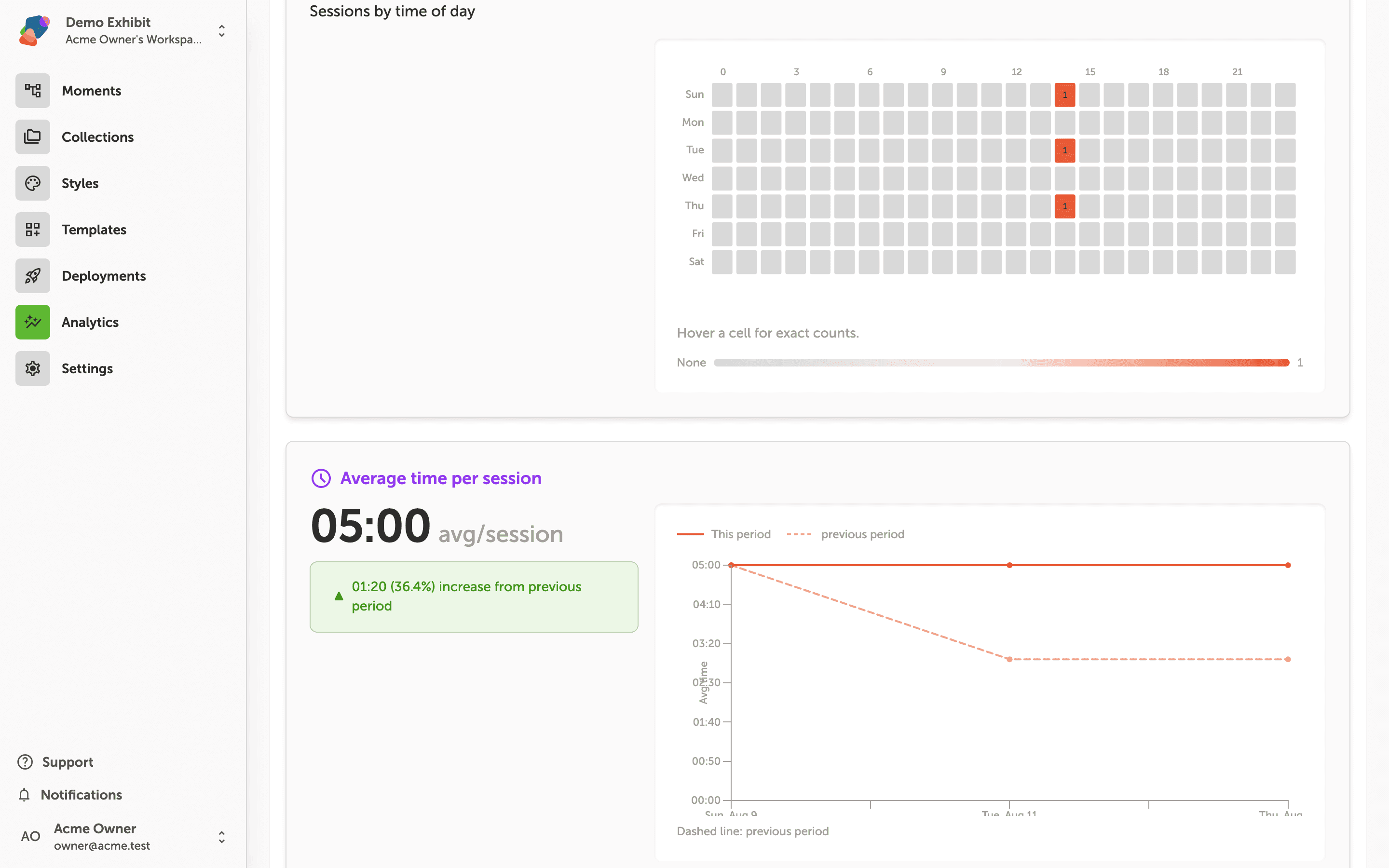
Click "User Behavior" to switch to this tab. The page reorganizes around movement and dwell time, starting with the User journey map, which shows how visitors progress from one moment to the next across your project.
Below the journey map, the "Average views and time per moment" table lists each moment by name alongside its view count and average dwell time. Use the "Last 7 days", "All devices", and "All snapshots" filters at the top to narrow the data to a specific time range, device type, or deployed snapshot.
Reviewing component interactions and scroll depth on the Content Performance tab
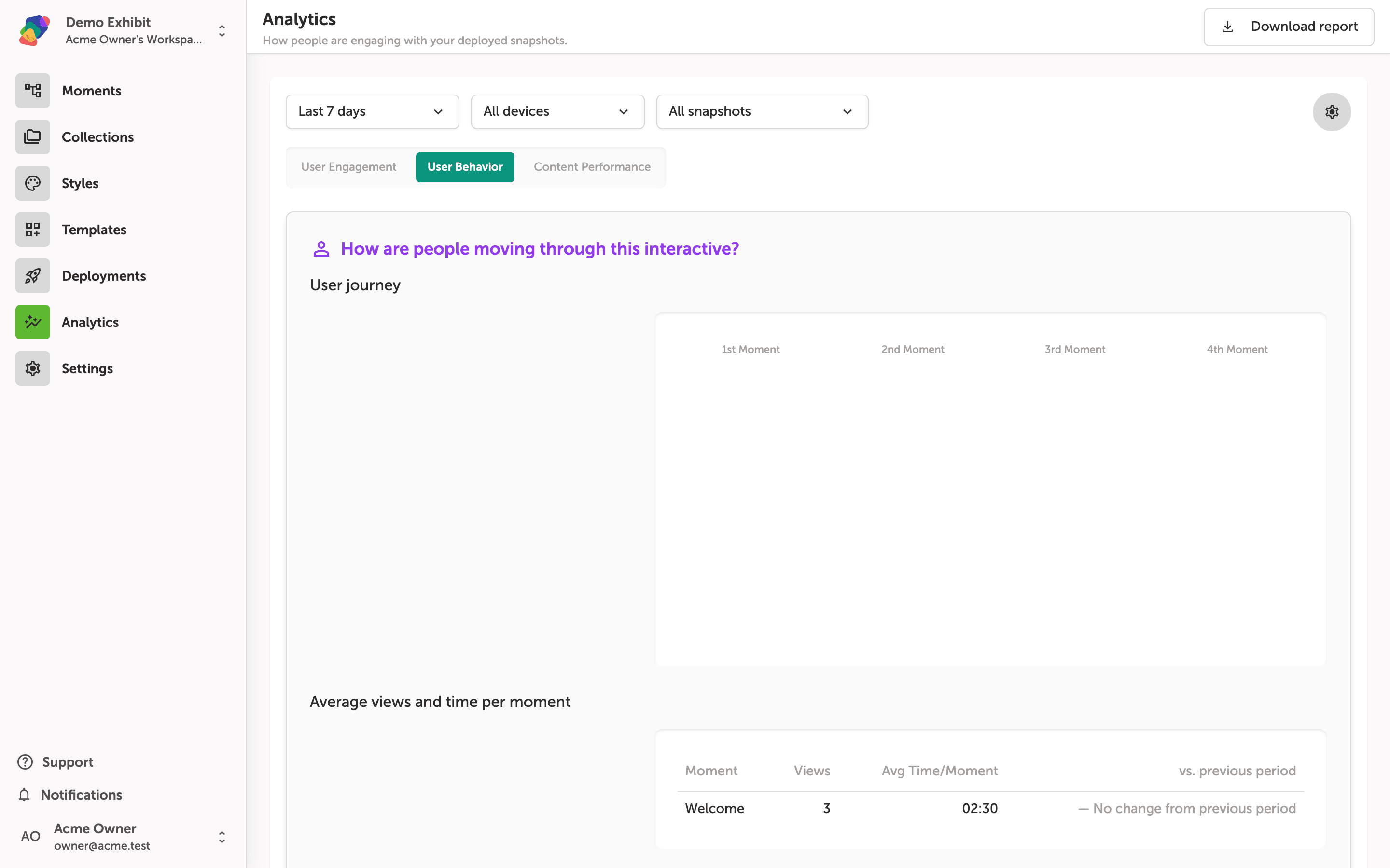
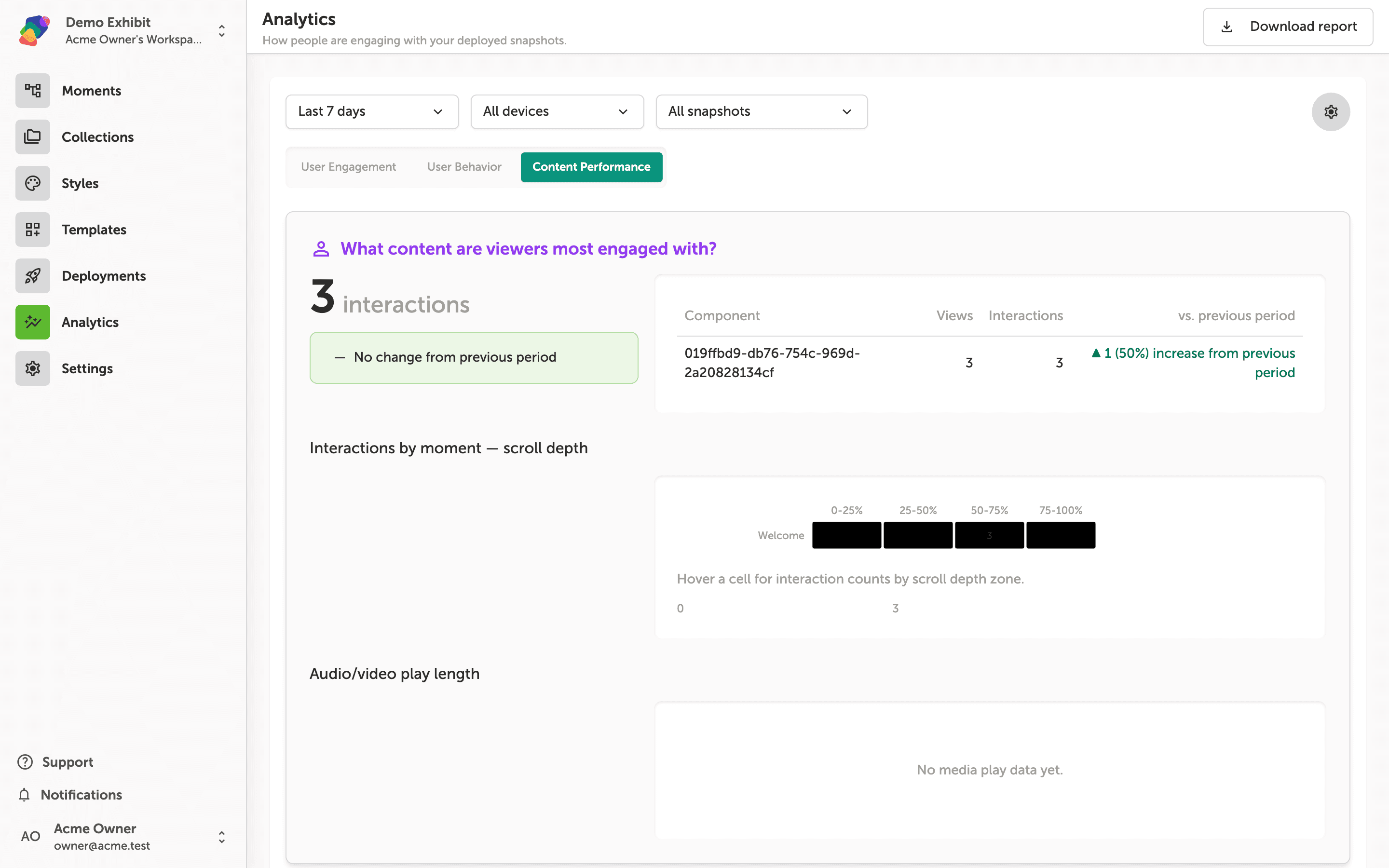
The Content Performance tab shows you what visitors are actually doing with the content inside your project. At the top, the component table lists each component by its ID alongside its Views, Interactions, and a comparison to the previous period—so you can spot which components are driving engagement and which are being ignored.
Below the component table, the Interactions by moment—scroll depth heatmap breaks down where within each moment visitors are interacting, divided into scroll-depth zones (0–25%, 25–50%, 50–75%, 75–100%). Hover over any cell to see the exact interaction count for that zone. The Audio/video play length section at the bottom tracks media engagement; if no media has been played in the selected period, it displays "No media play data yet."
When AI insight cards appear alongside Content Performance data
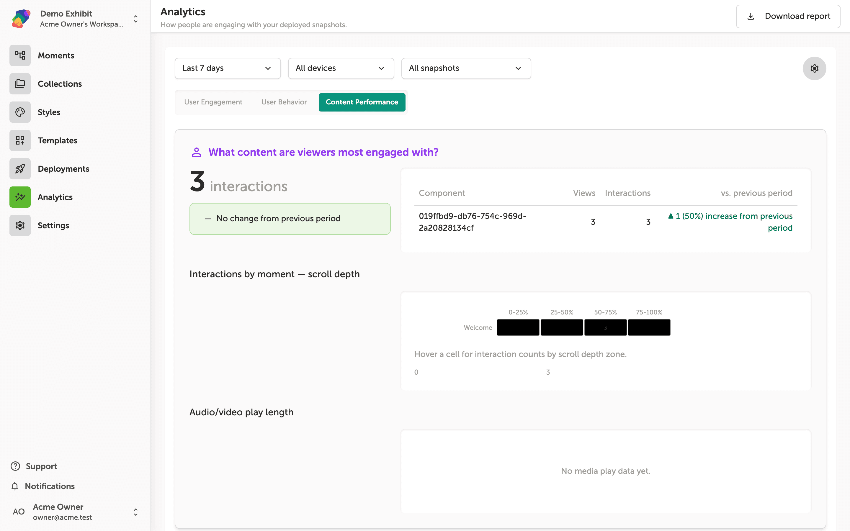
The Content Performance tab shows component-level data in two sections: a component interaction table at the top and an Interactions by moment—scroll depth heatmap below it. Hover over any cell in the heatmap to see the exact interaction count for that scroll depth zone on a given moment. The Audio/video play length section appears beneath the heatmap and displays media engagement data once visitors have played audio or video components.
The purple callout visible above the component table is an AI insight card. Zibit generates these automatically when it detects a meaningful pattern in your data—such as a single component driving a disproportionate share of interactions. If there is not yet enough data to surface a reliable pattern, the insight card simply does not appear. You do not need to configure anything to enable them.
You now have the tools to measure what's working in your project and spot where visitors are losing interest or skipping content. From here, you can start making data-informed changes to your moments, flows, and components.
- Adjust your flows based on behavior data: Use drop-off patterns from the User Behavior tab to reroute visitors toward high-value moments.
- Refine underperforming components: Low interaction rates on the Content Performance tab are a clear signal to rethink placement, sizing, or content.
- Schedule regular analytics reviews: Set a recurring cadence to check your dashboard after publishing updates so you can track the impact of each change.
- Explore style sets for visual improvements: If visitors are skipping text-heavy moments, a updated style set with stronger typographic hierarchy may help.
- Share findings with your space: Export or screenshot key charts to align collaborators in your space around the same performance goals.